Closed
Bug 594813
Opened 14 years ago
Closed 13 years ago
Customer Care banner box on SUMO articles
Categories
(support.mozilla.org :: Army of Awesome, task, P3)
support.mozilla.org
Army of Awesome
Tracking
(Not tracked)
VERIFIED
FIXED
2.7
People
(Reporter: malexis, Assigned: rrosario)
Details
Attachments
(5 files)
Summary:
Create banner box on SUMO articles for users coming from Customer Care links on twitter
*Uses existing support content from SUMO pages
*Adds greeting box before the start of the article that welcomes the user and tells them they were sent here by a Community Care volunteer

Launch deadline (including QA time): 9/30

Technical: Ideally, I think this header banner would be triggered with a parameter in the url. Then, any SUMO article with this parameter would show the banner box. It's also easy to add/remove the banner when viewing the page, since you just have to change the url.

For example:
http://support.mozilla.com/en-US/kb/Deleting+cookies becomes
http://support.mozilla.com/en-US/kb/Deleting+cookies?ref=twitter and shows the banner box

Placeholder text:

main: You've come to the right place for Firefox help! This page should provide you with a solution to what you posted on Twitter. If not, our community volunteers are ready to help.

smaller text: You were sent here by one of our volunteers from the [Army of Awesome] (link to Customer Care).

Examples of how this could look:
- WordPress greeting box (image + text)
- Digg announcement (text only)
- Facebook announcement (text only)
Comment 1•14 years ago
|
||
Mike: I assume the target for this is "when Customer Care launches"? We aren't planning to push anything before then.

Chris, any input on style?
Assignee: nobody → chowse
Component: Webdev → Customer Care
OS: Windows 7 → All
Product: mozilla.org → support.mozilla.com
QA Contact: webdev → customer-care
Hardware: x86 → All
Target Milestone: --- → 2.2.5
Version: other → unspecified
Comment 2•14 years ago
|
||
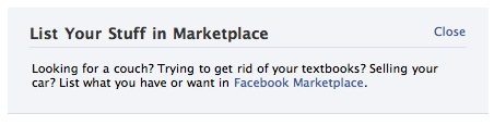
Links to banner box examples in the description got cut off. Here they are:

WordPress greeting box
- http://crunchpress.com/wp-content/uploads/2009/01/greet-box.png
Digg announcement
- http://ocaoimh.ie/wp-content/uploads/2007/11/digg-com.png
Facebook announcement
- http://wildbit.com/wp-content/uploads/2007/06/facebook-announcement.png
Comment 3•14 years ago
|
||
Here are two ways I could see the box being positioned above articles. Just some ideas.
Comment 4•14 years ago
|
||
While it would be nice to get this in before we push the SignPost project, this depends on the SUMOdev team and a separate push (let alone getting a mockup from chowse).

If we can do this before end of Q3, that would be nice, but this shouldn't block the release of this project.
Comment 5•14 years ago
|
||
First stab. Sizing & position could be improved, but I think the basic style will remain the same.
Comment 6•14 years ago
|
||
Alternate design, placed above the article's heading. I've also broken the text into 3 lines to make it easier to read.
Comment 7•14 years ago
|
||
Another alternate design, similar to the StackOverflow first-run box. The content of the entire page slides down, revealing the referral box 'underneath' it. Since space permits, the Army of Awesomeness block has been moved to the margin, and there is an option to close/hide this UI.
Comment 8•14 years ago
|
||
Last design. A Twitter-style overlay that slides down from the top, covering the header.
Comment 9•14 years ago
|
||
(In reply to comment #6)
> Created attachment 474807 [details]
> Referral Box Mockup (Top of Page)
>
> Alternate design, placed above the article's heading. I've also broken the text
> into 3 lines to make it easier to read.

I think I like this one the best, mostly because it's friendly and tells you that you are in the right place.

The ones at the top of the window (comment #7 and #8) seem easy to skip over and I'm concerned that animating it will make it look like an advertisement.
Comment 10•14 years ago
|
||
(In reply to comment #7)
> Created attachment 474808 [details]
> Referral Box Mock-up (Sliding Panel at Top)
>
> Another alternate design, similar to the StackOverflow first-run box. The
> content of the entire page slides down, revealing the referral box 'underneath'
> it. Since space permits, the Army of Awesomeness block has been moved to the
> margin, and there is an option to close/hide this UI.

I have to say I prefer this one. It always manages to grab my attention when I visit Stack Overflow with a new profile, and the animation adds a nice touch of interactivity + it never bothered me, even after seeing it several times. Might be different for others of course.

Michael, the difference with this one is that the whole page moves to reveal the box, instead of the box sliding down and overlaying parts of the page, which would indeed not be easy to spot.
Comment 11•14 years ago
|
||
I think the risk of missing the two at the top of the window is low assuming that the animation works well. Not sure if it would look like an ad, though maybe that's a risk.

Between the two styles at the top, I would definitely pick the one that overlays (attachment 474810 [details]). Blocks that pushes the main content down (attachment 474808 [details]) always feel more heavyweight, because when you close it, the rest of the page has to move up.

Between the two normal banners, I agree with Michael that attachment 474807 [details] is the best placement.

I'm torn. Seeing how the animation would actually look like would help here.
Comment 12•14 years ago
|
||
He's a quick, rough attempt at what the animation looks like:
http://people.mozilla.com/~williamr/communitycare/bannerbox/

Works best when your window is 1024 pixels wide so the banner takes up the whole width. After you click to close the box, refresh the page to see the animation again.

Hope that helps.
Comment 13•14 years ago
|
||
Two more prototypes, one which slides in from the top, one from the bottom:

http://people.mozilla.com/~chowse/drop/sumo/customer-care/v1/top.html
http://people.mozilla.com/~chowse/drop/sumo/customer-care/v1/bottom.html
Comment 14•14 years ago
|
||
The one sliding in from the top has potential to become my personal fave, but I don't think it's a good idea to keep it fixed in view even when you scroll. I'd much rather see it leave the view as you scroll down, especially considering small screens and the overall annoyance of having something overlaid like, which might cause a negative effect on viewers.

In short, I like the message, style, animation -- but make it not follow the content as you scroll.
Comment 15•14 years ago
|
||
One additional note: the "Click Anywhere to Close" text is misleading, because you can't click outside the box to close it. Ideally that would be possible, but assuming it's not, we should change the text of that link.
Comment 16•14 years ago
|
||
Another important requirement is that the "?ref=twitter" part of the URL is kept even if the original URL is e.g. https://support.mozilla.com/kb/How+to+avoid+crashes?ref=twitter (currently the parameter is stripped unless the URL has a locale).
Comment 17•14 years ago
|
||
Talked with David and this will be easier to do as part of 2.3 (and things like comment 16 will be free). => 2.3
Priority: -- → P3
Target Milestone: 2.2.5 → 2.3
Comment 18•14 years ago
|
||
Fixed the prototype:

http://people.mozilla.com/~chowse/drop/sumo/customer-care/v1/top.html

* 'Click Anywhere to Close' is now 'Click Here to Close'. Clicking anywhere
  on the banner will still close it.

* The banner no longer scrolls with the page.
Assignee: chowse → nobody
Comment 19•14 years ago
|
||
This looks great to me!
Comment 20•14 years ago
|
||
+1
Comment 21•14 years ago
|
||
Mary and I currently like the bottom version the most since it doesn't cover the nav bar.

http://people.mozilla.com/~chowse/drop/sumo/customer-care/v1/bottom.html

Also, I would suggest replacing the "Click Anywhere to Close" text with a [X] graphic similar to how StackOverflow does theirs: http://stackoverflow.com/
Comment 22•14 years ago
|
||
As you have probably seen in the previous comments, I (and I believe Kadir) prefer the top version because it doesn't block the view when you scroll down. For smaller screens, that would be a very annoying behavior.

About covering the nav bar, maybe if we introduced a 1 second delay before this bar appeared this wouldn't be a problem? Because then you would see that something was there before the bar appeared, so you know it's covering something. Just a thought. The other solution would be to go back to a static box embedded on the page instead of these overlaid/sliding bars...

I like the idea of replacing "Click Anywhere to Close" with just an [X] though.
Comment 23•14 years ago
|
||
I also favor a top bar, also because the bottom version is highly unusual and might not be seen as a notificiation. But if we take the one that moves the content down, we would go around the problem that it covers the navigation bar+ it has the bonus of being more visible.
Comment 24•14 years ago
|
||
Forgot to mention that it would be fixed and scroll with the site, like this: http://stackoverflow.com/questions/1732348/regex-match-open-tags-except-xhtml-self-contained-tags
Comment 25•14 years ago
|
||
The problem with the one that pushes the content down is that the top nav is designed to be attached to the top of the page. If pushed down, it looks like a loose piece of UI because only the bottom corners are rounded.
Comment 26•14 years ago
|
||
(In reply to comment #24)
> Forgot to mention that it would be fixed and scroll with the site, like this:
> http://stackoverflow.com/questions/1732348/regex-match-open-tags-except-xhtml-self-contained-tags

Didn't see this comment when I replied. Yeah, if the bar spans the entire width of the page like on StackOverflow, that solution could work. I.e.:

* Bar slides in at the top, pushing the main content down.
* Bar remains visible when scrolling.
* When closing it, the bar fades away and the main content is pushed back up again.

Our bar would be much thicker though due to having more text. Not sure how that would look like.
Comment 27•14 years ago
|
||
This fell off the radar a bit while we were focusing on getting Army of Awesome out the door. Would like to pick this back up for SUMO 2.3.1 or 2.4.1.

The top location makes sense to me now based on comment 22 and 23. Seems the only question is whether to overlay it on top of the navbar or to show the banner at the top and push the navbar down so both are visible.

Chris: could you update the prototype so we can see the box with the new SUMO design? I think that will help us pick the best approach.

Stage site for new design: http://master.support.mozilla.com/en-US/kb/Firefox%20crashes
Comment 28•14 years ago
|
||
Chris: could you update the prototype as mentioned in comment 27? Thanks :)

This isn't going to make it in 2.3 so I'm moving it to 2.3.1 for now.
Target Milestone: 2.3 → 2.3.1
Comment 29•14 years ago
|
||
Updated:

http://people.mozilla.com/~chowse/drop/sumo/customer-care/v1/top.html
http://people.mozilla.com/~chowse/drop/sumo/customer-care/v1/bottom.html

I'm not happy with the colors, and the new nurse mascot may not work with the new design, but here's something to review in the meantime.
Updated•14 years ago
|
Target Milestone: 2.3.1 → 2.3.2
Comment 30•14 years ago
|
||
Even if we had a final design, this would be tough for Thursday.
Target Milestone: 2.3.2 → 2.4.1
Updated•14 years ago
|
Target Milestone: 2.4.1 → 2.4.2
Comment 31•14 years ago
|
||
What's the status of this, is it finalized to chowse's work from comment 29? Top or bottom?
Comment 32•14 years ago
|
||
There's way too much in 2.4.2 right now. AoA stuff can just go in 2.4.3.
Target Milestone: 2.4.2 → 2.4.3
Comment 33•14 years ago
|
||
(In reply to comment #31)
> What's the status of this, is it finalized to chowse's work from comment 29?
> Top or bottom?

Top version from comment 29 please. The only change is to replace "Click Anywhere to Close" with an [X] as mentioned in comment 21.

paulc: is it okay to assign this to you?
| Assignee | ||
Updated•13 years ago
|
Assignee: nobody → rrosario
| Assignee | ||
Updated•13 years ago
|
Target Milestone: 2.4.3 → 2.5
| Assignee | ||
Updated•13 years ago
|
Target Milestone: 2.5 → 2011Q1
| Assignee | ||
Comment 34•13 years ago
|
||
This... finally... landed! \o/
https://github.com/jsocol/kitsune/commit/ad0845a4c8a96ae94abf0057d20b97243d17dc48

William, the AOA links back to the articles need to have `?ref=aoa` query string for the banner to show.
Status: NEW → RESOLVED
Closed: 13 years ago
Resolution: --- → FIXED
Target Milestone: 2011Q1 → 2.7
Comment 35•13 years ago
|
||
Looks awesome Ricky! Thanks \o/
Comment 36•13 years ago
|
||
Verified articles display with AoA banner, links ok, close button
Status: RESOLVED → VERIFIED
You need to log in
before you can comment on or make changes to this bug.
Description
•