Closed
Bug 738491
(australis-tabs-win)
Opened 12 years ago
Closed 11 years ago
Implement Australis tab shape & styling on Windows
Categories
(Firefox :: Theme, defect)
Tracking
()
RESOLVED
FIXED
Firefox 28
People
(Reporter: jaws, Assigned: MattN)
References
(Depends on 2 open bugs, )
Details
(Whiteboard: [issues should be filed in new bugs and marked as blocking the offender])
Attachments
(2 files, 32 obsolete files)
|
19.02 KB,
patch
|
MattN
:
review+
|
Details | Diff | Splinter Review |
|
41.17 KB,
patch
|
MattN
:
review+
|
Details | Diff | Splinter Review |
Please see the associated URL for the design specs of the tab shape for the Australis theme.
Comment 1•12 years ago
|
||
This is a duplicate of bug 732583.
| Reporter | ||
Comment 2•12 years ago
|
||
(In reply to Brandon Cheng from comment #1)
> This is a duplicate of bug 732583.

This isn't a duplicate, it's part of the overall Australis tab work.
| Reporter | ||
Updated•12 years ago
|
Assignee: nobody → jaws
Status: NEW → ASSIGNED
| Reporter | ||
Comment 3•12 years ago
|
||
This is a WIP patch. It is lacking lightweight-theme support as well as clip-paths around the curve of the ends of the tabs.
Updated•12 years ago
|
Summary: Implement the Australis tab shape → Implement the Australis tab shape on Windows
Updated•12 years ago
|
Summary: Implement the Australis tab shape on Windows → Implement Australis tab shape & styling on Windows
Comment 6•12 years ago
|
||
I've tried it on UX channel, the unselected tabs look ok if I use a light wallpaper background, but it is hard to see if the wallpaper is dark. And the selected tab only suitable for aero glass and aero basic visual styles users, classic visual style users don't have the right selected tab color. I hope that the next patch will fix those bugs.
Comment 7•12 years ago
|
||
I don't think that tab-bar background could make the tabs text clearer on a dark background, it makes the tab-bar look uglier instead. The unselected tabs' text and the new-tab button should be white and the tab-bar background should be removed.
Comment 8•12 years ago
|
||
Title changed pinned tabs haven't been styled yet.
In fact there isn't enough glass, mainly with the browser maximized and that makes the tab title hard to read. Aero glass should cover completely the tab background.
Comment 10•12 years ago
|
||
In the specs it is clearly specified that the tab size must be reduced to 180 px without the curves. I was told that wasn't part of the plan, but I think it should be done.
| Reporter | ||
Comment 11•12 years ago
|
||
Pushed to UX branch, should appear in tomorrow's nightly UX build.
Attachment #629376 -
Attachment is obsolete: true
| Reporter | ||
Comment 12•12 years ago
|
||
Comment on attachment 631470 [details] [diff] [review]
WIP of patch v2

Dao: Can you please provide any feedback you have on this patch.

We still need to:
- get specific tab shape graphics for non-Aero
- improve the implementation of the glass fogging
- determine if the current solution for opacity:.5 of the tab-background with lightweight themes is acceptable
Attachment #631470 -
Flags: feedback?(dao)
Comment 13•12 years ago
|
||
Comment on attachment 631470 [details] [diff] [review]
WIP of patch v2

(In reply to Jared Wein [:jaws] from comment #12)
> - get specific tab shape graphics for non-Aero

Using images for the tab background is a bad idea. There's an unbound number of OS themes to support.

> - improve the implementation of the glass fogging

The fog doesn't seem effective enough, i.e. it doesn't make text legible enough on dark backgrounds. We have moved to white icons on glass; has the same be considered for the tab label color?

> - determine if the current solution for opacity:.5 of the tab-background
> with lightweight themes is acceptable

It's not. It doesn't integrate with the toolbars.
Attachment #631470 -
Flags: feedback?(dao) → feedback-
Comment 14•12 years ago
|
||
Why are we going for fog anyways? Microsoft plans to remove Aero from Windows 8 , and even IE9 and other browsers don't rely on fogging the glass. Apologies for being unaware about its UI importance.
Comment 15•12 years ago
|
||
The specs clearly show a tab strip completely covered by glass (http://people.mozilla.com/~shorlander/files/australis-designSpecs/images-win7/style-tabStripBackground.png), white tab label wouldn't be optimal and would look a bit weird on Win Seven/Vista. 210px is too much, it should be 180px wide (Firefox is the only browser that has such wide tabs).
Comment 16•12 years ago
|
||
(In reply to bogas04 from comment #14)
> Why are we going for fog anyways? Microsoft plans to remove Aero from
> Windows 8 , and even IE9 and other browsers don't rely on fogging the glass.
> Apologies for being unaware about its UI importance.

Win 8 will have a different design than the OS that use Aero : http://shorlander.dropmark.com/51486/532404
Comment 17•12 years ago
|
||
What if we add glow to the text , only? That's how text in Aero is natively made readable in Windows Vista/7
http://trunc.it/l890x
| Reporter | ||
Comment 18•12 years ago
|
||
(In reply to Dão Gottwald [:dao] from comment #13)
> Comment on attachment 631470 [details] [diff] [review]
> WIP of patch v2
>
> (In reply to Jared Wein [:jaws] from comment #12)
> > - get specific tab shape graphics for non-Aero
>
> Using images for the tab background is a bad idea. There's an unbound number
> of OS themes to support.

We have a specific requirement to not use computed gradients or computed borders for performance reasons. I don't know another way to achieve this look without using images.
Comment 19•12 years ago
|
||
(In reply to Jared Wein [:jaws] from comment #18)
> (In reply to Dão Gottwald [:dao] from comment #13)
> > Comment on attachment 631470 [details] [diff] [review]
> > WIP of patch v2
> >
> > (In reply to Jared Wein [:jaws] from comment #12)
> > > - get specific tab shape graphics for non-Aero
> >
> > Using images for the tab background is a bad idea. There's an unbound number
> > of OS themes to support.
>
> We have a specific requirement to not use computed gradients or computed
> borders for performance reasons. I don't know another way to achieve this
> look without using images.

If we need to keep on using computed gradients for the selected tab, then that's how it is. My understanding is that bug 761393 will fix the D2D perf issue.
Comment 20•12 years ago
|
||
I don't see why we should favor SVG over CSS gradients, given that they have similar perf drawbacks. With CSS gradients, we can at least be sure that we won't regress performance, since we'd use them a lot less than we currently do.
| Reporter | ||
Comment 21•12 years ago
|
||
Reassigning to Frank as he's going to be working on bringing this to completion now.
Assignee: jaws → fryn
Comment 22•12 years ago
|
||
Could another try be given to this patch on the UX branch ?
| Assignee | ||
Comment 23•12 years ago
|
||
Frank, do you have an updated WIP patch?
Assignee: fryn → mnoorenberghe+bmo
| Assignee | ||
Comment 24•12 years ago
|
||
Dão/Frank/Jared, I'd like to get some opinions on the approaches to implement the tab shape.

Here are some things I'm trying to keep in mind for the tab shape implementation:
* Getting the proper tab end shape and line thickness/anti-aliasing
* System colour/theme integration
* Proper pointer events
* Don't regress performance
* (are there other important goals?)

Some approaches I've considered for the tab shape (ignoring separators and other changes) keeping the above in mind:

1) SVG for the clip mask with transparent background images for edges/gradient.
   Use a background-image like tabBackgroundStart.png (which doesn't have a fill for the tab but includes anti-aliasing on the line) on .tab-background-start along with the vertical linear gradient and then use the clip-path property so that the tab fill gradient doesn't appear outside the bounds of the tab curve.

This works except that the outer edge of the tab shape is clipped by the clipPath and makes the line appear softer than the designs.  We could draw another line on top of the clipped element to make it stronger or add a shadow to replace the missing outer anti-aliasing that was clipped.

2) Clip .tab-background-start containing the tab gradient (but no border) with the clipPath. Then draw tabBackgroundStart.png on top for the border.

3) SVG for tab ends (shape border + gradient)
   Don't use images for the tab ends and just use SVG.  If performance of this is not good enough, we can use this approach but cache the result in an image using <canvas>.  This way we get the correct system colours and shape but it may take some work to get correct SVG paths for the border if a single border path is not enough to get the proper anti-aliasing.

4) Use the current active tab images but apply a filter to tint them with -moz-dialog to integrate with the system colours.  We can cache the result with <canvas> for performance, at the cost of complexity, if necessary.

Which of these approaches are preferred?

Thanks
Comment 25•12 years ago
|
||
If there are good reasons to use SVG and it doesn't perform well enough, we should try to get bug 764299 fixed. A manual cache using canvas sounds messy (mixing theme and application code?) and should be avoided if possible.
| Assignee | ||
Comment 26•12 years ago
|
||
(In reply to Dão Gottwald [:dao] from comment #25)
> If there are good reasons to use SVG and it doesn't perform well enough, we
> should try to get bug 764299 fixed. A manual cache using canvas sounds messy
> (mixing theme and application code?) and should be avoided if possible.

Agreed.  Do you have a preference for or objection to any of the proposals or do you have one of your own to add? I'm leaning towards proposal #2 but I haven't tested that approach yet.
| Reporter | ||
Comment 27•12 years ago
|
||
Poor tab strip performance is one of our biggest jank problems on Firefox, so we need to make sure that our new tab shape improves the performance greatly from where we are today.

I think the best route to doing that is to reduce the amount of work that is needed (vs. finding optimizations that allow us to squeeze more work in).

Can we look in to what we could do without using SVG at all? Would it be so bad to make ~20 tab shape images for the default theme colors? The sum file size of these won't be huge (estimating at 5kb each, totaling 100kb) when compared to the performance gains.

If the theme color is not one of the 20 or so that we want to support we could fall back to just showing a default color for that platform. Our limitless extensibility is hurting us here.
Comment 28•12 years ago
|
||
(In reply to Jared Wein [:jaws] from comment #27)
> Poor tab strip performance is one of our biggest jank problems on Firefox,
> so we need to make sure that our new tab shape improves the performance
> greatly from where we are today.

We're already going to style only the selected tab as opposed to all tabs, which will reduce the load on our graphics stack (where D2D seems to be the biggest bottleneck).

> Can we look in to what we could do without using SVG at all?

Can you elaborate on how SVG is inherently slow? My understanding is that the initial image creation time is negligible and later becomes moot if the result is cached.

> Would it be so bad to make ~20 tab shape images for the default theme colors?

Yes. It would be pretty much unmaintainable. We're not implementing the final revision of the last tab strip design of all times in this bug. We'll need to refine and hack on it. And it should be flexible enough to somewhat accommodate to future OS themes, as those aren't set in stone either.
Comment 29•12 years ago
|
||
Apart from what I said, it's not immediately clear to me which of the proposed alternatives is preferable. Matt, since you've spent more time than I thinking about this, do you see any specific pros and cons with regards to performance, implementation complexity or other factors? What makes you prefer #2?
| Assignee | ||
Comment 30•12 years ago
|
||
(In reply to Dão Gottwald [:dao] from comment #29)
> Apart from what I said, it's not immediately clear to me which of the
> proposed alternatives is preferable. Matt, since you've spent more time than
> I thinking about this, do you see any specific pros and cons with regards to
> performance, implementation complexity or other factors? What makes you
> prefer #2?

Comments on each approach inline:

(Quoting Matthew N. [:MattN] from comment #24)
> Here are some things I'm trying to keep in mind for the tab shape
> implementation:
> * Getting the proper tab end shape and line thickness/anti-aliasing
> * System colour/theme integration
> * Proper pointer events
> * Don't regress performance
  * Maintainability
  * Implementation Complexity
>
> Some approaches I've considered for the tab shape (ignoring separators and
> other changes) keeping the above in mind:
>
> 1) SVG for the clip mask with transparent background images for
> edges/gradient.
>    Use a background-image like tabBackgroundStart.png (which doesn't have a
> fill for the tab but includes anti-aliasing on the line) on
> .tab-background-start along with the vertical linear gradient and then use
> the clip-path property so that the tab fill gradient doesn't appear outside
> the bounds of the tab curve.
>
> This works except that the outer edge of the tab shape is clipped by the
> clipPath and makes the line appear softer than the designs.  We could draw
> another line on top of the clipped element to make it stronger or add a
> shadow to replace the missing outer anti-aliasing that was clipped.

The problem mentioned above (that the tab border gets clipped by the clip-path) is enough of a reason to not take this approach IMO.

> 2) Clip .tab-background-start containing the tab gradient (but no border)
> with the clipPath. Then draw tabBackgroundStart.png on top for the border.

Here is a variation which I'm currently implementing:
2.5) Clip .tab-background-start containing the base background color (but no border) with the clipPath. Then draw tabBackgroundStart.png on top for the border and gradient.

This gets us the proper tab shape, system colours, no* computed gradients, and proper pointer events (not working yet but they work in a test case). Performance should be good because most expensive effects are coming from images. The CSS is fairly easy to understand, not as easy to tweak since it uses ::before and ::after pseudo elements (to avoid new DOM elements) which don't show up in tools like DOM Inspector.

* I'm currently using one gradient from a color to itself to achieve the effect of background-size on a solid color.  This should be cached now though IIUC.

> 3) SVG for tab ends (shape border + gradient)
>    Don't use images for the tab ends and just use SVG.  If performance of
> this is not good enough, we can use this approach but cache the result in an
> image using <canvas>.  This way we get the correct system colours and shape
> but it may take some work to get correct SVG paths for the border if a
> single border path is not enough to get the proper anti-aliasing.

I haven't tested this approach yet but this is my analysis:
Proper tab shape although differing in anti-aliasing compared to using an image. Care would have to be taken to make sure that the SVG gradient & border align properly with .tab-background-middle.  Interaction with flex has potential for problems.  I not as sure about SVG performance but presumably bug 764299 would make this not too bad.  SVG has the advantage of giving us more control over pointer-events as most of the propert values only apply to SVG. Maintainability and complexity of SVG over approaches with images is debatable. SVG can be edited by hand or with free tools whereas tweaking a bitmap image is more restrictive or require source files (ie. PSD) and paid software.

> 4) Use the current active tab images but apply a filter to tint them with
> -moz-dialog to integrate with the system colours.  We can cache the result
> with <canvas> for performance, at the cost of complexity, if necessary.

I think that applying the SVG filter (svg:fe) may make this approach too expensive and it seems more complex than using a semi-transparent image over top of a solid background color. Getting the result of the filter to exactly match the middle of the tab may be a problem.

--
I'll upload a demo and/or patch of approach two soon.

Frank reminded me the other day about tab drag and high-dpi screens.  Any approach using images would have to have high-res versions swapped in when the platform functionality is ready.  I haven't look at how the tab drag works to see how hard it would be to get that working with tab separators but IMO it shouldn't be a blocker because it's a very subtle issue and I suspect most people are focusing on the selected tab and not the separators while dragging.
Comment 31•12 years ago
|
||
(In reply to Matthew N. [:MattN] from comment #30)
> Frank reminded me the other day about tab drag and high-dpi screens.  Any
> approach using images would have to have high-res versions swapped in when
> the platform functionality is ready.

Windows lets you adjust DPI settings in multiple steps independently from the screen. You can also just increase font sizes. For people with poor eye sight these are fairly common ways to improve accessibility. One set of images per setting isn't really feasible for this. Ideally tabs would scale freely and automatically like they currently do.
Comment 32•12 years ago
|
||
(In reply to Dão Gottwald [:dao] from comment #31)
> (In reply to Matthew N. [:MattN] from comment #30)
> > Frank reminded me the other day about tab drag and high-dpi screens.  Any
> > approach using images would have to have high-res versions swapped in when
> > the platform functionality is ready.
>
> Windows lets you adjust DPI settings in multiple steps independently from
> the screen. You can also just increase font sizes. For people with poor eye
> sight these are fairly common ways to improve accessibility. One set of
> images per setting isn't really feasible for this. Ideally tabs would scale
> freely and automatically like they currently do.

Dão is spot on here. There are an increasing number of HD displays being incorporated into 11" and 13" notebooks and some are already shipping with Windows' high DPI modes set by default. I'll be putting together a list of bugs I've identified in the higher DPI Windows environment and it would be nice to not be adding more to that list as we develop new features.

That being said, I'm only offering information here, not making any technology recommendation. I leave that to you all.
| Assignee | ||
Comment 33•12 years ago
|
||
Here is a patch which demonstrates approach 2.5 (2 layers of images for the tab ends) for hovered tabs and ~approach 3 (SVG for the tab end border with a clipped linear gradient below) for the selected tab.

This has one use of [beforehovered] from bug 585558 to workaround the fact that the new-tab-button is anonymous in the tab strip.

I created two new SVG files because my understanding is that the fragment syntax to specify an SVG element by ID is not supported for CSS images, like it is for the clip-path. It seems like there was some talk about this at the W3C so perhaps we could implement this.  I'm not sure if this is a big deal with omnijar.

This patch can obviously be cleaned up so don't focus on CSS property redundancy or organization.  Are either of these approaches suitable? The SVG one would be preferred means not having to make images for many settings but that may come at the cost of performance.

I've also just used the tab colour for aero for now as Stephen is going to give me the correct colours to apply as a gradient on top of -moz-dialog so we don't need to specify tab colours for each Windows theme. The design specs currently specify computed colours for the tabs.
Attachment #631470 -
Attachment is obsolete: true
Attachment #662848 -
Flags: feedback?(dao)
Comment 34•12 years ago
|
||
I'm not specialist here, but what about Canvas?

Isn't it much faster than SVG, looking on benchmarks:
http://www.ernestdelgado.com/gmaps/canvas/ddemo1.html
http://intertwingly.net/stories/2006/07/10/penroseTiling.html
http://prototype-graphic.xilinus.com/samples/shape.html
and
http://smus.com/canvas-vs-svg-performance/
Comment 35•12 years ago
|
||
(In reply to Virtual_ManPL from comment #34)
> I'm not specialist here, but what about Canvas?
>
> Isn't it much faster than SVG, looking on benchmarks:
> http://www.ernestdelgado.com/gmaps/canvas/ddemo1.html
> http://intertwingly.net/stories/2006/07/10/penroseTiling.html
> http://prototype-graphic.xilinus.com/samples/shape.html
> and
> http://smus.com/canvas-vs-svg-performance/

From what I understand, the problem is the shape. SVG provides some special features that Canvas doesn't.
Comment 36•12 years ago
|
||
But wasn't it the Canvas whom gives you complete control over everything like shapes, text and other widgets with pixel level control?
Comment 37•12 years ago
|
||
Please continue this discussion somewhere else.
Comment 38•12 years ago
|
||
Comment on attachment 662848 [details] [diff] [review]
WIP v.3 Combo of approaches 2.5 and 3 from comment 30

Looks mostly ok under the most common conditions.

The new tab button is cut off on the right side.

I find background tabs insufficiently readable against my dark desktop background, so I think we need the fog to be more opaque. If we could make it entirely opaque behind tab labels, we'd also get better text rendering using sub-pixel anti-aliasing.

I also find background tabs not very distinguishable, so I think we need to separate to be more visible.

Strange things happen if you increase the font size, so this seems like it needs more work.

>--- a/browser/base/content/browser.css
>+++ b/browser/base/content/browser.css

> .tabbrowser-tab:not([pinned]) {
>   -moz-box-flex: 100;
>-  max-width: 250px;
>+  max-width: 210px;
>   min-width: 100px;
>   width: 0;
>   transition: min-width 200ms ease-out,
>               max-width 250ms ease-out,
>               opacity 50ms ease-out 20ms /* hide the tab for the first 20ms of the max-width transition */;
> }

I don't think this belongs in here. It's orthogonal to the styling changes.
Attachment #662848 -
Flags: feedback?(dao)
Comment 39•12 years ago
|
||
(In reply to Dão Gottwald [:dao] from comment #38)
> Comment on attachment 662848 [details] [diff] [review]
> WIP v.3 Combo of approaches 2.5 and 3 from comment 30

> The new tab button is cut off on the right side.

Just a note on this. While I was coding the Australis theme on AMO, I had this same issue. It seems to be related to graphics, as I could only reproduce it while running Nvidia's driver.
| Assignee | ||
Comment 40•12 years ago
|
||
I propose that this bug focus on the layout and tab shape so that we have have a base to work upon for the remaining styling issues (mostly color/opacity related).  I will wait to land this patch on central and instead work in a project repo so the follow-up concerns can be addressed before a partial release.  This will make patches easier to manage and allow parallel work on Linux + Mac.

Known issues:
* 1px on the seam between tab-background-middle and tab-background-end where pointer-events don't work. It seems to be a platform bug (possibly related to the scaleX) and I will investigate.

I propose the following as follow-up issues:
* Lightweight theme support
* Other color/opacity issues that don't make the current patch unusable.
* New tab button in the tab bar accepts pointer-events for the whole box (not just the shape).

Thanks

(In reply to Dão Gottwald [:dao] from comment #38)
> I find background tabs insufficiently readable against my dark desktop
> background, so I think we need the fog to be more opaque. If we could make
> it entirely opaque behind tab labels, we'd also get better text rendering
> using sub-pixel anti-aliasing.

If you're saying to change the background tabs to not have any transparency then I think that's asking for a different design which is a bit off-topic.

> I also find background tabs not very distinguishable, so I think we need to
> separate to be more visible.

The separator is now twice as dark.

> Strange things happen if you increase the font size, so this seems like it
> needs more work.

I'm able to increase the the font-size very high (over 18px) now without issues so I think that should cover over 99% of people.  I think we can handle a small edge case of 20px+ font-sizes in a follow-up which can be addressed before landing on central.

> >--- a/browser/base/content/browser.css
> >+++ b/browser/base/content/browser.css
>
> > .tabbrowser-tab:not([pinned]) {
> >   -moz-box-flex: 100;
> >-  max-width: 250px;
> >+  max-width: 210px;
> >   min-width: 100px;
> >   width: 0;
> >   transition: min-width 200ms ease-out,
> >               max-width 250ms ease-out,
> >               opacity 50ms ease-out 20ms /* hide the tab for the first 20ms of the max-width transition */;
> > }
>
> I don't think this belongs in here. It's orthogonal to the styling changes.

It's part of the design spec but I removed it for now.
Attachment #662848 -
Attachment is obsolete: true
Attachment #672717 -
Flags: feedback?(dao)
| Assignee | ||
Comment 41•12 years ago
|
||
Try build: https://ftp.mozilla.org/pub/mozilla.org/firefox/try-builds/mozilla@noorenberghe.ca-2c668a28aa7a/try-win32/
Comment 42•12 years ago
|
||
There are still a few known problems in the current implementation. What strikes me most is the background that should be much more fogged ( http://people.mozilla.com/~shorlander/files/australis-designSpecs/images-win7/style-tabStripBackground.png ). The tabs should be smaller (180 px according to the specs) and the favicon and the close button shouldn't be that close to the edges ( http://people.mozilla.com/~shorlander/files/australis-designSpecs/images-win7/dimensions-tab.png ). Main problem is still the fog : tab names are almost unnoticeable with my dark wallpaper. But it's nice to see some progress on Australis.
Comment 43•12 years ago
|
||
(In reply to Matthew N. [:MattN] from comment #40)
> (In reply to Dão Gottwald [:dao] from comment #38)
> > I find background tabs insufficiently readable against my dark desktop
> > background, so I think we need the fog to be more opaque. If we could make
> > it entirely opaque behind tab labels, we'd also get better text rendering
> > using sub-pixel anti-aliasing.
>
> If you're saying to change the background tabs to not have any transparency
> then I think that's asking for a different design which is a bit off-topic.

What Guillaume said. As far as I remember, the design assumed a 0.8 opacity at the center of the fog. Going to full opacity at the center might not compromise the design at that point.
Comment 44•12 years ago
|
||
The area between tabs on the top does not seem to belong to any of the tabs. This is particularly noticeable with pinned tabs where most of the tab strip at the windows edge is unresponsive to clicks.
Comment 45•12 years ago
|
||
When a pinned tab is selected and when you hover the pinned tab right to it, the hover tab is overlapping the selected one.
Comment 46•12 years ago
|
||
(In reply to Matthew N. [:MattN] from comment #40)
> Created attachment 672717 [details] [diff] [review]
> wip v.4 SVG for tab shape
>
> I propose that this bug focus on the layout and tab shape so that we have
> have a base to work upon for the remaining styling issues (mostly
> color/opacity related).  I will wait to land this patch on central and
> instead work in a project repo so the follow-up concerns can be addressed
> before a partial release.  This will make patches easier to manage and allow
> parallel work on Linux + Mac.

I think for review we need an initial patch with all required pieces in place and major flaws that we already know about addressed. (I say "initial" since minor followup issues will likely pop up once this landed, which is fine.) I don't like reviewing partial work like this, since CSS makes it easy to incrementally build up complexity and end up with a mess. This is orthogonal to how we get to that initial patch -- a project branch where you can liberally land incremental changes seems perfectly fine.

I'm not sure whether and how this matters for Linux and Mac, but I encourage you not to worry about them; those platforms' requirements are a subset of those of Windows, so porting should be trivial once Windows is done.
| Assignee | ||
Comment 47•12 years ago
|
||
- worked around the pointer event bug for the new tab button
- addressed the readability issues by including the glass fog like Stephen's design spec.

If I workaround the 1px pointer-event bug at the seam between the middle and end of the tab background by not using transform:scaleX(-1), it would introduce a 1px visible bug so I've not included that workaround here. As the patch is here, you can see the visuals working properly.  I will file the layout bug tomorrow about the visible 1px column not getting the pointer-events.  Perhaps I'm doing something wrong but I haven't found it. I don't think this should block review of the CSS as it's likely a rounding bug which won't require a change on my part.  I'm fairly sure since it happens in a small testcase and since the same clip-path is being used to clip the background color and I can see that working properly.

(In reply to Dão Gottwald [:dao] from comment #46)
> (In reply to Matthew N. [:MattN] from comment #40)
> > Created attachment 672717 [details] [diff] [review]
> >
> > I propose that this bug focus on the layout and tab shape so that we have
> > have a base to work upon for the remaining styling issues (mostly
> > color/opacity related).  I will wait to land this patch on central and
> > instead work in a project repo so the follow-up concerns can be addressed
> > before a partial release.  This will make patches easier to manage and allow
> > parallel work on Linux + Mac.
>
> I think for review we need an initial patch with all required pieces in
> place and major flaws that we already know about addressed. (I say "initial"
> since minor followup issues will likely pop up once this landed, which is
> fine.)

This patch addresses the major issues that I know about.
Attachment #672717 -
Attachment is obsolete: true
Attachment #673242 -
Attachment is obsolete: true
Attachment #672717 -
Flags: feedback?(dao)
Attachment #675509 -
Flags: review?(dao)
Comment 48•12 years ago
|
||
FYI, the fog looks very bad in Windows 8.
Comment 49•12 years ago
|
||
It looks a lot better on Win 7. But the tabs still look huge (180 px needed) and favicon and close button are still too close to the edges.
Comment 50•12 years ago
|
||
And do we want something like bug 755793 for Firefox ?
Comment 51•12 years ago
|
||
Don't we already have this ?? It's been since Firefox 4 if I remember correctly.
Comment 52•12 years ago
|
||
(In reply to Darren Kalck [:D-Kalck] from comment #51)
> Don't we already have this ?? It's been since Firefox 4 if I remember
> correctly.

Drawing in the titlebar was done in Firefox 4. That bug post entails moving the tabs into the titlebar.
Comment 53•12 years ago
|
||
I forgot to mention two things in my previous comments :
First the new close button still need to be implemented. Secondly when the tabs overlap the tab strip the left-right arrows, the dropdown menu button and the new tab one should look differently. They look a bit weird on the fogged tab strip.
Comment 54•12 years ago
|
||
I'm curious as to why we're creating a "fog" instead of a "glow" like Microsoft Office 2010 has.

http://cdn3.blogsdna.com/wp-content/uploads/2009/12/Word-Addin-Tabs-for-Microsoft-Office-2010.png
Comment 55•12 years ago
|
||
Comment on attachment 675509 [details] [diff] [review]
v.1 Glass fog @ 80% opacity and working new-tab-button pointer-events

>--- a/browser/themes/winstripe/browser-aero.css
>+++ b/browser/themes/winstripe/browser-aero.css
>@@ -4,16 +4,18 @@
>
> %define WINSTRIPE_AERO
> %include browser.css
> %undef WINSTRIPE_AERO
>
> %define customToolbarColor hsl(210,75%,92%)
> %define glassActiveBorderColor rgb(37, 44, 51)
> %define glassInactiveBorderColor rgb(102, 102, 102)
>+%define glassFgTabTexture linear-gradient(to bottom, transparent, transparent 1px, hsla(0, 0%, 100%, 0.8) 1px, hsl(204, 33%, 97%) 2px, hsl(210, 58%, 95%))

Why is this needed? Just like the old bgTabTexture, fgTabTexture is supposed to work with arbitrary themes and should work fine on glass, right? If it doesn't, something might be wrong with it.

>   .tabbrowser-tab:not(:-moz-lwtheme),
>   .tabs-newtab-button:not(:-moz-lwtheme) {
>-    background-image: @toolbarShadowOnTab@, @bgTabTexture@,
>-                      -moz-linear-gradient(@customToolbarColor@, @customToolbarColor@);
>+    color: black;
>   }
>
>   .tabbrowser-tab:not(:-moz-lwtheme):hover,
>   .tabs-newtab-button:not(:-moz-lwtheme):hover {
>-    background-image: @toolbarShadowOnTab@, @bgTabTextureHover@,
>-                      -moz-linear-gradient(@customToolbarColor@, @customToolbarColor@);
>+    color: black;
>   }

What is the second rule needed for? What's .tabs-newtab-button in the selector needed for?

>-  .tabbrowser-tab[selected="true"]:not(:-moz-lwtheme) {
>-    background-image: -moz-linear-gradient(white, @toolbarHighlight@ 50%),
>-                      -moz-linear-gradient(@customToolbarColor@, @customToolbarColor@);
>+  .tab-background-start[selected=true]:not(:-moz-lwtheme)::before,
>+  .tab-background-end[selected=true]:not(:-moz-lwtheme)::before {
>+    background-image: @glassFgTabTexture@;
>+    background-color: @customToolbarColor@;
>   }

The old background image made sure that the tab and the toolbar connect perfectly, because both of them use toolbarHighlight + customToolbarColor. Your code makes this more fragile and indeed breaks the smooth transition; the colors don't match anymore if my eyes are to be trusted.

>   /* Toolbar shadow behind tabs */
>   /* This code is only needed for restored windows (i.e. sizemode=normal)
>      because of the border radius on the toolbar below the tab bar. */
>   #main-window[sizemode=normal] #nav-bar[tabsontop=true]:not(:-moz-lwtheme),
>   #main-window[sizemode=normal] #nav-bar[tabsontop=true][collapsed=true]:not([customizing]) + toolbar:not(:-moz-lwtheme),
>   #main-window[sizemode=normal] #nav-bar[tabsontop=true][collapsed=true]:not([customizing]) + #customToolbars + #PersonalToolbar:not(:-moz-lwtheme),
>   #main-window[sizemode=normal][disablechrome] #navigator-toolbox[tabsontop=true]:not(:-moz-lwtheme)::after {
>-    border-top: 1px solid @toolbarShadowColor@;
>     border-top-left-radius: 2.5px;
>     border-top-right-radius: 2.5px;
>+  }
>+
>+  #main-window #nav-bar[tabsontop=true]:not(:-moz-lwtheme),
>+  #main-window #nav-bar[tabsontop=true][collapsed=true]:not([customizing]) + toolbar:not(:-moz-lwtheme),
>+  #main-window #nav-bar[tabsontop=true][collapsed=true]:not([customizing]) + #customToolbars + #PersonalToolbar:not(:-moz-lwtheme),
>+  #main-window[disablechrome] #navigator-toolbox[tabsontop=true]:not(:-moz-lwtheme)::after {
>+    border-top: 1px solid @toolbarShadowColor@;
>     background-clip: padding-box;
>   }

Can you explain these changes? It's not clear to me why the new tab shape and styling would require them.

>+  #main-window[tabsontop=true] #toolbar-menubar:not(:-moz-lwtheme) {
>+    border-top-right-radius: 2.5px;
>+    border-top-left-radius: 2.5px;
>+  }

What is this good for, given that the fog is transparent on the right and left sides?

>+  /* Glass Fog */
>+  #main-window #TabsToolbar[tabsontop=true]:not(:-moz-lwtheme),
>+  #main-window[tabsontop=true] #toolbar-menubar:not(:-moz-lwtheme),
>+  #main-window[sizemode="normal"][tabsontop=true] > #titlebar > #titlebar-content:not(:-moz-lwtheme) {

We need this independently from whether tabs are on top.

>+  #main-window[sizemode="normal"][tabsontop=true] > #titlebar > #titlebar-content:not(:-moz-lwtheme) {
>+    /* fill in the fog gap */
>+    padding-bottom: 3px;
>+  }

What gap? I'm lost :/

>+  .tabbrowser-tab:not([selected]) > .tab-stack > .tab-content > .tab-text:not(:-moz-lwtheme) {
>+    text-shadow: 0 0 10px #fff,
>+                 0 0 10px #fff;
>+  }

I don't think the mockup contained this. This probably isn't the cheapest thing to render, so would be good to avoid.

>-  #main-menubar:not(:-moz-lwtheme):not(:-moz-window-inactive) {
>+  #navigator-toolbox[tabsontop=false] > #toolbar-menubar > #menubar-items > #main-menubar:not(:-moz-lwtheme):not(:-moz-window-inactive) {
>     background-color: rgba(255,255,255,.5);
>     border-radius: 4px;
>   }

We should completely get rid of this and related code once you've made it so that tabsontop=false gets the fog.

When the tab strip overflows, we use inverted icons. This is now inconsistent with the new tab button if the tab strip doesn't overflow. I think given the fog we can just stop inverting these icons.
Attachment #675509 -
Flags: review?(dao) → review-
Comment 56•12 years ago
|
||
Will this be shipped and then polished (tab size, dimension/padding, close button, etc.)in follow-ups or must it be perfect to land on central ?

And is this design final or has there been some changes recently in term of visual design ? (it can all the same be iterated on later).
Comment 57•12 years ago
|
||
Try run for 5908555b31f5 is complete.
Detailed breakdown of the results available here:
    https://tbpl.mozilla.org/?tree=Try&rev=5908555b31f5
Results (out of 7 total builds):
    success: 7
Builds (or logs if builds failed) available at:
http://ftp.mozilla.org/pub/mozilla.org/firefox/try-builds/mozilla@noorenberghe.ca-5908555b31f5
Comment 58•12 years ago
|
||
I tried the test builds in Comment 57 on Windows 7.

I think that the style of background (behind) tabs is not clearly. So it doesn't has color contrast fully. Labels of background tabs melt into aero glass styling.

I seems the style of background tabs should be contrast from with back aero glass styling. Or do we have any plans which make the part of aero glass in tabbar more fitting with new Austrails design?
Comment 59•12 years ago
|
||
The persona themes for Windows 7 were hard coded to adapt its UI , however with Windows 8 , it doesn't play nice. I hope UI devs will keep this in mind :)
| Assignee | ||
Comment 60•12 years ago
|
||
Thanks everyone for the feedback. I created an etherpad keeping track of what I changed in v.2 and what is left to do in follow-ups: https://firefox-ux.etherpad.mozilla.org/AustralisTabs
Some of the notes are based on discussions with shorlander last Wednesday and may not be reflected in a spec.

Highlights for v.2:
* new fog with box-shadow to match the design spec
* wider clickable area at the top of tabs
* luna blue colors (from spec)
* addressed various pieces of feedback from shorlander such as fixing the tab middle border blurriness
* new close button image
* favicon and close button positions match spec

Try build: http://ftp.mozilla.org/pub/mozilla.org/firefox/try-builds/mozilla@noorenberghe.ca-172c96ba3453

If there are no objections, I'll start filing the follow-up bugs (mentioned in the etherpad) within the next day or two.

(In reply to Dão Gottwald [:dao] from comment #55)
> Comment on attachment 675509 [details] [diff] [review]
> v.1 Glass fog @ 80% opacity and working new-tab-button pointer-events
>
> >--- a/browser/themes/winstripe/browser-aero.css
> >+++ b/browser/themes/winstripe/browser-aero.css
> >@@ -4,16 +4,18 @@
> >
> > %define WINSTRIPE_AERO
> > %include browser.css
> > %undef WINSTRIPE_AERO
> >
> > %define customToolbarColor hsl(210,75%,92%)
> > %define glassActiveBorderColor rgb(37, 44, 51)
> > %define glassInactiveBorderColor rgb(102, 102, 102)
> >+%define glassFgTabTexture linear-gradient(to bottom, transparent, transparent 1px, hsla(0, 0%, 100%, 0.8) 1px, hsl(204, 33%, 97%) 2px, hsl(210, 58%, 95%))
>
> Why is this needed? Just like the old bgTabTexture, fgTabTexture is supposed
> to work with arbitrary themes and should work fine on glass, right? If it
> doesn't, something might be wrong with it.

The aero spec had a different color but shorlander has since sent me a "white gradient that should work for all flavors of Windows" which is now fgTabTexture so I removed this.

> >   .tabbrowser-tab:not(:-moz-lwtheme):hover,
> >   .tabs-newtab-button:not(:-moz-lwtheme):hover {
> >-    background-image: @toolbarShadowOnTab@, @bgTabTextureHover@,
> >-                      -moz-linear-gradient(@customToolbarColor@, @customToolbarColor@);
> >+    color: black;
> >   }
>
> What is the second rule needed for? What's .tabs-newtab-button in the
> selector needed for?

I have now reverted the second rule.

> >-  .tabbrowser-tab[selected="true"]:not(:-moz-lwtheme) {
> >-    background-image: -moz-linear-gradient(white, @toolbarHighlight@ 50%),
> >-                      -moz-linear-gradient(@customToolbarColor@, @customToolbarColor@);
> >+  .tab-background-start[selected=true]:not(:-moz-lwtheme)::before,
> >+  .tab-background-end[selected=true]:not(:-moz-lwtheme)::before {
> >+    background-image: @glassFgTabTexture@;
> >+    background-color: @customToolbarColor@;
> >   }
>
> The old background image made sure that the tab and the toolbar connect
> perfectly, because both of them use toolbarHighlight + customToolbarColor.
> Your code makes this more fragile and indeed breaks the smooth transition;
> the colors don't match anymore if my eyes are to be trusted.

This should be fixed in this new version.

> >   /* Toolbar shadow behind tabs */
> >   /* This code is only needed for restored windows (i.e. sizemode=normal)
> >      because of the border radius on the toolbar below the tab bar. */
> >   #main-window[sizemode=normal] #nav-bar[tabsontop=true]:not(:-moz-lwtheme),
> >   #main-window[sizemode=normal] #nav-bar[tabsontop=true][collapsed=true]:not([customizing]) + toolbar:not(:-moz-lwtheme),
> >   #main-window[sizemode=normal] #nav-bar[tabsontop=true][collapsed=true]:not([customizing]) + #customToolbars + #PersonalToolbar:not(:-moz-lwtheme),
> >   #main-window[sizemode=normal][disablechrome] #navigator-toolbox[tabsontop=true]:not(:-moz-lwtheme)::after {
> >-    border-top: 1px solid @toolbarShadowColor@;
> >     border-top-left-radius: 2.5px;
> >     border-top-right-radius: 2.5px;
> >+  }
> >+
> >+  #main-window #nav-bar[tabsontop=true]:not(:-moz-lwtheme),
> >+  #main-window #nav-bar[tabsontop=true][collapsed=true]:not([customizing]) + toolbar:not(:-moz-lwtheme),
> >+  #main-window #nav-bar[tabsontop=true][collapsed=true]:not([customizing]) + #customToolbars + #PersonalToolbar:not(:-moz-lwtheme),
> >+  #main-window[disablechrome] #navigator-toolbox[tabsontop=true]:not(:-moz-lwtheme)::after {
> >+    border-top: 1px solid @toolbarShadowColor@;
> >     background-clip: padding-box;
> >   }
>
> Can you explain these changes? It's not clear to me why the new tab shape
> and styling would require them.

Reverted.

> >+  #main-window[tabsontop=true] #toolbar-menubar:not(:-moz-lwtheme) {
> >+    border-top-right-radius: 2.5px;
> >+    border-top-left-radius: 2.5px;
> >+  }
>
> What is this good for, given that the fog is transparent on the right and
> left sides?

The fog was reimplemented with a box-shadow like the live demo in the design spec so this was removed.  It did have an effect still though.

> >+  /* Glass Fog */
> >+  #main-window #TabsToolbar[tabsontop=true]:not(:-moz-lwtheme),
> >+  #main-window[tabsontop=true] #toolbar-menubar:not(:-moz-lwtheme),
> >+  #main-window[sizemode="normal"][tabsontop=true] > #titlebar > #titlebar-content:not(:-moz-lwtheme) {
>
> We need this independently from whether tabs are on top.

I talked to shorlander about this last Monday and he said there is no need for fog when tabs are on bottom.

> >+  #main-window[sizemode="normal"][tabsontop=true] > #titlebar > #titlebar-content:not(:-moz-lwtheme) {
> >+    /* fill in the fog gap */
> >+    padding-bottom: 3px;
> >+  }
>
> What gap? I'm lost :/

Ignore this as it's is no longer an issue with the box-shadow fog.

> >+  .tabbrowser-tab:not([selected]) > .tab-stack > .tab-content > .tab-text:not(:-moz-lwtheme) {
> >+    text-shadow: 0 0 10px #fff,
> >+                 0 0 10px #fff;
> >+  }
>
> I don't think the mockup contained this. This probably isn't the cheapest
> thing to render, so would be good to avoid.

I meant to remove that.

> >-  #main-menubar:not(:-moz-lwtheme):not(:-moz-window-inactive) {
> >+  #navigator-toolbox[tabsontop=false] > #toolbar-menubar > #menubar-items > #main-menubar:not(:-moz-lwtheme):not(:-moz-window-inactive) {
> >     background-color: rgba(255,255,255,.5);
> >     border-radius: 4px;
> >   }
>
> We should completely get rid of this and related code once you've made it so
> that tabsontop=false gets the fog.

See above about fog with tabs on bottom.

> When the tab strip overflows, we use inverted icons. This is now
> inconsistent with the new tab button if the tab strip doesn't overflow. I
> think given the fog we can just stop inverting these icons.

Good point. Fixed.

(In reply to Siddhartha Dugar [:sdrocking] from comment #44)
> The area between tabs on the top does not seem to belong to any of the tabs.
> This is particularly noticeable with pinned tabs where most of the tab strip
> at the windows edge is unresponsive to clicks.

10px of additional clickable area has been added to each side to address this.

(In reply to Guillaume C. [:ge3k0s] from comment #49)
> It looks a lot better on Win 7. But the tabs still look huge (180 px needed)
> and favicon and close button are still too close to the edges.
Fixed.

(In reply to Guillaume C. [:ge3k0s] from comment #53)
> I forgot to mention two things in my previous comments :
> First the new close button still need to be implemented. Secondly when the
> tabs overlap the tab strip the left-right arrows, the dropdown menu button
> and the new tab one should look differently. They look a bit weird on the
> fogged tab strip.

Fixed.

(In reply to Guillaume C. [:ge3k0s] from comment #56)
> Will this be shipped and then polished (tab size, dimension/padding, close
> button, etc.)in follow-ups or must it be perfect to land on central ?

This patch along with the follow-ups will land in a project branch to get more testing and polish.  The feature will most likely need to be feature-complete before getting merge to mozilla-central. I believe I addressed your concerns in this patch (except for tab size which will happen in a follow-up).

> And is this design final or has there been some changes recently in term of
> visual design ? (it can all the same be iterated on later).

There have been some refinements to simplify the design such as using a single tab texture for all Windows themes rather than 4 different ones (aero glass + 3 XP).

(In reply to bogas04 from comment #59)
> The persona themes for Windows 7 were hard coded to adapt its UI , however
> with Windows 8 , it doesn't play nice. I hope UI devs will keep this in mind
> :)

Thanks for the feedback. We're aware that the fog is not ideal for Windows 8 and we will refine that in other bugs (perhaps bug 808403).
Attachment #675509 -
Attachment is obsolete: true
Attachment #681124 -
Attachment is obsolete: true
Attachment #681402 -
Flags: ui-review?(shorlander)
Attachment #681402 -
Flags: review?(dao)
Comment 61•12 years ago
|
||
Comment on attachment 681402 [details] [diff] [review]
v.2 box-shadow fog, close button, better pointer-events, & polish

> > >+  /* Glass Fog */
> > >+  #main-window #TabsToolbar[tabsontop=true]:not(:-moz-lwtheme),
> > >+  #main-window[tabsontop=true] #toolbar-menubar:not(:-moz-lwtheme),
> > >+  #main-window[sizemode="normal"][tabsontop=true] > #titlebar > #titlebar-content:not(:-moz-lwtheme) {
> >
> > We need this independently from whether tabs are on top.
>
> I talked to shorlander about this last Monday and he said there is no need
> for fog when tabs are on bottom.

It's desperately needed. Background tab labels are illegible without it. Since it presumably also simplifies code, please make this change.
Attachment #681402 -
Flags: review?(dao) → review-
Comment 62•12 years ago
|
||
FYI: http://hg.mozilla.org/projects/ux/rev/6f3abe9c8664 may have triggered
Bug 811894 - crash in nsLayoutUtils::ChangeMatrixBasis
Got startup crash when doing ux-nightly 64-bit channel update (32-bit ok)
| Assignee | ||
Comment 63•12 years ago
|
||
(In reply to Dão Gottwald [:dao] from comment #61)
> Comment on attachment 681402 [details] [diff] [review]
> v.2 box-shadow fog, close button, better pointer-events, & polish
>
> > > >+  /* Glass Fog */
> > > >+  #main-window #TabsToolbar[tabsontop=true]:not(:-moz-lwtheme),
> > > >+  #main-window[tabsontop=true] #toolbar-menubar:not(:-moz-lwtheme),
> > > >+  #main-window[sizemode="normal"][tabsontop=true] > #titlebar > #titlebar-content:not(:-moz-lwtheme) {
> > >
> > > We need this independently from whether tabs are on top.
> >
> > I talked to shorlander about this last Monday and he said there is no need
> > for fog when tabs are on bottom.
>
> It's desperately needed. Background tab labels are illegible without it.
> Since it presumably also simplifies code, please make this change.

I was testing with an extension toolbar installed so the glass was not getting shown behind the tabs. I now see the problem and will post a new patch today.

(In reply to aja+bugzilla from comment #62)
> FYI: http://hg.mozilla.org/projects/ux/rev/6f3abe9c8664 may have triggered
> Bug 811894 - crash in nsLayoutUtils::ChangeMatrixBasis
> Got startup crash when doing ux-nightly 64-bit channel update (32-bit ok)

Yes, I'm aware of the issue and have backed out the patch on UX to see if it fixes the crash on x64.
| Assignee | ||
Comment 64•12 years ago
|
||
Attachment #681402 -
Attachment is obsolete: true
Attachment #681402 -
Flags: ui-review?(shorlander)
Attachment #681748 -
Flags: ui-review?(shorlander)
Attachment #681748 -
Flags: review?(dao)
Comment 65•12 years ago
|
||
> (In reply to aja+bugzilla from comment #62)
> > FYI: http://hg.mozilla.org/projects/ux/rev/6f3abe9c8664 may have triggered
> > Bug 811894 - crash in nsLayoutUtils::ChangeMatrixBasis
> > Got startup crash when doing ux-nightly 64-bit channel update (32-bit ok)
>
> Yes, I'm aware of the issue and have backed out the patch on UX to see if it
> fixes the crash on x64.

Following your backout and m-c merge, and subsequent relanding....no more win8-64 crash.| Assignee | ||
Comment 66•12 years ago
|
||
Attachment #681748 -
Attachment is obsolete: true
Attachment #681748 -
Flags: ui-review?(shorlander)
Attachment #681748 -
Flags: review?(dao)
Attachment #681820 -
Flags: ui-review?(shorlander)
Attachment #681820 -
Flags: review?(dao)
Comment 67•12 years ago
|
||
Comment on attachment 681820 [details] [diff] [review]
v.2.2 - v.2.1 broke the border when maximized

>--- a/browser/base/content/browser.css
>+++ b/browser/base/content/browser.css

> #main-window[tabsintitlebar] #appmenu-button-container,
> #main-window[tabsintitlebar] #titlebar-buttonbox {
>   position: relative;
>+  z-index: 1;
> }
> %endif

Please explain this change.

>--- a/browser/themes/winstripe/browser-aero.css
>+++ b/browser/themes/winstripe/browser-aero.css

>   .tabbrowser-tab:not(:-moz-lwtheme),
>   .tabs-newtab-button:not(:-moz-lwtheme) {
>-    background-image: @toolbarShadowOnTab@, @bgTabTexture@,
>-                      -moz-linear-gradient(@customToolbarColor@, @customToolbarColor@);
>+    color: black;
>   }

What color would be used here if you didn't specify black?

>+  #main-window #nav-bar[tabsontop=true]:not(:-moz-lwtheme) {

>+  #main-window #TabsToolbar:not(:-moz-lwtheme)::before {

>+  #main-window #tabbrowser-tabs[tabsontop=true] > .tabbrowser-arrowscrollbox > .arrowscrollbox-scrollbox > .scrollbox-innerbox:not(:-moz-lwtheme) {

remove #main-window

>-  #main-menubar:not(:-moz-lwtheme):not(:-moz-window-inactive) {
>+  #navigator-toolbox[tabsontop=false] > #toolbar-menubar > #menubar-items > #main-menubar:not(:-moz-lwtheme):not(:-moz-window-inactive) {
>     background-color: rgba(255,255,255,.5);
>     border-radius: 4px;
>   }

Why is this specific to tabs on bottom? Does the fog not cover the menu bar there?

>--- a/browser/themes/winstripe/browser.css
>+++ b/browser/themes/winstripe/browser.css

>-%define toolbarHighlight rgba(255,255,255,.5)
>-%define selectedTabHighlight rgba(255,255,255,.7)
>-%define toolbarShadowColor rgba(10%,10%,10%,.4)
>-%define toolbarShadowOnTab -moz-linear-gradient(bottom, rgba(10%,10%,10%,.4) 1px, transparent 1px)
>-%define bgTabTexture -moz-linear-gradient(transparent, hsla(0,0%,45%,.1) 1px, hsla(0,0%,32%,.2) 80%, hsla(0,0%,0%,.2))
>-%define bgTabTextureHover -moz-linear-gradient(hsla(0,0%,100%,.3) 1px, hsla(0,0%,75%,.2) 80%, hsla(0,0%,60%,.2))
>+%define toolbarHighlight rgba(253, 253, 253, 0.45)
>+%define toolbarShadowColor hsla(209, 67%, 12%, 0.35)
>+%define fgTabTexture linear-gradient(to bottom, rgba(254, 254, 254, 0.72), rgba(254, 254, 254, 0.72) 0px, rgba(250, 250, 250, 0.88) 1px, rgba(250, 250, 250, 0.88) 1px, rgba(254, 254, 254, 0.72) 2px, @toolbarHighlight@)
>+%define fgTabBackgroundMiddle linear-gradient(to bottom, -moz-dialog, -moz-dialog)
>+%define bgTabTextureHover linear-gradient(to bottom, transparent, transparent 1px, rgba(243, 245, 248, 0.36) 1px, rgba(252, 252, 252, 0.25) 2px, rgba(242, 245, 248, 0.10))

remove spaces within rgba and hsla expressions (elsewhere in this patch too)

>+.tabbrowser-tab:not([selected]):not([afterselected-visible]):not([afterhovered]):not([first-visible-tab]):not(:hover)::before,
>+#tabbrowser-tabs:not([overflow]) .tabbrowser-tab[last-visible-tab]:not([selected]):not([beforehovered]):not(:hover)::after {
>+  /* background tab separators (1px wide) */
>+  -moz-margin-start: -1px;
>+  background-image: linear-gradient(to bottom, rgba(10, 31, 51, 0), rgba(10, 31, 51, 0.3));
>+  background-position: left bottom;
>   background-repeat: no-repeat;
>+  background-size: 1px 100%;
>+  content: '';
>+  display: -moz-box;
>+  height: 29px;
>+  width: 1px;
>+}

Why hardcode the height here?

> %ifndef WINSTRIPE_AERO
>+/* Use lighter colors of buttons and text in the titlebar on lune-blue */
> @media (-moz-windows-theme: luna-blue) {
>+  #main-window[sizemode="maximized"][tabsintitlebar][tabsontop=true] .tabbrowser-tab:not([selected]) > .tab-stack > .tab-content > .tab-text:not(:-moz-lwtheme) {

maximized and tabsontop=true are redundant. They're implied by tabsintitlebar.
Comment 68•12 years ago
|
||
> Following your backout and m-c merge, and subsequent relanding....no more
> win8-64 crash.

Startup crash is back:
https://crash-stats.mozilla.com/report/index/bp-00998518-f76f-48f2-a9f0-e97712121115
Comment 69•12 years ago
|
||
May I ask why we're using strips of the background instead of the border-image property? From what I've looked at of the code, we're doing setting the background to 3 images and specifying their position their position with -moz-calc. This is essentially doing the same as border-image.
Comment 70•12 years ago
|
||
I know it's a little late, but there are some mockups showing possible solutions for how to implement Australis on Windows8 DESKTOP over at Bug #808403 ... I'm still not convinced that the Australis tab-styling should be used for Windows8 and would be grateful for any opinions on the subject (post them over at Bug #80403 .. no need to clutter up this one). The last sketches include both Windows8 and Australis-style tabs so you can compare them side-by-side.
Comment 71•12 years ago
|
||
Whoops, the second bug should be Bug #808403 as well, obviously.
Updated•12 years ago
|
Attachment #681820 -
Flags: review?(dao)
| Assignee | ||
Comment 72•12 years ago
|
||
shorlander, have you had a chance to apply the patch and make any tweaks to the CSS?

(In reply to Dão Gottwald [:dao] from comment #67)
> Comment on attachment 681820 [details] [diff] [review]
> v.2.2 - v.2.1 broke the border when maximized
>
> >--- a/browser/base/content/browser.css
> >+++ b/browser/base/content/browser.css
>
> > #main-window[tabsintitlebar] #appmenu-button-container,
> > #main-window[tabsintitlebar] #titlebar-buttonbox {
> >   position: relative;
> >+  z-index: 1;
> > }
> > %endif
>
> Please explain this change.

This is so the appmenu and titlebar buttons appear on top of the glass fog (#TabsToolbar::before) when tabs are in the titlebar.  This should have been in the aero stylesheet so I've now moved it.

> >--- a/browser/themes/winstripe/browser-aero.css
> >+++ b/browser/themes/winstripe/browser-aero.css
>
> >   .tabbrowser-tab:not(:-moz-lwtheme),
> >   .tabs-newtab-button:not(:-moz-lwtheme) {
> >-    background-image: @toolbarShadowOnTab@, @bgTabTexture@,
> >-                      -moz-linear-gradient(@customToolbarColor@, @customToolbarColor@);
> >+    color: black;
> >   }
>
> What color would be used here if you didn't specify black?

-moz-dialogtext from |tab| and |toolbarbutton| selectors. I believe this was from the original patches so I don't know why this is necessary.

> >+  #main-window #nav-bar[tabsontop=true]:not(:-moz-lwtheme) {
>
> >+  #main-window #TabsToolbar:not(:-moz-lwtheme)::before {
>
> >+  #main-window #tabbrowser-tabs[tabsontop=true] > .tabbrowser-arrowscrollbox > .arrowscrollbox-scrollbox > .scrollbox-innerbox:not(:-moz-lwtheme) {
>
> remove #main-window

done

> >-  #main-menubar:not(:-moz-lwtheme):not(:-moz-window-inactive) {
> >+  #navigator-toolbox[tabsontop=false] > #toolbar-menubar > #menubar-items > #main-menubar:not(:-moz-lwtheme):not(:-moz-window-inactive) {
> >     background-color: rgba(255,255,255,.5);
> >     border-radius: 4px;
> >   }
>
> Why is this specific to tabs on bottom? Does the fog not cover the menu bar
> there?

Correct, the fog does not reach far enough because the navigation toolbar is in between the tabs and menu bar.

> >--- a/browser/themes/winstripe/browser.css
> >+++ b/browser/themes/winstripe/browser.css
>
> >-%define toolbarHighlight rgba(255,255,255,.5)
> >-%define selectedTabHighlight rgba(255,255,255,.7)
> >-%define toolbarShadowColor rgba(10%,10%,10%,.4)
> >-%define toolbarShadowOnTab -moz-linear-gradient(bottom, rgba(10%,10%,10%,.4) 1px, transparent 1px)
> >-%define bgTabTexture -moz-linear-gradient(transparent, hsla(0,0%,45%,.1) 1px, hsla(0,0%,32%,.2) 80%, hsla(0,0%,0%,.2))
> >-%define bgTabTextureHover -moz-linear-gradient(hsla(0,0%,100%,.3) 1px, hsla(0,0%,75%,.2) 80%, hsla(0,0%,60%,.2))
> >+%define toolbarHighlight rgba(253, 253, 253, 0.45)
> >+%define toolbarShadowColor hsla(209, 67%, 12%, 0.35)
> >+%define fgTabTexture linear-gradient(to bottom, rgba(254, 254, 254, 0.72), rgba(254, 254, 254, 0.72) 0px, rgba(250, 250, 250, 0.88) 1px, rgba(250, 250, 250, 0.88) 1px, rgba(254, 254, 254, 0.72) 2px, @toolbarHighlight@)
> >+%define fgTabBackgroundMiddle linear-gradient(to bottom, -moz-dialog, -moz-dialog)
> >+%define bgTabTextureHover linear-gradient(to bottom, transparent, transparent 1px, rgba(243, 245, 248, 0.36) 1px, rgba(252, 252, 252, 0.25) 2px, rgba(242, 245, 248, 0.10))
>
> remove spaces within rgba and hsla expressions (elsewhere in this patch too)

Done

> >+.tabbrowser-tab:not([selected]):not([afterselected-visible]):not([afterhovered]):not([first-visible-tab]):not(:hover)::before,
> >+#tabbrowser-tabs:not([overflow]) .tabbrowser-tab[last-visible-tab]:not([selected]):not([beforehovered]):not(:hover)::after {
> >+  /* background tab separators (1px wide) */
> >+  -moz-margin-start: -1px;
> >+  background-image: linear-gradient(to bottom, rgba(10, 31, 51, 0), rgba(10, 31, 51, 0.3));
> >+  background-position: left bottom;
> >   background-repeat: no-repeat;
> >+  background-size: 1px 100%;
> >+  content: '';
> >+  display: -moz-box;
> >+  height: 29px;
> >+  width: 1px;
> >+}
>
> Why hardcode the height here?

It seems that this is no longer necessary so I removed it.

> > %ifndef WINSTRIPE_AERO
> >+/* Use lighter colors of buttons and text in the titlebar on lune-blue */
> > @media (-moz-windows-theme: luna-blue) {
> >+  #main-window[sizemode="maximized"][tabsintitlebar][tabsontop=true] .tabbrowser-tab:not([selected]) > .tab-stack > .tab-content > .tab-text:not(:-moz-lwtheme) {
>
> maximized and tabsontop=true are redundant. They're implied by
> tabsintitlebar.

That was leftover from when I was playing with tabs in the titlebar for restored Windows on XP because tabsintitlebar is false in that case. That work will be done in a follow-up.
Attachment #681820 -
Attachment is obsolete: true
Attachment #681820 -
Flags: ui-review?(shorlander)
Attachment #683758 -
Flags: ui-review?(shorlander)
Attachment #683758 -
Flags: review?(dao)
| Assignee | ||
Updated•12 years ago
|
Alias: australis-tabs-win
| Assignee | ||
Updated•12 years ago
|
Comment 73•12 years ago
|
||
Comment on attachment 683758 [details] [diff] [review]
v.3 address review comments

>--- a/browser/themes/winstripe/browser-aero.css
>+++ b/browser/themes/winstripe/browser-aero.css

>   .tabbrowser-tab:not(:-moz-lwtheme),
>   .tabs-newtab-button:not(:-moz-lwtheme) {
>-    background-image: @toolbarShadowOnTab@, @bgTabTexture@,
>-                      -moz-linear-gradient(@customToolbarColor@, @customToolbarColor@);
>+    color: black;
>   }

remove this

>+  .tab-background-middle[selected=true]:not(:-moz-lwtheme) {
>+    background-image: url(chrome://browser/skin/tabbrowser/tab-border-middle.svg),
>+                      @fgTabTexture@,
>+                      linear-gradient(to bottom, transparent, transparent 1px,  @customToolbarColor@ 1px,  @customToolbarColor@);

nit: remove double spaces

>+  #main-window[tabsintitlebar] #appmenu-button-container,
>+  #main-window[tabsintitlebar] #titlebar-buttonbox {
>+    z-index: 1;
>+  }

document what you're doing here

>   /* Toolbar shadow behind tabs */
>+  #nav-bar[tabsontop=true]:not(:-moz-lwtheme) {
>+    border-top: 1px solid @toolbarShadowColor@;
>+    background-clip: padding-box;
>+  }
>+
>   /* This code is only needed for restored windows (i.e. sizemode=normal)
>      because of the border radius on the toolbar below the tab bar. */
>   #main-window[sizemode=normal] #nav-bar[tabsontop=true]:not(:-moz-lwtheme),
>   #main-window[sizemode=normal] #nav-bar[tabsontop=true][collapsed=true]:not([customizing]) + toolbar:not(:-moz-lwtheme),
>   #main-window[sizemode=normal] #nav-bar[tabsontop=true][collapsed=true]:not([customizing]) + #customToolbars + #PersonalToolbar:not(:-moz-lwtheme),
>   #main-window[sizemode=normal][disablechrome] #navigator-toolbox[tabsontop=true]:not(:-moz-lwtheme)::after {
>     border-top: 1px solid @toolbarShadowColor@;
>     border-top-left-radius: 2.5px;
>     border-top-right-radius: 2.5px;
>     background-clip: padding-box;
>   }

The code you're adding doesn't handle the cases handled by the existing code (collapsed=true, disablechrome).

>-  #main-window[sizemode=normal] #TabsToolbar[tabsontop=true]:not(:-moz-lwtheme) {
>+
>+  /* Glass Fog */
>+  #TabsToolbar:not(:-moz-lwtheme) {
>+    background-image: none;
>     margin-bottom: -1px;
>-    background-image: none !important;
>+    position: relative;
>   }

margin-bottom: -1px is causing the tabs to overlap the content area with tabs on bottom. The previous selector limited this code to tabsontop=true.

>-  #main-window[sizemode=normal] #tabbrowser-tabs[tabsontop=true] > .tabbrowser-arrowscrollbox > .arrowscrollbox-scrollbox > .scrollbox-innerbox:not(:-moz-lwtheme) {
>+  #tabbrowser-tabs[tabsontop=true] > .tabbrowser-arrowscrollbox > .arrowscrollbox-scrollbox > .scrollbox-innerbox:not(:-moz-lwtheme) {
>     position: relative;
>   }

Why this change?

>     #toolbar-menubar[autohide=true] {
>       background-color: transparent !important;
>+      border-radius: 0;
>     }

What's the point of this addition?

>--- a/browser/themes/winstripe/browser.css
>+++ b/browser/themes/winstripe/browser.css

>-%define toolbarHighlight rgba(255,255,255,.5)
>+%define toolbarHighlight rgba(253,253,253,0.45)

You need to update inContentUI.css to reflect this change.

>+#tabbrowser-tabs:not([overflow]) .tabbrowser-tab[last-visible-tab]:not([selected]):not([beforehovered]):not(:hover)::after {

use the child selector

>+#tabbrowser-tabs[overflow] .tabbrowser-tab[pinned]::before {

ditto

>+  #main-window[tabsintitlebar] .tabs-newtab-button,
>+  #main-window[tabsintitlebar] #new-tab-button,
>+  #main-window[tabsintitlebar] #TabsToolbar > toolbarpaletteitem > #new-tab-button {
>+    list-style-image: url(chrome://browser/skin/tabbrowser/newtab-inverted.png);

The second selector affects the new tab button even when it's not on the tab bar.

>+  #main-window[tabsintitlebar] #alltabs-button[type="menu"] {
>+    list-style-image: url("chrome://browser/skin/toolbarbutton-dropdown-arrow-inverted.png");

same here

>+  #main-window[tabsintitlebar] #tabview-button {
>+    list-style-image: url(chrome://browser/skin/tabview/tabview-inverted.png);

ditto
Attachment #683758 -
Flags: review?(dao) → review-
Comment 74•12 years ago
|
||
I still find weird not to include new tab dimensions in this patch. Why is this problematic ?
Comment 75•12 years ago
|
||
(In reply to Guillaume C. [:ge3k0s] from comment #74)
> I still find weird not to include new tab dimensions in this patch. Why is
> this problematic ?

Because this isn't a per platform setting and it would also affect the Non-Australis-tab-shape platforms. When all platform have the shape it's a easy change.

And it's important everything is working right on Windows before the other platforms becomes the shape.
Comment 76•12 years ago
|
||
I hope this is the right place to post this; if not, I can file a separate a bug.

Taras observed noticeable choppiness in the Australis tab animations on an underpowered netbook-type machine during the graphics work week. I ran a simple performance test to try to quantify the impact of the new theme on tabstrip animation frame rates on powerful and weak hardware, and the results seem to suggest a serious performance regression in Australis. I used the startFrameRecording/stopFrameRecording calls to get the timings between frames during the tab open/close animations.

Test 1. Opening tabs on a fast machine (Lenovo Thinkpad W520: Core i7 @ 2.30 GHz, 8GB RAM, Quadro 1000M + Intel integrated):

Current theme: 51 fps
Australis: 42 fps, -18% fps regression

Test 2. Closing tabs on a fast machine:

Current theme: 47 fps
Australis: 47 fps, no change

Test 3. Opening tabs on a slow machine (Lenovo G575 "netbook" w AMD C-50 @ 1.00 GHZ, 2 GB shared RAM, ATI Radeon HD 6250M):

Current theme: 38 fps
Australis: 20 fps, ~47% regression

Test 4. Closing tabs on a slow machine

Current theme: 35 fps
Australis: 23 fps, ~35% regression

The tests were run on Windows 7 using Nightly and UX builds with patched omni.ja files with my instrumentation. I removed all toolbars from the UI and only opened about:blank pages during the tests. Each test was run 5 times and I took care to ensure the same animation was being measured in each test.

I think we should fix any performance issues before releasing Australis.. The perf and graphics teams can help out
Comment 77•12 years ago
|
||
Vlad - Thanks for running this set of perf tests.

I think the next step is to identify the cause of the regressions that Vlad has documented in comment 76. cc Bas, who I think already has information related to these perf issues.
| Assignee | ||
Comment 78•12 years ago
|
||
(In reply to Dão Gottwald [:dao] from comment #73)
> Comment on attachment 683758 [details] [diff] [review]
> v.3 address review comments
>
> >--- a/browser/themes/winstripe/browser-aero.css
> >+++ b/browser/themes/winstripe/browser-aero.css
>
> >   .tabbrowser-tab:not(:-moz-lwtheme),
> >   .tabs-newtab-button:not(:-moz-lwtheme) {
> >-    background-image: @toolbarShadowOnTab@, @bgTabTexture@,
> >-                      -moz-linear-gradient(@customToolbarColor@, @customToolbarColor@);
> >+    color: black;
> >   }
>
> remove this

done

> >+  .tab-background-middle[selected=true]:not(:-moz-lwtheme) {
> >+    background-image: url(chrome://browser/skin/tabbrowser/tab-border-middle.svg),
> >+                      @fgTabTexture@,
> >+                      linear-gradient(to bottom, transparent, transparent 1px,  @customToolbarColor@ 1px,  @customToolbarColor@);
>
> nit: remove double spaces

done

> >+  #main-window[tabsintitlebar] #appmenu-button-container,
> >+  #main-window[tabsintitlebar] #titlebar-buttonbox {
> >+    z-index: 1;
> >+  }
>
> document what you're doing here

done

> >   /* Toolbar shadow behind tabs */
> >+  #nav-bar[tabsontop=true]:not(:-moz-lwtheme) {
> >+    border-top: 1px solid @toolbarShadowColor@;
> >+    background-clip: padding-box;
> >+  }
> >+
> >   /* This code is only needed for restored windows (i.e. sizemode=normal)
> >      because of the border radius on the toolbar below the tab bar. */
> >   #main-window[sizemode=normal] #nav-bar[tabsontop=true]:not(:-moz-lwtheme),
> >   #main-window[sizemode=normal] #nav-bar[tabsontop=true][collapsed=true]:not([customizing]) + toolbar:not(:-moz-lwtheme),
> >   #main-window[sizemode=normal] #nav-bar[tabsontop=true][collapsed=true]:not([customizing]) + #customToolbars + #PersonalToolbar:not(:-moz-lwtheme),
> >   #main-window[sizemode=normal][disablechrome] #navigator-toolbox[tabsontop=true]:not(:-moz-lwtheme)::after {
> >     border-top: 1px solid @toolbarShadowColor@;
> >     border-top-left-radius: 2.5px;
> >     border-top-right-radius: 2.5px;
> >     background-clip: padding-box;
> >   }
>
> The code you're adding doesn't handle the cases handled by the existing code
> (collapsed=true, disablechrome).

I could see the problem with disablechrome and I addressed that but not with other collapsed cases mentioned. If I'm still missing something that is a regression, let me know.

> >-  #main-window[sizemode=normal] #TabsToolbar[tabsontop=true]:not(:-moz-lwtheme) {
> >+
> >+  /* Glass Fog */
> >+  #TabsToolbar:not(:-moz-lwtheme) {
> >+    background-image: none;
> >     margin-bottom: -1px;
> >-    background-image: none !important;
> >+    position: relative;
> >   }
>
> margin-bottom: -1px is causing the tabs to overlap the content area with
> tabs on bottom. The previous selector limited this code to tabsontop=true.

good catch. fixed.

> >-  #main-window[sizemode=normal] #tabbrowser-tabs[tabsontop=true] > .tabbrowser-arrowscrollbox > .arrowscrollbox-scrollbox > .scrollbox-innerbox:not(:-moz-lwtheme) {
> >+  #tabbrowser-tabs[tabsontop=true] > .tabbrowser-arrowscrollbox > .arrowscrollbox-scrollbox > .scrollbox-innerbox:not(:-moz-lwtheme) {
> >     position: relative;
> >   }
>
> Why this change?

I can't remember and can't seem to repro problems without it so I removed it.

> >     #toolbar-menubar[autohide=true] {
> >       background-color: transparent !important;
> >+      border-radius: 0;
> >     }
>
> What's the point of this addition?

Removed

> >--- a/browser/themes/winstripe/browser.css
> >+++ b/browser/themes/winstripe/browser.css
>
> >-%define toolbarHighlight rgba(255,255,255,.5)
> >+%define toolbarHighlight rgba(253,253,253,0.45)
>
> You need to update inContentUI.css to reflect this change.

Done.  I was going to do that in a follow-up originally.

> >+#tabbrowser-tabs:not([overflow]) .tabbrowser-tab[last-visible-tab]:not([selected]):not([beforehovered]):not(:hover)::after {
>
> use the child selector
>
> >+#tabbrowser-tabs[overflow] .tabbrowser-tab[pinned]::before {
>
> ditto

both fixed

> >+  #main-window[tabsintitlebar] .tabs-newtab-button,
> >+  #main-window[tabsintitlebar] #new-tab-button,
> >+  #main-window[tabsintitlebar] #TabsToolbar > toolbarpaletteitem > #new-tab-button {
> >+    list-style-image: url(chrome://browser/skin/tabbrowser/newtab-inverted.png);
>
> The second selector affects the new tab button even when it's not on the tab
> bar.
>
> >+  #main-window[tabsintitlebar] #alltabs-button[type="menu"] {
> >+    list-style-image: url("chrome://browser/skin/toolbarbutton-dropdown-arrow-inverted.png");
>
> same here
>
> >+  #main-window[tabsintitlebar] #tabview-button {
> >+    list-style-image: url(chrome://browser/skin/tabview/tabview-inverted.png);
>
> ditto

I added "#TabsToolbar >" before these
Attachment #683758 -
Attachment is obsolete: true
Attachment #683758 -
Flags: ui-review?(shorlander)
Attachment #688921 -
Flags: review?(dao)
Comment 79•12 years ago
|
||
I did some more measurements of australis vs default theme, focusing on paint times of tab-open animation (which represent the regression better than frame times, and is generally worse than during tab-close animation), and also tried to break down the changes to evaluate how they contribute to the regression.

Few average paint times during tab open animation:

Fast PC:
--------
Default theme: 5.6 ms
Australis:     8.6 ms (frame rate doesn't suffer)
Australis without tab borders: 6.8 ms
Australis without tab borders and clip-paths: 6.4 ms
Australis without tab borders and clip paths (HW accel off): 4.4 ms

Slow PC:
--------
Default theme: 11.4 ms
Default theme (HW accel off): 6.4 ms
Australis    : 28.5 ms (frame rate about half of default theme)
Australis (HW accel off): 13.8 ms
Australis without tab borders: 23.1 ms
Australis without tab borders and clip-paths: 19.3 ms

- For complete average measurements and test setup, see the attachment.

Summary:
--------
- Australis increases paint times by about 50% on a fast PC (frame rate doesn't suffer) and by 200% (3x duration) on a slow PC (though frame rate suffers less).
- SVG borders and clip paths account to about 50% of the regression.
- Turning HW acceleration off reduces paint times by about 30% on a fast PC and by 50% on a slow PC (important to note that the embedded GPU of E-350 is quite decent).

Australis generates the following warning during each animation frame, which possibly increase the paint times both for the exception and for the wrapped children (during measurements, warnings were disabled at the error console. When I enabled warnings, frame rates suffered considerably):

Warning: XUL box for _moz_generated_content_after element contained an inline #text child, forcing all its children to be wrapped in a block.
Source File: chrome://browser/content/tabbrowser.xml
Line: 1014 (that's: fm.setFocus(newBrowser, focusFlags); )
Comment 80•12 years ago
|
||
I've noticed that on the mockups the close button is grey rather than black. It looks better with the fogged background.
Comment 81•12 years ago
|
||
Comment on attachment 688921 [details] [diff] [review]
v.4 address comment 73 review

>+  .tab-background-middle[selected=true]:not(:-moz-lwtheme) {
>+    background-image: url(chrome://browser/skin/tabbrowser/tab-border-middle.svg),
>+                      @fgTabTexture@,
>+                      linear-gradient(to bottom, transparent, transparent 1px, @customToolbarColor@ 1px, @customToolbarColor@);

remove "to bottom, "

>+%define fgTabTexture linear-gradient(to bottom, rgba(254,254,254,0.72), rgba(254,254,254,0.72) 0px, rgba(250,250,250,0.88) 1px, rgba(250,250,250,0.88) 1px, rgba(254,254,254,0.72) 2px, @toolbarHighlight@)
>+%define fgTabBackgroundMiddle linear-gradient(to bottom, -moz-dialog, -moz-dialog)
>+%define bgTabTextureHover linear-gradient(to bottom, transparent, transparent 1px, rgba(243,245,248,0.36) 1px, rgba(252,252,252,0.25) 2px, rgba(242,245,248,0.10))

ditto

>+.tabbrowser-tab:not([selected]):not([afterselected-visible]):not([afterhovered]):not([first-visible-tab]):not(:hover)::before,
>+#tabbrowser-tabs:not([overflow]) > .tabbrowser-tab[last-visible-tab]:not([selected]):not([beforehovered]):not(:hover)::after {
>+  /* background tab separators (1px wide) */
>+  -moz-margin-start: -1px;
>+  background-image: linear-gradient(to bottom, rgba(10,31,51,0), rgba(10,31,51,0.3));

ditto

>+  #main-window[tabsintitlebar] .tabbrowser-tab:not([selected]) > .tab-stack > .tab-content > .tab-text:not(:-moz-lwtheme) {
>+    color: white;

just "#main-window[tabsintitlebar] .tabbrowser-tab:not([selected]):not(:-moz-lwtheme)"

At least I don't see why you would target .tab-text directly.
Attachment #688921 -
Flags: review?(dao) → review+
| Assignee | ||
Comment 82•12 years ago
|
||
Attachment #688921 -
Attachment is obsolete: true
Attachment #697965 -
Flags: review+
Comment 84•12 years ago
|
||
(In reply to Avi Halachmi (:avih) from comment #79)

> I did some more measurements of australis vs default theme [...]

We should really just have a separate bug on file for Australis performance stuff. [Can someone file that if it doesn't already exist?] The early implementation is going to be a lot of initial/incremental changes smeared over a bunch of bugs. Performance issues are a still a bit premature, but they'll certainly get lost as we start closing out bugs like this one.


(In reply to Dão Gottwald [:dao] from comment #81)

> Flags: review?(dao@mozilla.com) → review+

\o/ Thanks for getting this done.


(In reply to Matthew N. [:MattN] from comment #83)
> Whiteboard: [fixed-in-ux]

\o/ Ditto. :)
Comment 85•12 years ago
|
||
Since the v5 has landed on UX the tabs are circa 1px too much into the tab strip (exact same problem we have seen before with add-on manager tab)
Comment 86•12 years ago
|
||
The problem appears just in maximised mode though.
Comment 87•12 years ago
|
||
Attaching a screenshot since it will be more understandable than words.
| Assignee | ||
Comment 88•11 years ago
|
||
(In reply to Guillaume C. [:ge3k0s] from comment #85)
> Since the v5 has landed on UX the tabs are circa 1px too much into the tab
> strip (exact same problem we have seen before with add-on manager tab)

That problem is caused by the patch in bug 813786 which is also on UX.
Comment 89•11 years ago
|
||
(In reply to Guillaume C. [:ge3k0s] from comment #80)
> I've noticed that on the mockups the close button is grey rather than black.
> It looks better with the fogged background.

Any opinion about this ?
Comment 90•11 years ago
|
||
This patch "flattens" the new tab button by doing away with using ::before and ::after. Matt and I agree that this greatly reduces maintenance overhead, since debugging ::before and ::after is particularly painful.

This flattening may cause a *slight* performance regression at first, but our measurements show that it likely helps with later optimizations that we're going to perform down the road.
Comment 91•11 years ago
|
||
Comment on attachment 714107 [details] [diff] [review]
Eliminate pseudoelements from new tab button

So here's my first shot at it.

The only strange thing I've noticed is that, in restored windows, the icon in the new tab button appears to "shudder" when opening some tabs.

STR:

1) Put the window into the restored state
2) Keep hitting Ctrl-T to open tabs, and watch the icon in the new tab button

Results:

Icon moves left and right by what seems like 1px, though I can't seem to determine why. This is not the case without this patch applied.
Attachment #714107 -
Flags: feedback?(mnoorenberghe+bmo)
Comment 92•11 years ago
|
||
Comment on attachment 714107 [details] [diff] [review]
Eliminate pseudoelements from new tab button

> .tabs-newtab-button {
>   clip-path: url(chrome://browser/content/browser.xul#winstripe-tab-clip-path-outer);
>+  display: inline-block;
>   width: 65px;
> }

Mixing standard block layout with non-standard -moz-box layout is asking for trouble.
Comment 93•11 years ago
|
||
You're right dao, in that I don't need display: inline-block here. I thought I did though - we were getting a lot of warnings thrown in the console; warnings like:

Timestamp: 15/02/2013 10:12:46 AM
Warning: XUL box for _moz_generated_content_before element contained an inline #text child, forcing all its children to be wrapped in a block.
Source File: chrome://browser/content/browser.xul
Line: (null)

bz said this was likely because we were using a -moz-box on pseudo-elements where we'd set content = "". His suggestion was to use inline-block instead to avoid the warning.

I forgot that it only applied to pseudo-elements, so I'll just remove it.
Attachment #714107 -
Attachment is obsolete: true
Attachment #714107 -
Flags: feedback?(mnoorenberghe+bmo)
Attachment #714362 -
Flags: feedback?(mnoorenberghe+bmo)
Comment 94•11 years ago
|
||
Fixed the shuddering issue by increasing the width of the newtab button by 1px.
Attachment #714362 -
Attachment is obsolete: true
Attachment #714362 -
Flags: feedback?(mnoorenberghe+bmo)
Attachment #714387 -
Flags: feedback?(mnoorenberghe+bmo)
Comment 95•11 years ago
|
||
The new tab button is getting increasingly wide in this bug. Is it really necessary?
Comment 96•11 years ago
|
||
(In reply to Siddhartha Dugar [:sdrocking] from comment #95)
> The new tab button is getting increasingly wide in this bug. Is it really
> necessary?

It should be the same size as the pinned tabs.
Comment 97•11 years ago
|
||
Updating patch to use images for the newtab hover gradient and curve.
Attachment #714387 -
Attachment is obsolete: true
Attachment #714387 -
Flags: feedback?(mnoorenberghe+bmo)
Attachment #716256 -
Flags: feedback?(mnoorenberghe+bmo)
Comment 98•11 years ago
|
||
(In reply to Mike Conley (:mconley) from comment #97)
> Created attachment 716256 [details] [diff] [review]
> No pseudoelements and bg-images for newtab - v2
>
> Updating patch to use images for the newtab hover gradient and curve.

The close button could also be updated to be greyer as seen on the mockups.
| Assignee | ||
Comment 99•11 years ago
|
||
This is a WIP patch on top of attachment 716256 [details] [diff] [review] for non-Aero:
* flatten every except the selected tab since flattening it wouldn't allow us to get the system colours and have the border stroke drawn above the tabstrip at the same time.
* converts the SVG strokes to PNG.
* uses rectangular areas for pointer-events on deselected tabs for now.
* gets rid of the flipping of images for the -end.

Mike, would you mind running the perf numbers on this patch in non-Aero if you still have Blake's netbook?
Attachment #717026 -
Flags: feedback?(mconley)
Comment 100•11 years ago
|
||
Comment on attachment 717026 [details] [diff] [review]
Part 3 - WIP1 Flatten deselected tabs and use PNG for curves and hover

It's good - though I had to de-bitrot it a little (first I backed out the lw-theme patch, then applied Avi's measurement, then my newtab patch, then yours).

Performance is quite good - it's on row 22 of the spreadsheet.
Attachment #717026 -
Flags: feedback?(mconley) → feedback+
| Assignee | ||
Comment 101•11 years ago
|
||
Comment on attachment 716256 [details] [diff] [review]
No pseudoelements and bg-images for newtab - v2

Looks good.  I incorporated it into v.6.
Attachment #716256 -
Flags: feedback?(mnoorenberghe+bmo) → feedback+
| Assignee | ||
Comment 102•11 years ago
|
||
Attaching revised v3 so tracking progress is easier.
Attachment #717026 -
Attachment is obsolete: true
| Assignee | ||
Comment 103•11 years ago
|
||
This is a much more performant base for Windows (assuming cleanup didn't regress it):

				Tab Open	Tab Close
				Interv.	Paint	Interv.	Paint
Current theme			23.6	8.2	23.3	7.1
v.5 + LWT			39.3	13.1	26.2	8.3
This patch before cleanup	24.4	9.7	23.3	6.8
Attachment #695835 -
Attachment is obsolete: true
Attachment #697965 -
Attachment is obsolete: true
Attachment #698602 -
Attachment is obsolete: true
Attachment #716256 -
Attachment is obsolete: true
Attachment #717433 -
Attachment is obsolete: true
Attachment #717438 -
Flags: review?(mconley)
Attachment #717438 -
Flags: review?(dao)
| Assignee | ||
Comment 104•11 years ago
|
||
Fix two Windows 8 bugs:
* Fullscreen background color issue now that deselected tabs are transparent
* double border between navbar and tabs toolbar
Attachment #717438 -
Attachment is obsolete: true
Attachment #717438 -
Flags: review?(mconley)
Attachment #717438 -
Flags: review?(dao)
Attachment #717451 -
Flags: review?(mconley)
Attachment #717451 -
Flags: review?(dao)
Comment 105•11 years ago
|
||
(In reply to Guillaume C. [:ge3k0s] from comment #98)
> (In reply to Mike Conley (:mconley) from comment #97)
> > Created attachment 716256 [details] [diff] [review]
> > No pseudoelements and bg-images for newtab - v2
> >
> > Updating patch to use images for the newtab hover gradient and curve.
>
> The close button could also be updated to be greyer as seen on the mockups.

Apparently it's not the plan ? It's just interesting to note that the pre-Australis version of the tab strip shows grey close button for unselected tabs and a black one for the selected tab. Shorlander's mockup shows only grey close buttons and the current implementation only shows black ones.
Comment 106•11 years ago
|
||
I've also noticed two bugs with the new patch (6.1) :
1. When the new tab button is clicked or the new tab shortcut is used the browser doesn't switch to the newly opened tab.
2. The "list all tab" dropdown arrow is white (inverted) even on the fogged tabstrip.

When the tabstrip overflows there is also a strange blue glow that appears on the right-left arrows when you opened a tab that is off-view (may be related to bug 1.)

I also encouters several bugs with tab history (I'm unable to reopen last closed tab, but I don't know if it's related) and restore last tabs seems busted too.

It would also be nice to have feedback on the grey close buttons as explained in comment 105. ;-)
| Assignee | ||
Comment 107•11 years ago
|
||
(In reply to Guillaume C. [:ge3k0s] from comment #105)
> (In reply to Guillaume C. [:ge3k0s] from comment #98)
> > (In reply to Mike Conley (:mconley) from comment #97)
> > > Created attachment 716256 [details] [diff] [review]
> > > No pseudoelements and bg-images for newtab - v2
> > >
> > > Updating patch to use images for the newtab hover gradient and curve.
> >
> > The close button could also be updated to be greyer as seen on the mockups.
>
> Apparently it's not the plan ? It's just interesting to note that the
> pre-Australis version of the tab strip shows grey close button for
> unselected tabs and a black one for the selected tab. Shorlander's mockup
> shows only grey close buttons and the current implementation only shows
> black ones.

I saw your comments but haven't investigated more because the color of the close button is likely a simple fix that is a lower priority than the major performance improvements.  I keep your comments unread in my email so I won't forget.

I suspect most of the issues in comment 106 (except #2) are caused by a bad merge from m-c. I will investigate.
Comment 108•11 years ago
|
||
Thanks for the answer. ;-)

(In reply to Matthew N. [:MattN] from comment #107)
> I suspect most of the issues in comment 106 (except #2) are caused by a bad
> merge from m-c. I will investigate.

Yes, it's probably caused by the merge since there are also other anomalies like the in-content options that are pref'd on and shouldn't be.
Comment 109•11 years ago
|
||
Comment on attachment 717451 [details] [diff] [review]
v.6.1 Folded v.5 (attachment 697965 [details] [diff] [review]) + flattening: ntb (attachment 716256 [details] [diff] [review]) + tabs (attachment 717433 [details] [diff] [review]) + 2 Win8 bugs

Review of attachment 717451 [details] [diff] [review]:
-----------------------------------------------------------------

I'm happy with this! Great job, Matt.

::: browser/themes/winstripe/browser.css
@@ +1927,4 @@
>  }
>
>  %ifndef WINSTRIPE_AERO
> +/* Use lighter colors of buttons and text in the titlebar on lune-blue */

Nit "luna"

::: browser/themes/winstripe/jar.mn
@@ +126,5 @@
>          skin/classic/browser/tabbrowser/tab.png                      (tabbrowser/tab.png)
>          skin/classic/browser/tabbrowser/tab-arrow-left.png           (tabbrowser/tab-arrow-left.png)
>          skin/classic/browser/tabbrowser/tab-arrow-left-inverted.png  (tabbrowser/tab-arrow-left-inverted.png)
>          skin/classic/browser/tabbrowser/tab-overflow-border.png      (tabbrowser/tab-overflow-border.png)
> +        skin/classic/browser/tabbrowser/tabActiveMiddle.png          (tabbrowser/tabActiveMiddle.png)

The mix of camel-case and dashed kinda makes my OCD twitch, but I'll let it go. :)
Attachment #717451 -
Flags: review?(mconley) → review+
Comment 110•11 years ago
|
||
Note that this r+ was by inspection. This patch will, of course, no longer apply until the paths are changed to reflect our new theme folders.
| Assignee | ||
Comment 111•11 years ago
|
||
Look at attachment 717451 [details] [diff] [review] if you want a working interdiff with the prior patches.

(In reply to Mike Conley (:mconley) from comment #109)
> Comment on attachment 717451 [details] [diff] [review]
> Nit "luna"

Hmm… I'm sure I fixed this once before.

> ::: browser/themes/winstripe/jar.mn
> The mix of camel-case and dashed kinda makes my OCD twitch, but I'll let it
> go. :)

You started it :)  I went back to names with hyphens like I had before.
Attachment #717451 -
Attachment is obsolete: true
Attachment #717451 -
Flags: review?(dao)
Attachment #719160 -
Flags: review?(dao)
| Assignee | ||
Comment 112•11 years ago
|
||
This builds on top of attachment 719160 [details] [diff] [review] and moves the common Australis tab styles to themes/shared/ in preparation for easy porting to other platforms.

Other fixes:
* Fix RTL issue for ends of the selected tab by adding :-moz-locale-dir
* Rename the clip-path to remove the windows/winstripe prefix since it will be identical for all platforms. I also moved it outside the platform ifdef.
* Re-ordered style blocks to section rulesets better.

I plan to fold this together with the previous parts before committing but I'm leaving them separate for now so that it's easier to see what I changed in brower.css before moving styles to themes/shared/.
Attachment #719393 -
Flags: review?(mconley)
Attachment #719393 -
Flags: review?(dao)
Comment 113•11 years ago
|
||
Comment on attachment 719393 [details] [diff] [review]
Part 4 v.1 Move common styles to themes/shared/, fix RTL, shared clipPath

Review of attachment 719393 [details] [diff] [review]:
-----------------------------------------------------------------

LGTM - the missing semi-colon on line 121, when I fixed it over here, made everything look good.

I'm *really* glad to see this stuff but into a shared file. Great work.

::: browser/themes/shared/tabs.inc.css
@@ +63,5 @@
> +                pointer events go for the curve.
> +   - ::after  - provides the border/stroke of the tab curve and is overlayed above ::before.  Pointer
> +                events go through to ::before to get the proper shape.
> + */
> +

Nit - drop the extra newline

@@ +117,5 @@
> +.tab-background-middle[selected=true] {
> +  background-color: transparent;
> +  background-image: url(chrome://browser/skin/tabbrowser/tab-active-middle.png),
> +                    @fgTabBackgroundMiddle@;
> +  background-position: 0% 0%, right 0 top 1px

Missing semicolon - this is causing background-position and background-repeat to not be applied in this rule, which is making .tab-background-middle look a little funky.

::: browser/themes/windows/browser.css
@@ -1792,5 @@
>    }
>  }
>  %endif
>
> -.tabbrowser-tab,

It's sooooo good to see this stuff go (up the chain). +1.
Attachment #719393 -
Flags: review?(mconley) → review+
Comment 114•11 years ago
|
||
(In reply to Guillaume C. [:ge3k0s] from comment #106)
> 2. The "list all tab" dropdown arrow is white (inverted) even on the fogged
> tabstrip.

This is resolved on the UX branch. Other buttons are still white on the fogged tabstrip though. This is the only problem I see alongside with the close button color and the tab size (follow-up). The rest looks perfect. :-)
| Assignee | ||
Comment 115•11 years ago
|
||
(In reply to Guillaume C. [:ge3k0s] from comment #114)
> Other buttons are still white on the fogged tabstrip though.

Thanks for all your testing Guillaume. :-)  The inverted icons should be fixed in the next UX nightly.

> This is the only problem I see alongside with the
> close button color and the tab size (follow-up).

I see the discrepancy now.  I was using the close button image from Luna Blue which is darker in the initial state.  I'll adjust the opacity for the other themes.
Comment 116•11 years ago
|
||
(In reply to Matthew N. [:MattN] from comment #115)
> (In reply to Guillaume C. [:ge3k0s] from comment #114)
> > Other buttons are still white on the fogged tabstrip though.
>
> Thanks for all your testing Guillaume. :-)  The inverted icons should be
> fixed in the next UX nightly.
No problem. I'm sorry for being sometimes pernickety especially concerning Stephen Horlander's specs, but I'm always glad to help. :-)

The icons are fixed indeed.
Comment 117•11 years ago
|
||
(In reply to Matthew N. [:MattN] from comment #115)
> (In reply to Guillaume C. [:ge3k0s] from comment #114)
> > This is the only problem I see alongside with the
> > close button color and the tab size (follow-up).
>
> I see the discrepancy now.  I was using the close button image from Luna
> Blue which is darker in the initial state.  I'll adjust the opacity for the
> other themes.
In fact it depends on the mockups : Luna's live mockup shows a black button, but the other one shows a grey one ( http://people.mozilla.com/~shorlander/files/australis-designSpecs/images-winXP-lunaBlue/padding-mainWindow.png )
| Assignee | ||
Comment 118•11 years ago
|
||
Stephen, can you clarify what colour the tab close button should be in the normal state? See comment 117.
Flags: needinfo?(shorlander)
Comment 119•11 years ago
|
||
FWIW there is a mockup that summarizes every theme specs. It could be relevant : https://wiki.mozilla.org/images/0/0c/Australis-i02-Tabs.jpg
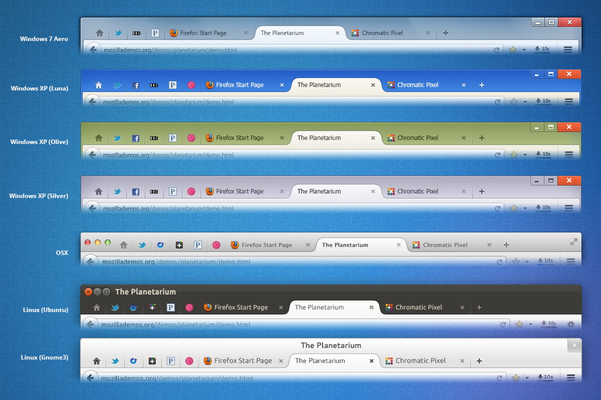
| Assignee | ||
Comment 120•11 years ago
|
||
I haven't heard of any new Windows bugs on UX so this should be stabilized now.
Attachment #719160 -
Attachment is obsolete: true
Attachment #719160 -
Flags: review?(dao)
Attachment #722700 -
Flags: review?(dao)
| Assignee | ||
Comment 121•11 years ago
|
||
* Use defines for tab dimensions
* Update new-tab-button clip-path to match other clip-paths
Attachment #719393 -
Attachment is obsolete: true
Attachment #719393 -
Flags: review?(dao)
Attachment #722702 -
Flags: review?(dao)
Comment 122•11 years ago
|
||
Wouldn't be possible to calculate which icons to use (dark/inverted) in Windows 8? Dark icons on darker color background are harder to spot and vice versa.
Comment 123•11 years ago
|
||
(In reply to Matthew N. [:MattN] from comment #121)
> Created attachment 722702 [details] [diff] [review]
> Part 4 v.1 Move common styles to themes/shared/. Use defines for tab
> dimensions and adjust clip path
>
> * Use defines for tab dimensions
> * Update new-tab-button clip-path to match other clip-paths

Should I close bug 826689 or is it useful ?
Comment 124•11 years ago
|
||
When hovered the inactive tab is 1px higher than the selected tab
| Assignee | ||
Comment 125•11 years ago
|
||
(In reply to Peter Henkel [:Terepin] from comment #122)
> Wouldn't be possible to calculate which icons to use (dark/inverted) in
> Windows 8? Dark icons on darker color background are harder to spot and vice
> versa.

Please file a separate bug since that's not really specific to this implementation.
Comment 126•11 years ago
|
||
Many of the gradients you've used in your patches use the -moz- prefix. Just thought I'd point that out in case you need to change it.
| Assignee | ||
Comment 127•11 years ago
|
||
(In reply to Valerio from comment #124)
> Created attachment 722704 [details]
> When hovered the inactive tab is 1px higher than the selected tab

Thanks for the report.  This is fixed in attachment 722702 [details] [diff] [review] which isn't yet on UX.
Comment 128•11 years ago
|
||
Don't know if it's related to the new patch but there is a new bug in UX builds with the close button doesn't making the tab close (except for the farthest tab on the right). At first glance it seems plugin-related, but I don't know how to reproduce it all the time.
Comment 129•11 years ago
|
||
Comment 130•11 years ago
|
||
What is the plan with supporting custom themes? Latest UX still doesn't look too good/usable with my current theme on XP. I appreciate it will be very difficult to get it to work well with every theme - will there be some kind of option to switch to one of the default XP styles for the standard XP themes instead? or maybe a general 'Firefox' theme?
Comment 131•11 years ago
|
||
(In reply to Alejandro Rodriguez from comment #129)
> Created attachment 723094 [details]
> little appearance bug

This is the first time I'm creating something on a bug, so sorry if I'm wrong in something. There is a small problem with actual UX tabs because they don't match nav-bar top border color at all. Would be nice if someone can fix it.

Thanks!

P.S.: My English is not perfect at all. If there is something not clear, I'll try to explain it better.
Updated•11 years ago
|
Attachment #723094 -
Attachment description: little appearance bug → Little appearance bug on UX tabs
Comment 132•11 years ago
|
||
If I open many tabs in overflow mode and then I close them, the left and right arrows of the overflow mode remains visible
Comment 133•11 years ago
|
||
(In reply to Guillaume C. [:ge3k0s] from comment #128)
> Don't know if it's related to the new patch but there is a new bug in UX
> builds with the close button doesn't making the tab close (except for the
> farthest tab on the right). At first glance it seems plugin-related, but I
> don't know how to reproduce it all the time.

Never mind I've tried several times to reproduce this issue and wasn't able to do it. If it happens again I'll post here.


(In reply to Valerio from comment #132)
> Created attachment 723095 [details]
> overflow's arrows remains visible
>
> If I open many tabs in overflow mode and then I close them, the left and
> right arrows of the overflow mode remains visible

I can't reproduce this. I had the same problem when UX branch was busted, but it doesn't happen to me with latest build. Do you have a clearer way to reproduce it ?
Comment 134•11 years ago
|
||
(In reply to Guillaume C. [:ge3k0s] from comment #133)
> (In reply to Guillaume C. [:ge3k0s] from comment #128)
> > Don't know if it's related to the new patch but there is a new bug in UX
> > builds with the close button doesn't making the tab close (except for the
> > farthest tab on the right). At first glance it seems plugin-related, but I
> > don't know how to reproduce it all the time.
>
> Never mind I've tried several times to reproduce this issue and wasn't able
> to do it. If it happens again I'll post here.
>
>
> (In reply to Valerio from comment #132)
> > Created attachment 723095 [details]
> > overflow's arrows remains visible
> >
> > If I open many tabs in overflow mode and then I close them, the left and
> > right arrows of the overflow mode remains visible
>
> I can't reproduce this. I had the same problem when UX branch was busted,
> but it doesn't happen to me with latest build. Do you have a clearer way to
> reproduce it ?

Step to reproduce:
- open UX;
- open up many tabs with the new tab button to activate overflow mode;
- right click on the first tab(the homepage tab in the screenshot that I previously posted here) and select close other tabs
Comment 135•11 years ago
|
||
Another method:
- Open UX
- Open a few tabs in a maximized window
- Minimize window
- Set the width of the window to activate overflow mode
- Maximize window
Comment 136•11 years ago
|
||
Yeah I can reproduce this like that.

Another little issue : when the nav bar is hidden the borders aren't right. The tab is one pixel too much in the bookmark bar right beneath it (same previous problem as with the in-content pages like Add-ons manager).
Comment 137•11 years ago
|
||
Comment on attachment 722700 [details] [diff] [review]
v6.3 Don't invert icons on glass fog

>+  #main-window #TabsToolbar:not(:-moz-lwtheme) {

>+  #main-window #TabsToolbar:not(:-moz-lwtheme)::before {

What's the point of #main-window in these selectors?
Comment 138•11 years ago
|
||
(In reply to Dão Gottwald [:dao] from comment #137)

> What's the point of #main-window in these selectors?

If this is the only review comment on this patch, we need to call this bug done and continue work in smaller followup bugs until we're ready to merge the whole enchilada to mozilla-central. And if it's not the only review comment, that needs to be finished ASAP so this project isn't blocked on multiweek review passes.

I'm finding it way too hard to follow the progress of this bug plus the bugs that it blocks plus issues people are reporting from UX testing plus further design work. And given that Matt and Mike have been checking each others' work, I consider this to essentially already be reviewed.

This patch doesn't have to be perfect, it just needs to be a solid enough foundation for further work on top of it.
Comment 139•11 years ago
|
||
The seemingly redundant but expensive "#main-window " selector prefix was already there in a previous version, I pointed it out, Matt removed it, now it's back. I'd like to know why. We can file a followup bug on this, but I don't think that makes us any more agile.
Comment 140•11 years ago
|
||
Comment on attachment 722700 [details] [diff] [review]
v6.3 Don't invert icons on glass fog

The handling of increased font sizes seems to have regressed here. Can you make sure to stretch the selected tab's images vertically? (This appears to be already working for background tabs.) Also, increasing font size seems to stretch the new tab button some but not enough, leaving a gap at the bottom.
| Assignee | ||
Comment 141•11 years ago
|
||
(In reply to Dão Gottwald [:dao] from comment #137)
> What's the point of #main-window in these selectors?

There is no point to them.  They were accidentally left in after temporarily checking an attribute on #main-window. They will be removed in the next version which I will post after you're done reviewing the patch.

(In reply to Dão Gottwald [:dao] from comment #140)
> The handling of increased font sizes seems to have regressed here.

I'd like to handle this in a follow-up since this is not a problem for "Extra Large Fonts"/150% text therefore getting to this broken state requires specifying a custom font-size in the advanced appearance settings which is less common than the default 3 options.
| Assignee | ||
Comment 142•11 years ago
|
||
Since this bug is wrapping up, please file new issues blocking the appropriate bug (e.g. australis-tabs(-win|-linux|-osx), bug 813802, etc.)

(In reply to Alejandro Rodriguez from comment #131)
> (In reply to Alejandro Rodriguez from comment #129)
> > Created attachment 723094 [details]
> > little appearance bug

Thanks. This is a known issue which Stephen Horlander, our visual designer is looking into.

> This is the first time I'm creating something on a bug, so sorry if I'm
> wrong in something. There is a small problem with actual UX tabs because
> they don't match nav-bar top border color at all. Would be nice if someone
> can fix it.

Thanks.  I don't see the problem in your image.  Can you please file a new bug? https://bugzilla.mozilla.org/enter_bug.cgi?blocked=australis-tabs-win&product=Firefox&component=Theme

(In reply to Valerio from comment #132)
> Created attachment 723095 [details]
> overflow's arrows remains visible
>
> If I open many tabs in overflow mode and then I close them, the left and
> right arrows of the overflow mode remains visible

I filed bug 850924 to track this.

(In reply to Guillaume C. [:ge3k0s] from comment #136)
> Another little issue : when the nav bar is hidden the borders aren't right.
> The tab is one pixel too much in the bookmark bar right beneath it (same
> previous problem as with the in-content pages like Add-ons manager).

Please file a new bug blocking this one (if it's for Windows).
https://bugzilla.mozilla.org/enter_bug.cgi?blocked=australis-tabs-win&product=Firefox&component=Theme
Whiteboard: [fixed-in-ux] → [issues should be filed in new bugs and marked as blocking the offender]
| Assignee | ||
Updated•11 years ago
|
Attachment #722704 -
Attachment is obsolete: true
| Assignee | ||
Updated•11 years ago
|
Attachment #723095 -
Attachment is obsolete: true
Comment 143•11 years ago
|
||
(In reply to Matthew N. [:MattN] from comment #142)
> Since this bug is wrapping up, please file new issues blocking the
> appropriate bug (e.g. australis-tabs(-win|-linux|-osx), bug 813802, etc.)
>
> (In reply to Alejandro Rodriguez from comment #131)
> > (In reply to Alejandro Rodriguez from comment #129)
> > > Created attachment 723094 [details]
> > > little appearance bug
>
> Thanks. This is a known issue which Stephen Horlander, our visual designer
> is looking into.
>
> > This is the first time I'm creating something on a bug, so sorry if I'm
> > wrong in something. There is a small problem with actual UX tabs because
> > they don't match nav-bar top border color at all. Would be nice if someone
> > can fix it.
>
> Thanks.  I don't see the problem in your image.  Can you please file a new
> bug?
> https://bugzilla.mozilla.org/enter_bug.cgi?blocked=australis-tabs-
> win&product=Firefox&component=Theme

Both are the same problems, I just elaborated a bit more on the second comment. Anyway, I can create a new bug if you want.

Thanks!
Comment 144•11 years ago
|
||
(In reply to Matthew N. [:MattN] from comment #142)
> (In reply to Guillaume C. [:ge3k0s] from comment #136)
> > Another little issue : when the nav bar is hidden the borders aren't right.
> > The tab is one pixel too much in the bookmark bar right beneath it (same
> > previous problem as with the in-content pages like Add-ons manager).
>
> Please file a new bug blocking this one (if it's for Windows).
> https://bugzilla.mozilla.org/enter_bug.cgi?blocked=australis-tabs-
> win&product=Firefox&component=Theme

Done. Filed bug 851023.
Comment 145•11 years ago
|
||
Comment on attachment 722700 [details] [diff] [review]
v6.3 Don't invert icons on glass fog

>+/* Background tab separators (1px wide).
>+   Also show separators beside the selected tab when dragging it. */
>+#tabbrowser-tabs[movingtab] > .tabbrowser-tab[beforeselected]:not([last-visible-tab])::after,
>+.tabbrowser-tab:not([selected]):not([afterselected-visible]):not([afterhovered]):not([first-visible-tab]):not(:hover)::before,
>+#tabbrowser-tabs:not([overflow]) > .tabbrowser-tab[last-visible-tab]:not([selected]):not([beforehovered]):not(:hover)::after {
>+  -moz-margin-start: -1px;
>+  background-image: linear-gradient(rgba(10,31,51,0), rgba(10,31,51,0.3));
>+  background-position: left bottom;
>   background-repeat: no-repeat;
>+  background-size: 1px 100%;
>+  content: '';
>+  display: inline-block;
>+  height: 29px;
>+  width: 1px;
>+}

Why are you using inline-block here (and elsewhere)? We shouldn't mix this with -moz-box layout. The behavior is unspecified and shaky.

>+/* pinned tabs need position: fixed for separator when overflowing */
>+#tabbrowser-tabs[overflow] > .tabbrowser-tab[pinned]::before {
>+  position: fixed;
>+}

This should be [positionpinnedtabs] instead of [overflow].

>+.tab-background-start[selected=true]::before,
>+.tab-background-end[selected=true]::before {
>+  /* all ::before pseudo elements */
>+  content: "";
>+  display: inline-block;
>+  left: 29px;
>+}

Isn't left:29px a no-op unless you've changed 'position'?

>+  #main-window[tabsintitlebar] #TabsToolbar > #alltabs-button[type="menu"] {

remove [type="menu"]
| Assignee | ||
Comment 146•11 years ago
|
||
Thanks.

(In reply to Dão Gottwald [:dao] from comment #145)
> Why are you using inline-block here (and elsewhere)? We shouldn't mix this
> with -moz-box layout. The behavior is unspecified and shaky.

See comment 93.  Do you know a better way to avoid the warnings on every background tab hover?  Boris did say the warning probably wasn't necessary for ::before and ::after but we didn't want the flood of output to affect perf. We can file a bug to get the warning disabled for these pseudo-elements and then swutch back to -moz-box.
Comment 147•11 years ago
|
||
(In reply to Matthew N. [:MattN] from comment #146)
> We can file a bug to get the warning disabled for these
> pseudo-elements and then swutch back to -moz-box.

OK.
Comment 148•11 years ago
|
||
Comment on attachment 722702 [details] [diff] [review]
Part 4 v.1 Move common styles to themes/shared/. Use defines for tab dimensions and adjust clip path

>+.tab-background-start[selected=true]::before,
>+.tab-background-end[selected=true]::before {
>+  /* all ::before pseudo elements */
>+  content: "";
>+  display: inline-block;
>+  left: @tabCurveWidth@;
>+}

Same question as in comment 145.
| Assignee | ||
Comment 149•11 years ago
|
||
I filed bug 852420 about the error console warning. I removed the 'left: 29px' since you were right that is was a no-op. Other requested changes were also made.

I fixed bug 852420 here since it was caused by leftover CSS in this patch.
Attachment #722700 -
Attachment is obsolete: true
Attachment #722700 -
Flags: review?(dao)
Attachment #726527 -
Flags: review?(dao)
| Assignee | ||
Comment 150•11 years ago
|
||
(In reply to Matthew N. [:MattN] from comment #149)
> I fixed bug 852420 here since it was caused by leftover CSS in this patch.
I meant bug 851761 here
| Assignee | ||
Comment 151•11 years ago
|
||
Attachment #722702 -
Attachment is obsolete: true
Attachment #722702 -
Flags: review?(dao)
Attachment #726543 -
Flags: review?(dao)
Comment 152•11 years ago
|
||
Comment on attachment 726527 [details] [diff] [review]
Part 1 v.7 Address comment 145, bug 851761 and switch to -moz-box

>+  #TabsToolbar:not(:-moz-lwtheme)::before {
>+    box-shadow: 0 0 30px 30px rgb(174,189,204);
>+    content: "";
>+    display: block;
>+    height: 0;
>+    margin: 0 60px; /* (30px + 30px) from box-shadow */
>+    opacity: 0.85;
>+    position: absolute;
>+    pointer-events: none;
>+    top: 50%;
>+    width: -moz-available;
>+    z-index: -1;
>+  }

We should use -moz-box here too.

> %ifndef WINDOWS_AERO
>+/* Use lighter colors of buttons and text in the titlebar on luna-blue */
> @media (-moz-windows-theme: luna-blue) {
>-  .tabbrowser-tab,
>-  .tabs-newtab-button {
>-    background-image: @toolbarShadowOnTab@,
>-                      linear-gradient(hsla(51,34%,89%,.9), hsla(51,15%,79%,.9) 1px, hsla(51,9%,68%,.9));
>+  #main-window[tabsintitlebar] .tabbrowser-tab:not([selected]):not(:-moz-lwtheme) {
>+    color: white;
>   }

This needs to be CaptionText, generally, rather than 'white' just for luna-blue.
Attachment #726527 -
Flags: review?(dao) → review+
Comment 153•11 years ago
|
||
Comment on attachment 726543 [details] [diff] [review]
Part 4 v.2.1 Propagate changes in attachment 726527 [details] [diff] [review]

>+/* Tab pointer-events */
>+.tabbrowser-tab,
>+.tab-background,
>+.tab-background-start[selected=true],
>+.tab-background-end[selected=true],
>+.tab-background-start[selected=true]::after,
>+.tab-background-end[selected=true]::after,
>+.tab-content {
>+  pointer-events: none;
>+}

Document why you're doing this?

pointer-events are inherited, so it seems that anything but .tabbrowser-tab is redundant here.
Attachment #726543 -
Flags: review?(dao) → review+
Comment 154•11 years ago
|
||
Comment on attachment 726543 [details] [diff] [review]
Part 4 v.2.1 Propagate changes in attachment 726527 [details] [diff] [review]

>+/* Background tab separators (1px wide).
>+   Also show separators beside the selected tab when dragging it. */
>+#tabbrowser-tabs[movingtab] > .tabbrowser-tab[beforeselected]:not([last-visible-tab])::after,
>+.tabbrowser-tab:not([selected]):not([afterselected-visible]):not([afterhovered]):not([first-visible-tab]):not(:hover)::before,
>+#tabbrowser-tabs:not([overflow]) > .tabbrowser-tab[last-visible-tab]:not([selected]):not([beforehovered]):not(:hover)::after {
>+  -moz-margin-start: -1px;
>+  background-image: linear-gradient(rgba(10,31,51,0), rgba(10,31,51,0.3));
>+  background-position: left bottom;
>+  background-repeat: no-repeat;
>+  background-size: 1px 100%;
>+  content: '';
>+  display: -moz-box;
>+  height: @tabHeight@;
>+  width: 1px;
>+}

You shouldn't really have to set a height here since you're using -moz-box.
Updated•11 years ago
|
blocking-b2g: --- → shira?
Updated•11 years ago
|
tracking-firefox20:
--- → ?
| Reporter | ||
Updated•11 years ago
|
blocking-b2g: shira? → ---
tracking-firefox20:
? → ---
| Assignee | ||
Comment 155•11 years ago
|
||
Thanks for the reviews. This patch addresses comment 152 through comment 154.

===  File issues related to Australis tab styling in new bugs blocking this  ===
===  one (for Windows issues) or bug 732583 (for all platforms). Thanks.     ===
Attachment #726543 -
Attachment is obsolete: true
Attachment #729409 -
Flags: review+
Flags: needinfo?(shorlander)
| Assignee | ||
Comment 156•11 years ago
|
||
Attachment #723094 -
Attachment is obsolete: true
Attachment #726527 -
Attachment is obsolete: true
Attachment #732707 -
Flags: review+
| Assignee | ||
Updated•11 years ago
|
Whiteboard: [issues should be filed in new bugs and marked as blocking the offender] → [issues should be filed in new bugs and marked as blocking the offender][fixed-in-ux]
Comment 157•11 years ago
|
||
Yes, we get it, you're upset about Australis. Although I'm no fan of it myself, I don't think spamming this bug entry with copy/paste comments will achieve anything. Please be mindful, thanks.
Comment 158•11 years ago
|
||
This is not the only bug this person has been spamming. Various accounts with e-mail addresses from domains 'drdrb.com' and 'sharklasers.com' have been spamming Australis-related bugs since yesterday. Since it's the weekend I don't know if anyone with appropriate powers is available, but I suggest these accounts (or even the domains if this keeps up?) be banned.
Comment 159•11 years ago
|
||
Both domains are disposable e-mail addresses. It'd probably be a good idea to block all disposable e-mail domains (lists are available on the 'net) from being able to register accounts at bugzilla, to prevent this kind of immature spamming in the future?
Comment 160•11 years ago
|
||
(spam comments removed)
Updated•11 years ago
|
Restrict Comments: true
Comment 161•11 years ago
|
||
https://hg.mozilla.org/mozilla-central/rev/4d301b6c8d27
https://hg.mozilla.org/mozilla-central/rev/cba03cce9531
Status: ASSIGNED → RESOLVED
Closed: 11 years ago
Resolution: --- → FIXED
Restrict Comments: false
Whiteboard: [issues should be filed in new bugs and marked as blocking the offender][fixed-in-ux] → [issues should be filed in new bugs and marked as blocking the offender]
Target Milestone: --- → Firefox 28
| Assignee | ||
Updated•11 years ago
|
Updated•10 years ago
|
Restrict Comments: true
You need to log in
before you can comment on or make changes to this bug.
Description
•