Flexbox doesn't play nicely with font-inflation (at polkawillneverdie.stecktvollerideen.de); flex items that should wrap w/ inflated font-size end up with overlapping text instead
Categories
(Core :: Layout, defect)
Tracking
()
People
(Reporter: mozilla, Unassigned)
References
()
Details
Attachments
(4 files)
 screenshot from Firefox 31 in Responsive Design Mode (no bug)
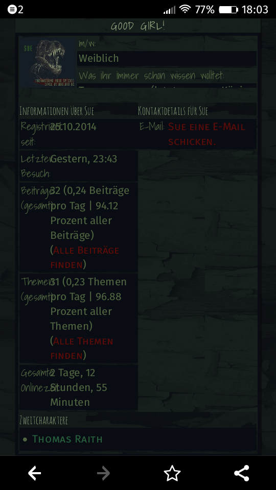
User Agent: Mozilla/5.0 (Windows NT 6.3; WOW64; rv:36.0) Gecko/20100101 Firefox/36.0
Build ID: 20150305021524

Steps to reproduce:

I browsed with Firefox OS 2.0 (Fire E) to the following URL:
http://polkawillneverdie.stecktvollerideen.de/member.php?action=profile&uid=1

Flexboxes are used as follows:

[css]

.flexcontainer {
	display:-ms-flexbox;
	display:-webkit-box;
	display:-webkit-flex;
	display:flex;

	-ms-flex-wrap:wrap;
	-webkit-box-orient:vertical;
	-webkit-flex-flow:row wrap;
	flex-flow:row wrap;

	-ms-flex-pack:justify;
	-webkit-box-pack:justify;
	-webkit-justify-content:space-between;
	justify-content:space-between
}

.flex1 {
	-webkit-box-flex:1;
	-ms-flex:1;
	-webkit-flex:1;
	flex:1;
}

.section {
	min-width: 200px;
}

[html]

<div class="flexcontainer">
<div class="section flex1">...A...</div>
<div class="section flex1">...B...</div>
</div>


Actual results:

Flexbox B stays right from A and does not wrap, so flexbox B is not visible.


Expected results:

Flexbox B wraps and appears in the next row (under A) because the screensize is too small.
|
||
Comment 1•9 years ago
|
||
Can you clarify what "B" and "A" actually represent in the page you linked to? (and ideally, attach a screenshot showing the brokenness)
|
|
||
Updated•9 years ago
|
|
|
||
Comment 2•9 years ago
|
||
Note that "flex-wrap" support was added in Firefox 28 (bug 702508 / bug 939901), and Firefox OS 2.0 is based on "Firefox 31/32" according to [1], so I'd expect Firefox OS 2.0 to support 'flex-wrap'.

[1] https://developer.mozilla.org/en-US/Firefox_OS/Releases/2.0
|
|
||
Comment 3•9 years ago
|
||
Here's what I see in the Firefox 2.0 Simulator (on my desktop machine).

I'm guessing "A" is the dinosaur picture, and "B" is the blurbs of text about her. As shown in the screenshot, the text-section *is* wrapped to be below the picture, which is what's supposed to happen.  (If I rotate the phone to landscape mode, the text-section no longer needs to wrap -- it ends up next to the picture.)

So I'm not seeing the bug.
|
|
||
Comment 4•9 years ago
|
||
[needinfo for screenshots / more complete description of what goes wrong]
|
|
||
Comment 5•9 years ago
|
||
|
|
||
Updated•9 years ago
|
Sorry, yes I can give you a screenshot what A and B is:
http://www.amaryllion.de/misc/bug_1142461.jpg

I don't know if it is possible to make a screenshot with my mobile phone. I would add one if I knew how.
In my simulator everything ist peachy. On my phone everything looks different.

And yes I expected that, too. :)
|
|
||
Comment 7•9 years ago
|
||
Does the "m/w: Weiblich" text section end up below the dinosaur photo, on your phone? (instead of to the right of it)
|
|
||
Comment 8•9 years ago
|
||
(on my Firefox OS Flame, screenshot = volume-down + power. Not sure about Fire E. https://support.mozilla.org/en-US/kb/take-screenshots-firefox-os suggests that it might also be home-button + power.)
|
|
||
Comment 9•9 years ago
|
||
Here's a screenshot of what I see in Firefox OS 3.0 on my Flame. I do see some text overlapping here, with flex items being sized smaller than they should be -- is that the issue you're seeing?

(The issue in this screenshot is likely due to font inflation, which is a feature that increases font-sizes to improve readability. It's possible that our flexbox sizing-measurements (and in particular the "do we need to wrap" measurement) is happening *without* font inflation, and then the final layout happens *with* font inflation.)

(If you're seeing something different, then I'll file a separate bug on this.)
|
|
||
Updated•9 years ago
|
|
Reporter | |
Comment 10•9 years ago
|
||
I finally managed to take a screenshot:

http://www.amaryllion.de/misc/bug_1142461_2015-03-12-18-04-38.png

I must apologize. My description was very unclear, I had it wrong in my mind. New: It seems that all the flexboxes are scaled rather than wraped to the next row. So B is indeed visible. Ugly, but visible. But the bug stays the same: It does not wrap. It should not scale everything.
|
|
||
Comment 11•9 years ago
|
||
Cool, that matches what I'm seeing (per my screenshot in comment 9). I think this is a bug with font-inflation, as noted there.

(For future reference -- it's best if you could post screenshots/etc. as bug attachments, because that way they're guaranteed to stick around. So e.g. if some time goes by before someone gets a chance to look at this, the screenshots will definitely still be available.)
|
|
Reporter | |
Comment 12•9 years ago
|
||
I hope I did right now with the attachment, this part is a bit difficult to find in here. :)
|
|
||
Comment 13•9 years ago
|
||
Perfect, thanks! :)
[Updating status to 'new' to indicate that this is a confirmed bug; meant to do that in previous comment]
[also marking as blocking the main font-inflation bug, since that's seems to be what we've done for other font-inflation-related bugs]
|
|
||
Comment 14•9 years ago
|
||
Just got another report of this on IRC today, BTW.

However: given bug 1127441 (which turned off font inflation in Firefox 39, currently on beta channel), this may become a non-issue.
If that weren't the case, it might be reasonable to turn off font inflation inside of flexbox, on the assumption that flexbox is a relatively new feature and people using it are likely aware of the idea of testing their sites on phones. (Also given that it's not clear to me how to fix all the problems -- although I would expect things to wrap. So there might be some more straightforward bug.)
|
|
||
Comment 16•9 years ago
|
||
(In reply to David Baron [:dbaron] ⏰UTC-7 from comment #15)
> If that weren't the case, it might be reasonable to turn off font inflation
> inside of flexbox,

(nemo reported that this seems to be what Chrome does on Android. At least, on a single page with a flex container and a block container, he was seeing Chrome do their equivalent of font inflation in the block container, but not in the flex container.)
|
||
Comment 17•5 years ago
|
||
(In reply to Daniel Holbert [:dholbert] (reduced availability until June 12) from comment #16)
(In reply to David Baron [:dbaron] ⏰UTC-7 from comment #15)
If that weren't the case, it might be reasonable to turn off font inflation
inside of flexbox,(nemo reported that this seems to be what Chrome does on Android. At least,
on a single page with a flex container and a block container, he was seeing
Chrome do their equivalent of font inflation in the block container, but not
in the flex container.)
I think the difference is mostly down to what is being proposed for bug 1552781.
If a flex container has enough text all by itself (split across any number of children), Chrome/Blink will still inflate it, too, and funnily enough their implementation seems to suffer something that very much looks like this bug, too.
|
||
Comment 18•2 years ago
|
||
Page no longer active
Description
•