The new tab re-design is inconsistent with well-accepted UI principles of tabbed interfaces and user expectations
Categories
(Firefox :: Tabbed Browser, enhancement)
Tracking
()
People
(Reporter: diffeomorphicvoodoo, Unassigned)
References
(Blocks 2 open bugs)
Details
(Whiteboard: [proton-tabs-bar])
Attachments
(6 files)
User Agent: Mozilla/5.0 (Windows NT 10.0; Win64; x64) AppleWebKit/537.36 (KHTML, like Gecko) Chrome/91.0.4472.114 Safari/537.36
Steps to reproduce:
Open Firefox. Open a few tabs. Look at the tab bar.
Actual results:
The new re-design violates well-established principles of UI for tabbed interfaces and in doing so surprises users that have gotten to them and makes it harder for them to visually navigate the tab bar.
Expected results:
Attached are the screenshots of tabbed interfaces from a number of different softwares that users are familiar with. A quick look at the screenshots will show that all of them follow certain design principles:
- The active tab appears slightly raised compared to the rest of the tabs and tabbar.
- The active tab is connected to an adjacent large UI element running across the width of the program, to further form a further visual cue to quickly identify the active tab.
- There are small indicators that help form the boundary between two adjacent tabs.
As a specific example, all these three features are present in a screenshot from Firefox 1.5.
https://wiki.mozilla.org/images/e/e1/Bon_Echo_Beta_2_Screen_Shot_1.PNG
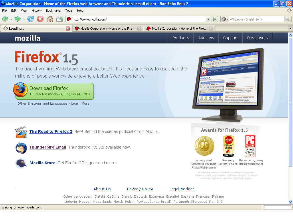
The current redesign of firefox's tabs runs counter to these principles in the following ways (see attached screenshot):
- If anything the active tab appears slightly suppressed compared to the rest of the tabs.
- The active tab not only is disconnected, but has a contrasting color compared the neighboring UI elements and the inactive tabs in fact have a more similar color.
- There are no visual indicators between adjacent inactive tabs.
The combination of 1 & 2 is particularly harmful to the user because it causes their eyes to land on a tab adjacent to the active tab when they are actually seeking the active tab.
| Reporter | ||
Comment 1•3 years ago
|
||
Tabs on Chrome
| Reporter | ||
Comment 2•3 years ago
|
||
| Reporter | ||
Comment 3•3 years ago
|
||
| Reporter | ||
Comment 4•3 years ago
|
||
| Reporter | ||
Comment 5•3 years ago
|
||
Comment 6•3 years ago
|
||
The Bugbug bot thinks this bug should belong to the 'Firefox::Tabbed Browser' component, and is moving the bug to that component. Please revert this change in case you think the bot is wrong.
Updated•3 years ago
|
Comment 7•3 years ago
|
||
Thanks for submitting this issue as feedback for the new design. Will mark this as a New Enhancement and add a whiteboard to be reviewed by the developer team.
Best,
Clara
Comment 8•3 years ago
|
||
bug 1704347 covers changing contrast / making the selected tab more obvious in some way, which seems to be the main complaint here.
| Reporter | ||
Comment 9•3 years ago
|
||
The issue here is not the lack of contrast (which was not even mentioned in the bug-report so I am not sure how you thought that that was the "main complaint" here), but that the re-designed tab interface violates well-established principles of UI for tabbed interfaces, going back all the way to Firefox 1.5.
| Reporter | ||
Updated•3 years ago
|
Comment 10•3 years ago
|
||
(In reply to diffeomorphicvoodoo from comment #9)
The issue here is not the lack of contrast (which was not even mentioned in the bug-report so I am not sure how you thought that that was the "main complaint" here)
You mentioned not finding the active tab obvious here:
(In reply to diffeomorphicvoodoo from comment #0)
The current redesign of firefox's tabs runs counter to these principles in the following ways (see attached screenshot):
- If anything the active tab appears slightly suppressed compared to the rest of the tabs.
- The active tab not only is disconnected, but has a contrasting color compared the neighboring UI elements and the inactive tabs in fact have a more similar color.
[snip]
The combination of 1 & 2 is particularly harmful to the user because it causes their eyes to land on a tab adjacent to the active tab when they are actually seeking the active tab.
Colours in the tabstrip and finding the active tab more easily is what bug 1704347 is about.
I believe that we don't currently have plans to re-connect the selected tab and the toolbar in a visual way as you suggest, so that part you can think of as "wontfix" if you prefer - but if it were to happen, bug 1704347 is the most likely place where it would. Our UX design folks are considering some of the feedback there, AIUI.
- There are no visual indicators between adjacent inactive tabs.
bug 1714766 covers some of this.
I can only resolve a bug in one way, not 2x dupes and 1x wontfix, so I picked just one.
Updated•3 years ago
|
| Reporter | ||
Comment 11•3 years ago
|
||
The issue raised in this bug-request was orthogonal to the one in bug 1704347. You can have poor color contrast with a traditional tab UI, and you can have a theme with more color contrast with the new tab UI. The issue of just not having enough contrast can be fixed by changing the theme (which is what a lot of the comments on that bug suggest); the issue of the new tab redesign making tabs simply not look like tabs can not be fixed without fiddling with userChrome.css.
The tab re-design was rude and the way you have chosen to respond to the bug-request was rude. Instead of attacking the core point of the bug-request, which was very clearly articulated - with pictures even, you just fished for artificial similarities to mark it as a duplicate just because both bugs concern colors in the tabstrib and finding the active tab. Can there not be two different bugs that concern the colors in the tabstrip and finding the active tab?
bug 1714766 covers some of this.
I agree, the third point was a duplicate issue, but the other two points and the central issue, which all the three points were only offered as evidence towards, weren't.
Wontfix would be the more accurate way to resolve the bug-request, as that is the answer to the central issue.
Description
•