Closed
Bug 387402
Opened 17 years ago
Closed 16 years ago
Short or zero-length events are hard or not selectable in Day/Week view
Categories
(Calendar :: Calendar Frontend, defect)
Calendar
Calendar Frontend
Tracking
(Not tracked)
VERIFIED
FIXED
0.9
People
(Reporter: chris.j.bugzilla, Assigned: berend.cornelius09)
References
Details
Attachments
(5 files, 1 obsolete file)
|
4.36 KB,
image/png
|
Details | |
|
2.18 KB,
image/png
|
Details | |
|
4.83 KB,
image/png
|
Details | |
|
1.20 KB,
application/zip
|
Details | |
|
7.97 KB,
patch
|
Fallen
:
review+
dbo
:
ui-review+
|
Details | Diff | Splinter Review |
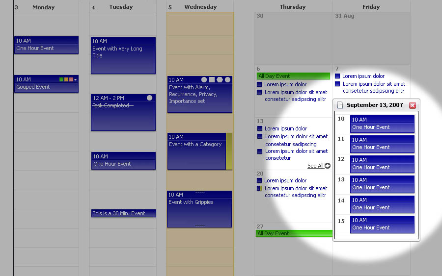
- Create an event with a height of 2-5 pixel
- Try to select this event for deletion.

Expected behavior (see attachment):
- An Event should always be selectable.
- An event should always display its Title

Suggestions:
- Set the minimum event height to "Title" font height + 4px space for grippy overlay
- Reduce Event border from 2px to 1px
Flags: blocking-calendar0.7+
Comment 2•17 years ago
|
||
Duplicate of Bug 324662?
Comment 4•17 years ago
|
||
It would be nice to get this in 0.7, but since no owner has shown up, I'm moving this back to blocker candidate status.
Flags: blocking-calendar0.7+ → blocking-calendar0.7?
Comment 6•17 years ago
|
||
Taking over dependencies from Bug 324662 that was resolved as a duplicate of this new bug and adjusting summary accordingly.
Blocks: 136719
OS: Windows XP → All
Hardware: PC → All
Summary: Events are hard or not selectable → Short or zero-length events are hard or not selectable in Day/Week view
Comment 8•17 years ago
|
||
Thanks to the help of Mickey, who pointed me to the right code section and to Joey (jminta), who gave me a push into the right direction on IRC, this is now working in my tree.

I've found a minimum heigth of 25px to be a good value in the vertical view orientation. I've chosen the same value for the horizontal orientation, although it doesn't look quite as good. But that's hard to fix unless we change the text orientation in the horizontal view as well.

I'll attach screenshots for UI-review in a short while.
Assignee: nobody → bugzilla
Status: NEW → ASSIGNED
Attachment #283354 -
Flags: ui-review?
Attachment #283354 -
Flags: review?(michael.buettner)
Updated•17 years ago
|
Attachment #283354 -
Flags: ui-review? → ui-review?(christian.jansen)
Comment 9•17 years ago
|
||
Comment 10•17 years ago
|
||
Comment 11•17 years ago
|
||
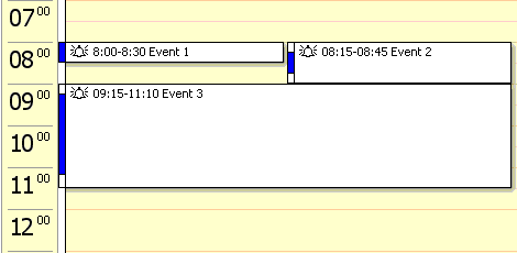
Comment on attachment 283357 [details]
1 minute event with vertical view orientation

This screenshot seems to imply that event shorter then about 20 minutes will get a 'wrong' size. A think that's a bit too high of a limit. 15 minute events are not that uncommon, I think.
Comment 12•17 years ago
|
||
mvl, I based my patch on attachment 271509 [details], submitted by Christian here in this bug. In that proposal the event title is situated between the upper and lower grippies.
Comment 13•17 years ago
|
||
that still doesn't change what I said. The problem of the 15 minute events still stands. I'm not sure what you are trying to say with your comment.
Comment 14•17 years ago
|
||
My point was just that I built my patch after the proposal from Christian, our resident UI guru.

Personally I have no problem with reducing the size somewhat to something like 20 or 15 pixels. But I would like to hear Christian's and Mickey's opinion on this first.
Comment 15•17 years ago
|
||
I'd suggest using a value expressed in "ex" and "em" units.
Comment 16•17 years ago
|
||
I understand mvl's point a bit differently. mvl, are you saying that in general < 20 minute events will have an incorrect size? If so, I don't think this is the case. If the event is smaller than 25 px, then size size is changed.

I take back my last comment, I didn't look at the patch at that point in time.
Comment 17•17 years ago
|
||
My point is that with the patch, events of about 15 minutes will get a size that doesn't math their real length in time. A result of this is that when you have two events, the first one taking 15 minutes, and they are right after each other, they will look like they conflict in time, while they really don't. I don't think that's a good thing. For very short events, i can live with it. but 15 minutes isn't all that short.
Comment 18•17 years ago
|
||
Doesn't that depend on the number of hours in the view? If you have many hours in the view, even 15 minute events will be "too short" to display a whole line. I understand your reasoning, but I don't think it should depend on the number of minutes, but rather on the number of pixels, as in the patch.
| Reporter | ||
Comment 19•17 years ago
|
||
(In reply to comment #12)
> mvl, I based my patch on attachment 271509 [details], submitted by Christian here in this
> bug. In that proposal the event title is situated between the upper and lower
> grippies.
>

IMO events should primarily be easy to read and easy to select. Displaying always the real length would be great, but is not feasible.

Thus I suggest to set the minimum hight to value which matches 30 min. I'm not sure, if the min height should be defined in pixels. I think itit would be better to have something like "Font height + 3px space at the top + 3px space at the bottom"

For saving vertical space I suggest to:
- reduce the border of events to 1px
- to fine tune the grippies (see attachment)
- to reduce the min. height of the grippi from 4x to 2px

and last but not least
- to get remove the 15 & 45 minute snap.
| Reporter | ||
Comment 20•17 years ago
|
||
Comment 21•17 years ago
|
||
(In reply to comment #19)
> Thus I suggest to set the minimum hight to value which matches 30 min.

I think 30 minutes is a bit long. We shouldn't make it harder to use 15 minute events. Those are not that uncommon.

I would suggest to use a minimum height of the minimum of n pixels and m minutes, where n is likely defined as function of the fontsize and size of the gripies, and m is in somewhere around 10 - 15.

The idea of the m minutes rule is that it sizes with the window. If you have a very small window, event shouldn't end up taking at least 3 hours.
But for big windows, there is no reason to draw 5 minute events as if they are taking 10 minutes. They can be drawn fine in their original size. The n pixel rule takes care of that.
| Reporter | ||
Comment 22•17 years ago
|
||
Your proposal sounds good. We can give it a try and should optimize the look and feel step by step....
Comment 23•17 years ago
|
||
The suggestions I see are probably good compromises. If people create tasks, they make them 10 or 15 minutes long.

I create web applications that vend ics data out of database applications and so the calendars I create are a bit weird. For example, what would it look like to have 60 one minute meetings in an hour? This probably seems weird, but why? Should it be impossible? What should the UI do if presented with this? If I did this, would it create 60 boxes of the 10 - 15 minute height? Would that one hour then take up 15 hours of the space allocated for the day?

I know this seems weird, but then again, not everyone's calendar is logical.
| Reporter | ||
Comment 24•17 years ago
|
||
Ray your case is not weired, but probably not the most used case ;-) Anyhow, I can imagine that [1] could be a solution that fits to your needs. Please keep in mind that this is still in flux.

[1] http://wiki.mozilla.org/images/7/77/Improved-events-2.jpg
Comment 25•17 years ago
|
||
I created a number of 5 minute events in Sunbird because I'm used to having "reminder" entries in my Lotus Notes calendar at work.  Reminders contain only a start time, with no duration - they are merely alarms.  They are highly useful for helping me keep necessary, intermediate tasks organized through the week, especially during busy days.

I often schedule 15-30 minute events during the week, as well.

So, it seemed odd to create 5-minute "reminder" tasks in Sunbird and only see thin lines in even my daily calendar view.  This bugzilla entry and discussion are partly getting at my needs.

Without asking for a non-proportional view option as a feature request, it seems entirely reasonable to at least make entries no smaller in height/width so that you can at least read an entry's From:To and part of Title information, given the current resolution, font characteristics, etc.  That may translate into an entry size visually equivalent to 30 minutes on one system, 15 on another, etc. . . but it would seem rather obvious to most users that you are seeing an entry in the minimal, useful format, I would suspect.
Comment 26•17 years ago
|
||
Ok, I tested this with various values and various hour box sizes (depending on the "Show XX hours at a time"-feature.

The minimum event box size where at least the first line can still be read is 20px. Even then the grippies already overlap the event name, but that can probably be at least partially remediated with the new grippies that Christian supplied.

These 20 pixels will correspond to a 15-minutes-event in a view showing 6-10 hours, 11-15 hours will correspond to a 30-minutes-event, 16-20 hours to a 45-minutes-event and in day/week views showing more hours such a zero-length event will look like an our-hour-event.

IMO 20px is therefore a reasonable setting. mvl, what is your opinion?
Comment 27•17 years ago
|
||
In general, the day/week view are some form of a table, where time is getting mapped to dates. The 'blocked' time corresponds to the time scale at the left side of the view. In other words, while looking at an event it's currently possible to immediately see the start/end times by looking at the time scale. If we're changing the size of the event boxes independent of the time they actually represent, we're loosing this feature, i.e. it's no longer possible to simply look at the time scale and rest assured that the events that fall into some range really block the corresponding amount of time.

I'm not saying that the current state of affairs is a good or even an acceptable solution. But installing an arbitrary minimum height strikes me as being the wrong solution to the problem, as we're loosing the 1-to-1 mapping of space to time which we currently have. Probably we should investigate other solutions instead of simply discussing which minimum height should be taken.

One solution could be to hide event boxes which wouldn't end up with some reasonable height, while displaying some form of indicator at the time scale bar. Clicking at the time scale bar could then increase the 'zoom factor' which would reveal those previously hidden events.

Another solution could be to display some form of placeholder instead of the usual event boxes, in order to indicate that there's an event that can't be displayed at its intrinsic size. This idea could also be extended to display placeholders that incorporate a certain number of consolidated events that all fall to certain time interval, all being too small to be displayed.

The above should only serve to push the discussion to some wider range instead of sticking to the original idea. It's not a full fledged concept ready to be implemented.

As a side note, usually I have my calendar view configured to always display 24 hours, which just takes up ~2/3 of my vertical display space. So it's not that uncommon that the event boxes are getting extremely small even if the corresponding time is reasonable long.
Comment 28•17 years ago
|
||
Comment on attachment 283354 [details] [diff] [review]
Patch to set mininum height and width to 25 pixels

>-                          chunkBox.setAttribute("style", "min-width: 1px; min-height: 1px;");
>+                          chunkBox.setAttribute("style", "min-width: 25px; min-height: 25px;");
The literal value '25' is repeated throughout this piece of code. If we later decide to change that value, we would need to change all occurrences of that value. It would be better to introduce a constant and refer to it using its symbolic name, e.g.
>   const kMinimumHeight = 25;

>+                              if (durMinutes * this.mPixPerMin < 25) {
>+                                  chunkBox.setAttribute("height", 25);
>+                              } else {
>+                                  chunkBox.setAttribute("height", durMinutes * this.mPixPerMin);
>+                              }
This particular piece of code is repeated twice, just with a different attribute. I suggest to not introduce redundant code and be a bit less verbose:
>  var extendFunctor = function(aAttribute) {
>      chunkBox.setAttribute(aAttribute,
>                            durMinutes * this.mPixPerMin < kMinimumHeight ?
>                                kMinimumHeight :
>                                durMinutes * this.mPixPerMin);
>  }
With this function in place (it should be introduced locally as it refers to local variables), you just need to write statements as such:
>  extendFunctor("width");

r- for now, based on the fact that the patch introduces redundancy and on the ongoing discussion on what the best approach is. The final patch should also take care of mvl's comment regarding the use a minimum height of the minimum of n pixels and m minutes.
Attachment #283354 -
Flags: review?(michael.buettner) → review-
Comment 29•17 years ago
|
||
(In reply to comment #26)
> These 20 pixels will correspond to a 15-minutes-event in a view showing 6-10
> hours, 11-15 hours will correspond to a 30-minutes-event, 16-20 hours to a
> 45-minutes-event and in day/week views showing more hours such a zero-length
> event will look like an our-hour-event.

The amount of pixels-per-hour depends on the window size (which tends to correlate to the screen size). Which size did you use?

I thin the suggestions in comment 27 by mickey are very reasonable. We should look for other solutions before going this 'easy' way out. I was thinking about not showing an event-box, but only an icon. But i'm not sure how that would interact with the current box-based layout.
Comment 30•17 years ago
|
||
> I was thinking about not showing an event-box, but only an icon.
> But i'm not sure how that would
> interact with the current box-based layout.

I'm no UI expert, but maybe the following ideas are worth considering:

* Events could have a fixed height in pixels and the calendar lines indicating days or hours could move around to accommodate events. So for example, if I have a lot of events scheduled between 9am and 5pm today, the distance in pixels between the horizontal line indicating 9am and the horizontal line indicating 5pm will be large compared to the distance in pixels between the lines indicating 12 midnight and 9am (or also between 5pm and the following midnight).

* Some sort of zoom in/zoom out tool could be used for viewing the day/week with a greater or lesser degree of temporal resolution.

* Just like the Mac OS X dock, events underneath the mouse cursor could swell up so they're easier to select. Events near the cursor could swell up to a lesser degree. Events far from the cursor could be squished down to make room.
Comment 31•17 years ago
|
||
(In reply to comment #27)
. . .
> I'm not saying that the current state of affairs is a good or even an
> acceptable solution. But installing an arbitrary minimum height strikes me as
> being the wrong solution to the problem, as we're loosing the 1-to-1 mapping > of space to time which we currently have. . .

It wasn't a fully thought-through issue to begin with, so there's nothing really being lost.  What *was* undeniably lost in the overall UI design became usability and readability for shorter events.

And, let's say some bright person decides to ask for events such as reminders - which are usually utilized in an alarm clock fashion.  You need to take some medication or somesuch - something so small in time, you only need a convenient popup and sound to keep you on track.  How to handle such events in a view which only offered time based upon a scale of duration?

You either need a true compromise or a different UI concept, I figure.  Event markers which can allow easy zoom or detailed popups require two different modes of understanding the high-level contents of different types of events on the same calendar view: one style is necessary (i.e., for shorter events) while such indicators become useless or don't apply to longer events.  There's little consistency there, as well.  In such a case, you might as well consider placing a readable event entry into the calendar for the shorter events (as already discussed in this thread), and simply give them a visual indicator to note they actually are shorter than other, naturally visible events.  Much more useful and - like longer events - they can be read without the need for zooming, popups or other UI options.

Perhaps an alternative view to the current one could be considered, for those (like me) who would rather see events and their scheduled times in a compact and convenient glance, with the event sizes at least one line of text in height, possibly being more (if the Subject causes wrapping, let's say).  In such a case, visual size of the event is not proportional to their length, as they simply line up with their starting times, not ending times.  That's the same interface style I use every day in business, and hoped to use something similarly quick and easy to view at home.
Comment 32•17 years ago
|
||
Do we really want to start discussing peoples' medication in a bug? That seems like a slippery slope....

Bug discussions can avoid ad hominem issues, yes?
Comment 33•17 years ago
|
||
If I've offended any individual sensibilities viewing this bug, my apologies.

I know many folks who program short "reminders" or rather small events into their work and personal calenders for various types of things other than 30+ minute events, is the point.

A small example - within 3+ paragraphs of text - meant to illustrate what a short (or zero) duration event might be used for, and why it should be equally readable, was not meant to draw anyone's personal history or issues into the discussion.  Nor to take away from the technical needs, here.

Again, I feel that items in a given calendar view should be consistently available for high-level glances, rather than (for example) relying on one method for reading items greater than X minutes and another method for reading those less than or equal to X minutes.  I think we'd like to avoid *potentially* placing different levels of implicit priority on longer vs. shorter events simply by requiring different levels of effort to read their Subject data.
Updated•17 years ago
|
Target Milestone: 0.7 → ---
Comment 35•17 years ago
|
||
Ok I am not a UI expert but I would think all of this trouble
could be fixed if the hour view could be changed to have
a fixed size instead of relative size.

Let's take a look at where this problem has been solved
before, for example in Microsoft Outlook calendar.

In outlook the hour view is splitted into 30 minute
intervals where every 30 min are fixed at 20 pixels.
If an event is less than 30 minutes it still takes
up a 30 minute slot but it uses a small line to show
what actual time it uses, this design has a number
of benefits:

1) You can always read the title
2) You can see graphically how long the event takes
3) You can enlarge the window to see more events
4) If you shrink the window you can still read titles
Comment 36•17 years ago
|
||
Can you include a screen shot? I have no idea what Microsoft does here and I rarely look at them for design suggestions. Thanks.
Comment 37•17 years ago
|
||
Ok here is an example of how three events look in Outlook. Now I am not saying we
should look at Outlook as a great example in design (I personally hate Outlook but that's another story :) but as an example of how using fixed size solves this problem.

http://i219.photobucket.com/albums/cc23/kristjanbjarni/Outlook_example-1.gif
Comment 38•17 years ago
|
||
Indeed, I find the previous mentioned solution a brilliant idea. Basically, this boils down to an indicator added to the event boxes that shows the time that each event really occupies. The event boxes itself just need some minimum height in order to not clip any important contents contained in it, just as the proposed patch already does. We could even say that we only add the 'time indicator' in case it's needed, i.e. if the event box height doesn't have a direct relationship to the time table at the left because the minimum height rule kicked in.

Again, I very much like that idea. Going that way, we still get away with a minimum amount of additional work, don't screw up the existing architecture of the views, still are miles away of an outlook clone but having solved the problem in an intuitive and elegant way.
Comment 39•17 years ago
|
||
One thing that we should not copy is the 'rounding' to the nearest 30 minutes. That's not needed for longer events, and conflicts with some schedules. For example, the school I once went to had a schedule with 50 minute classes. This means that for the teachers etc, a lot of events would start on 'weird' times, like 11:40. The event would takes 50 minutes which is long enough to draw them properly.
Comment 40•17 years ago
|
||
(In reply to comment #39)
> One thing that we should not copy is the 'rounding' to the nearest 30 minutes.
Correct, maybe I didn't make myself clear enough... :-) I proposed to just go ahead with all we currently have but introduce the minimum height feature (including your idea - use a minimum height of the minimum of n pixels and m
minutes). In case the event is actually shorter than what the event box indicates we add this 'time indicator' at one of the sides of the box which visually shows what time this event actually occupies.
Updated•17 years ago
|
Flags: blocking-calendar0.7? → wanted-calendar0.8+
| Reporter | ||
Comment 41•17 years ago
|
||
Comment on attachment 283354 [details] [diff] [review]
Patch to set mininum height and width to 25 pixels

Simon, due to the feedback, I'll sign this ui- for now. I think we have to work on a more flexible solution. I've you want me to work on that I can create a (new) proposal.
Attachment #283354 -
Flags: ui-review?(christian.jansen) → ui-review-
Comment 42•17 years ago
|
||
I played with this once and ended up writing this in userChrome (or stylish):
/*calendar minimal event size*/
calendar-event-box .calendar-event-box-container {
  min-height: 15px !important;
  min-width: 15px !important;
}
being just a simple workaround for accidental creation of 0min event
But I would say following:
1.I found 15px to be enough for title and grips etc
2.The real problem becomes overlapping short events,
(say 11.00-11.05 and11.05-11.10 witch don't get side by side cause they are not really  in their duration, so they get on overlapping in a confused way). Point is that if u set min height for an event what should be also correct sidebyside or overlapping representation? cause sidebyside does visually indicate now a real time/duration and is correct. The outlook example is a more schematic way of showing and not so accurate representation of the occurrences.

3.I began to think of a rather dual representation of events, meaning both correct time and bigger one (for labels) and this IMO means splitting the label, info (and grips?) from the actual normal box representation as the one today.

I tought it like this:
1.maybe grips can show outside the box (like small small tabs) to get rid of them in discussing the box dimension
2.maybe there can be a hover thing that actually expands to the min height
3.or maybe the name/info can be visually separated from the actual height of the box (I can think of different color/white transparent or others or a bullet/balloon like thing)

these would be thoughts for keeping the same as today but with just adding separated representation elements over it, for the ease of implementation

anyway, just some opinions...
Comment 43•17 years ago
|
||
Simon, are you still working on a patch for this bug?
Comment 44•17 years ago
|
||
No, I'm no longer working on this.

The proposed solutions are clever and good, but unfortunately way above my meager coding skills. Someone else may have to implement this.
Assignee: bugzilla → nobody
Status: ASSIGNED → NEW
Comment 45•16 years ago
|
||
Not going to happen for 0.8.
Flags: wanted-calendar0.8+ → wanted-calendar0.8-
| Reporter | ||
Comment 46•16 years ago
|
||
From an user experience standpoint this is an important bug. It would be great to have this in .9
Flags: wanted-calendar0.9?
Updated•16 years ago
|
Flags: wanted-calendar0.9?
Flags: wanted-calendar0.9+
Flags: wanted-calendar0.8-
| Assignee | ||
Updated•16 years ago
|
Assignee: nobody → Berend.Cornelius
| Assignee | ||
Comment 47•16 years ago
|
||
I based my new patch on Simon's from comment #10  and Mickey' review (see comment #28). In my patch the minimum height of the event is retrieved from the current font-size in the box, the height of the shadow-box and the additionally set margins, borders and paddings. The result is very close to Simon's literal 25px in height but my solution also works if the theme brings in a larger font-size.
For horizontal orientation of the views I made myself the work easier and based the minimal width simply on "2em". This considers the font-size but not directly all the margins borders and paddings - however the result looks fine. I don't think we can find an overall optimal solution for this case...
Attachment #283354 -
Attachment is obsolete: true
Attachment #323383 -
Flags: ui-review?(daniel.boelzle)
Attachment #323383 -
Flags: review?(philipp)
Comment 48•16 years ago
|
||
Comment on attachment 323383 [details] [diff] [review]
patch v. #2

>+                          if (minWidth == 0) {
>+                              chunkBox.eventNameLabel.setAttribute("style", "min-width: 2em");
Isn't a static value like this better kept in some CSS rule?

>+                              chunkBox.setAttribute("style", "min-width: " + minWidth + "px;");
Theoretically you could use chunkBox.setAttribute("minWidth", minWidth);

>+                              var height = durMinutes * this.mPixPerMin;
>+                              if (height < minHeight) {
>+                                  height = minHeight;
>+                              }
var height = Math.max(durMinutes * this.mPixPerMin, minHeight);
Same goes for minWidth

>+/**
>+ * A helper function to caluculate and add up certain css-values of a box.
calculate

>+ * It is assumeend and not verified that all css-values may be converted to integer values
Rather "It is required, that all css values can be converted to integers"

>+ *
>+ * @param aXULElement   The xul element to be inspected.
>+ * @param aXULElement   The css style properties for which values are to be retrieved
@param aStyleProps

>+function getSummarizedStyleValues(aXULElement, aStyleProps) {
>+    var retValue = 0;
>+    aCssStyleDeclares = document.defaultView.getComputedStyle(aXULElement, null);
You don't define this anywhere and its not an argument. Please use var cssStyleDeclares = ...;

>+    for (var i = 0; i < aStyleProps.length; i++) {
go ahead and use:

for each (var prop in aStyleProps) {
    retValue += parseInt(cssStyleDeclares.getPropertyValue(prop), 10);
}

Or at least make sure you pass 10 as a second argument for parseInt.

>+function getOptimalMinimumWidth(aXULElement) {
>+    return getSummarizedStyleValues(aXULElement, ["min-width"
>+                                                , "padding-left", "padding-right"
>+                                                , "margin-left", "margin-top"
>+                                                , "border-left-width", "border-right-width"]);
>+}
Please put commas at end of previous line.

>+ */function getOptimalMinimumHeight(aXULElement) {
Newline between end of comment and function

>+    // the following line of code presumes that the line-height is set to "normal"
>+    // which is supposed to be a "reasonable distance between the lines
>+    var firstEntity = parseInt(1.33 * getSummarizedStyleValues(aXULElement, ["font-size"]));
>+    var secondEntity = getSummarizedStyleValues(aXULElement
>+                                                , ["padding-bottom", "padding-top"
>+                                                , "margin-bottom", "margin-top"
>+                                                , "border-bottom-width", "border-top-width"]);
>+    return (firstEntity + secondEntity);
parseInt(..., 10);
commas as above


r=philipp
Attachment #323383 -
Flags: review?(philipp) → review+
| Assignee | ||
Comment 49•16 years ago
|
||
overworked the patch and checked it in under trunk and MOZILLA_1_8_BRANCH
->FIXED
Status: NEW → ASSIGNED
| Assignee | ||
Updated•16 years ago
|
Status: ASSIGNED → RESOLVED
Closed: 16 years ago
Resolution: --- → FIXED
Updated•16 years ago
|
Attachment #323383 -
Flags: ui-review?(daniel.boelzle) → ui-review+
Updated•16 years ago
|
Target Milestone: --- → 0.9
Comment 50•16 years ago
|
||
Checked in lightning build 2008062218 and sunbird 20080622 -> VERIFIED
Status: RESOLVED → VERIFIED
You need to log in
before you can comment on or make changes to this bug.
Description
•