Closed
Bug 732090
Opened 12 years ago
Closed 12 years ago
Create cover images for Firefox page on Facebook
Categories
(Marketing :: Design, task)
Marketing
Design
Tracking
(Not tracked)
RESOLVED
FIXED
People
(Reporter: williamr, Assigned: monique)
References
(Blocks 1 open bug, )
Details
Attachments
(20 files, 1 obsolete file)
|
294.62 KB,
image/jpeg
|
Details | |
|
228.74 KB,
image/jpeg
|
Details | |
|
232.66 KB,
image/jpeg
|
Details | |
|
860.79 KB,
image/jpeg
|
Details | |
|
1.16 MB,
application/zip
|
Details | |
|
175.86 KB,
image/jpeg
|
Details | |
|
717.48 KB,
application/pdf
|
Details | |
|
3.30 MB,
application/pdf
|
Details | |
|
643.40 KB,
image/png
|
Details | |
|
720.77 KB,
image/png
|
Details | |
|
511.92 KB,
image/png
|
Details | |
|
281.44 KB,
image/jpeg
|
Details | |
|
411.70 KB,
image/png
|
Details | |
|
372.38 KB,
image/jpeg
|
Details | |
|
363.00 KB,
image/jpeg
|
Details | |
|
371.89 KB,
image/jpeg
|
Details | |
|
353.08 KB,
image/jpeg
|
Details | |
|
383.81 KB,
image/jpeg
|
Details | |
|
374.31 KB,
image/jpeg
|
Details | |
|
727.87 KB,
application/octet-stream
|
Details |
Facebook just launched it's new timeline format for Pages, and we can now add a compelling graphic/photo at top of our page.

Timing: First graphic ready by March 8, allowing us to have our timeline format live by SXSW on March 9.

Creative brief: I'd like for us to explore 3 different concepts/treatments for this image. Rather than just using a graphic, photos in cover images are strongly compelling. Some ideas:

- Simply showing the Firefox logo or Firefox gear in creative ways (zoomed in, at different angles, etc)
- A treatment that uses the new mozilla.org style
- A montage of photos showing Mozillians, similar to the orange cover from the Brand Platform booklet. We could simply repurpose this image.
- A montage of photos showing some different milestones in Firefox history (NY Times ad, crop circle, Download Day record) and possibly some Mozillians too


Requirements:
- A cover image should be 851 x 315 pixels in non-transparent PNG and JPG formats (having both formats will let us test which looks better).
- Cover images shouldn't include any text since they can't be localized. All fans will see the same image regardless of what language they speak.
- Adding the Firefox wordmark would be fine but we don't have to include it.

Inspiration and examples from other pages:
- http://mashable.com/2012/02/29/facebook-timeline-brand-pages/#view_as_one_page-gallery_box4519
- http://adage.com/article/digital/meet-coolest-facebook-brand-timelines-coke-espn-ford/233015/
| Reporter | ||
Comment 1•12 years ago
|
||
| Reporter | ||
Comment 2•12 years ago
|
||
| Reporter | ||
Comment 3•12 years ago
|
||
Comment 4•12 years ago
|
||
(In reply to William Reynolds [:williamr] from comment #0)

>
> - Simply showing the Firefox logo or Firefox gear in creative ways (zoomed
> in, at different angles, etc)
Not a huge fan of this approach, as it might look like a cover for a storefront.

> - A treatment that uses the new mozilla.org style
I like.

> - A montage of photos showing Mozillians, similar to the orange cover from
> the Brand Platform booklet. We could simply repurpose this image.
I like a lot.

> - A montage of photos showing some different milestones in Firefox history
> (NY Times ad, crop circle, Download Day record) and possibly some Mozillians
> too
I like this most.

I suggest we try a few different things...the simplest one being that we repurpose the brand book orange collage. which is easier to have done/live for your deadline, and then we can explore other options (like the third option you noted).

Sean, any thoughts here?
I'll check to see if Rhonda is available to help with this.
| Reporter | ||
Comment 5•12 years ago
|
||
(In reply to Tara (musingt) from comment #4)
> > - A montage of photos showing some different milestones in Firefox history
> > (NY Times ad, crop circle, Download Day record) and possibly some Mozillians
> > too
> I like this most.

I also like this most :)


> I suggest we try a few different things...the simplest one being that we
> repurpose the brand book orange collage. which is easier to have done/live
> for your deadline, and then we can explore other options (like the third
> option you noted).

All sounds great to me, and happy to use a repurposed orange collage initially.
Updated•12 years ago
|
Assignee: tshahian → rspencer
Comment 6•12 years ago
|
||
Hi Rhonda,

 you can download a high res graphic of the collage here: https://www.wetransfer.com/dl/5Edn3M24/97fc11e8fcfcf7bca19ebbfc20d2cd8b1b9667f75ce0c1663aa78c29678fc49f682094b9265d2df

also, another version, here: https://wiki.mozilla.org/File:Firefox_Brand_Book.pdf

More pictures here: https://etherpad.mozilla.org/mwcphotobooth
and here: https://plus.google.com/u/0/photos/107843865438885960808/albums/5704287807373201601
| Reporter | ||
Comment 7•12 years ago
|
||
(In reply to Tara (musingt) from comment #6)
>  you can download a high res graphic of the collage here:
> https://www.wetransfer.com/dl/5Edn3M24/
> 97fc11e8fcfcf7bca19ebbfc20d2cd8b1b9667f75ce0c1663aa78c29678fc49f682094b9265d2
> df

I get a message saying this link has expired :( Tara, is there another way to get this file?
Comment 8•12 years ago
|
||
That's all I got, sorry. Attaching two references if it's helpful.
Comment 9•12 years ago
|
||
Comment 10•12 years ago
|
||
Comment 11•12 years ago
|
||
the brandbook photos are a bit outdated, but I like that better in terms of color. The MWC collage is great, but burns a little too bright/hot in the orange. I find the brandbook a little better. and that file is good to go, we can repurpose easily.
Comment 12•12 years ago
|
||
Comment 13•12 years ago
|
||
hey guys--
Using the brandbook image, I created a JPG and a PNG.
Take a look and let me know what you think.
:)
--rhonda
Comment 14•12 years ago
|
||
Thanks Rhonda. Tara, can you review this? You've been dealing with photo collages a lot lately.

One quick note - the guy 2nd from the left on the bottom row (bearded, looking into the camera) should be replaced as he was a prominent employee who no longer works here.
Comment 15•12 years ago
|
||
Question: Are we concerned with photos of the old fox costume? We may not care, but I thought I'd ask. :)
Comment 16•12 years ago
|
||
(In reply to Carmen from comment #15)
> Question: Are we concerned with photos of the old fox costume? We may not
> care, but I thought I'd ask. :)

Good point. We should move away from those whenever possible.
Comment 17•12 years ago
|
||
Thanks Rhonda.

I like these, but my quick reaction was that simply cropping the brand book collage won't work.  It not only includes [possibly too many] obsolete photos ... but also (at this size) would be showcasing select individuals a little too much... more so than the "community".  I feel like I'm looking at a select group of people here vs. a big collage capturing the essence of Firefox through a wide variety of photos.  So, either we'd need to edit and show a tighter cluster of photos in the same space, or try something different.

* one option is to simply crop from the MWC collage... which is a heavier orange and the photos don't show as well, but it could work.

* or we can have Rhonda re-do the collage with select photos we provide -- leaning more towards iconic imagery (like the crop circle) and group shots vs. individual headshots. She can apply the same orange tint to it in the end.

* or, we use the summit group photo which we've used a lot.


thoughts?
| Reporter | ||
Comment 18•12 years ago
|
||
Thanks Rhonda! Test screengrab attached in the PDF. I've also included a screengrab of what the 2010 Summit photo looks like as an additional option.
| Reporter | ||
Comment 19•12 years ago
|
||
Our Nobox friends brainstormed some cover image ideas on their own and I'm attaching a PDF with their ideas.

From the PDF, I like both treatments of the large Firefox logo (pages 3 and 4). I like the orange graphic (page 6, similar to what Rhonda created) but don't find it as compelling as I thought it would be, perhaps because the orange feels a bit dull against Facebook's white background and the orange masks the colors in the photos of the people. Could also be because there are so many small images in the collage.

So far, my favorites (in order) are pages 4, 3, 6 and the Summit photo.
Comment 20•12 years ago
|
||
I like page 6 (the collage) it's pretty much what I had in mind, though it's the old photos so not sure how much re-designing we want to do here. I have new photos, and perhaps we can get the source file from the MWC people, but I really like the density of photos in pg. 6
| Reporter | ||
Comment 21•12 years ago
|
||
Attaching one more cover option from Nobox. Has the orange background from the brand platform with a large Firefox on top logo. This is one of my favorites so far.
Comment 22•12 years ago
|
||
re: comment #21.  That's cool too.  Though I prefer not to have such a giant logo on the page :)  I don't find it necessary, personally, and it's somewhat redundant since there is another logo right next to it in the profile picture.

I'd really love to have specific picture included/excluded from the collage though.  Things like the FF crop circle should definitely be there, and again certain employees (and foxes) should be replaced.

I'll see if I can get the source file of the MWC collage.
Comment 23•12 years ago
|
||
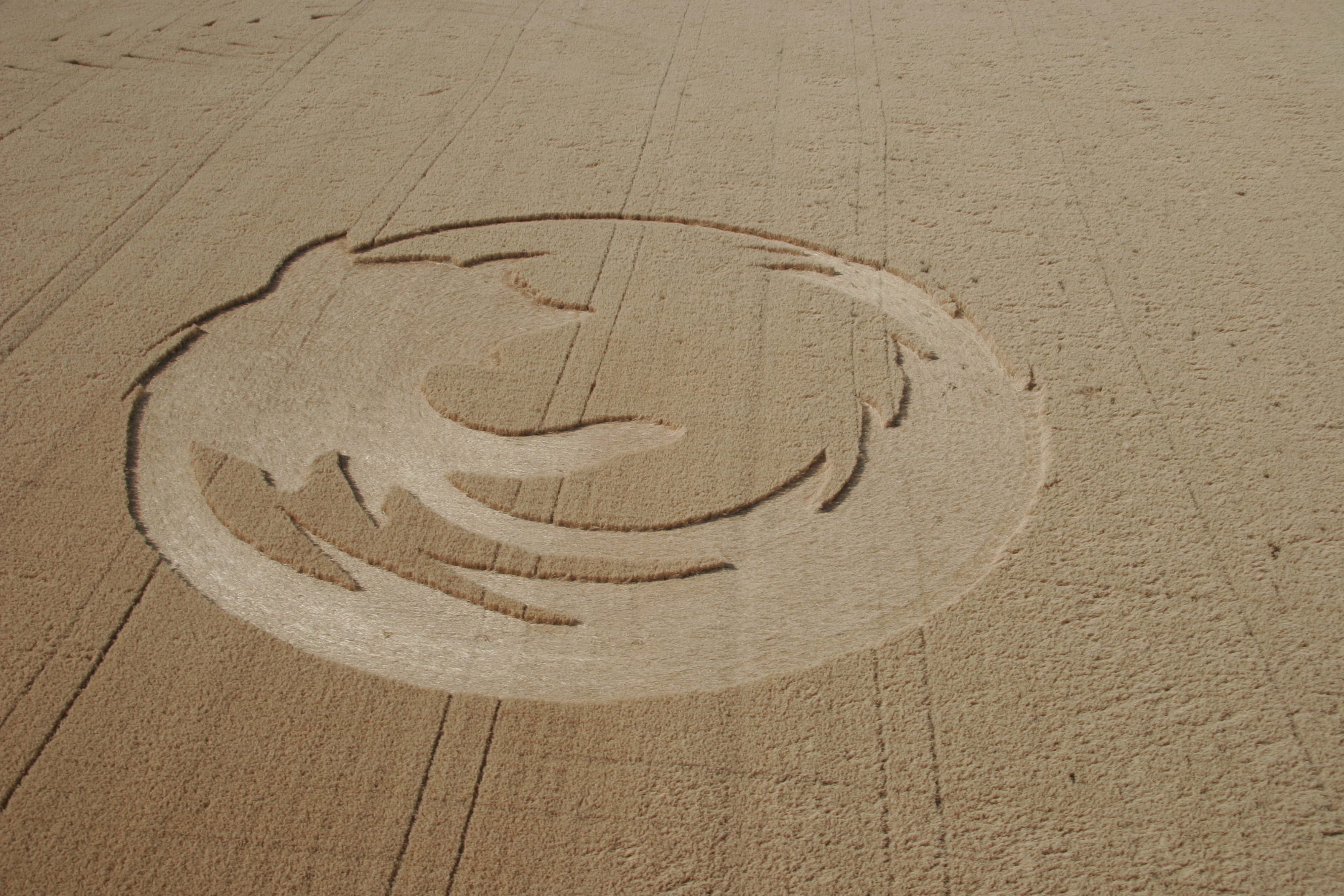
Sorry if this is a silly question, but can we just use the FF crop circle photo? I'm noticing a trend of brands switching to the new Timeline early, and a single, cool photo image for the cover photo seems to be the cover image of choice. Plus, that crop circle photo is just so darned cool.

We can then have more time to think on this moving forward, and we can do different iterations over time.
Comment 24•12 years ago
|
||
Carmen, that definitely works for me :) I don't see the need to rush this. the only thing I can see is if blogs want to pick up the "coolest / best / most creative brand timelines" which is definitely normal to do when new things roll out, and *maybe* we could get picked up :) but other than that slim chance at interweb fame for our social media channel......your suggestion to simplify works great -- that's what I was suggesting too with just using the Summit Photo. The crop circle is great too (though i find the summit photo a little more exciting). You can try both.
Comment 25•12 years ago
|
||
Hey guys--
Im happy to use whatever photos you would like to try. Since you would like this by tomorrow, if you can send me the photos you would like me to use I'll crop them for you and send them back.
:)
--rhonda
Comment 26•12 years ago
|
||
Fair enough.  Thanks Rhonda.

William/Carmen, I say lets have Rhonda do one with the crop circle, and one with the summit shot.  then lets revisit afterwards.   sound good?  Can you provide those pictures fro Rhonda please?
Comment 27•12 years ago
|
||
So if we do the summit shot, or the crop circle photo, we don't need any treatment from Rhonda. We can just upload directly and position in the space. Or were you thinking something else?
Comment 28•12 years ago
|
||
Hey Carmen--
I think we would still need to fit the photo into the size required, and add some artful cropping. I dont necessarily need to do it if someone else wants to take a stab at cropping them in the size required.
:)
--rhonda
| Reporter | ||
Comment 29•12 years ago
|
||
Thanks all, and I'm happy using either the Summit Photo (attachment 603072 [details]) or the crop circle for our initial photo when we activate our timeline view tomorrow. I already have the Summit Photo cropped appropriately but it would be great if Rhonda could take a stab at fitting and artful cropping of the crop circle photo. Here are two options for source files:

http://onlyhdwallpapers.com/wallpaper/firefox_crop_circles_desktop_3504x2336_wallpaper-324010.jpg

http://inel.files.wordpress.com/2007/10/oregonstatelinuxusersgroupfirefoxcropcircleo.jpg

Rhonda, please note that the Firefox logo will appear on top of the photo in the bottom left (see attachment)
Comment 30•12 years ago
|
||
hey Carmen--
here is the crop circle in a JPG and a PNG.
:)
--rhonda
Attachment #602977 -
Attachment is obsolete: true
Comment 31•12 years ago
|
||
Comment 32•12 years ago
|
||
Hi,

The community in Cuba has done something similar to the crop circle a few weeks ago:

https://www.facebook.com/media/set/?set=a.335308549838506.68898.196073313762031&type=3

They are using the image for the frontpage image too.
Comment 33•12 years ago
|
||
link to download collage graphics:
https://www.wetransfer.com/dl/cl7W199X/7210346326559483122f6e750168238f4eacaad373281a4622eaaa995d9c9a6364ff7d6729d6534
Comment 34•12 years ago
|
||
Ruben, that's *awesome*.
Updated•12 years ago
|
Status: NEW → ASSIGNED
Comment 35•12 years ago
|
||
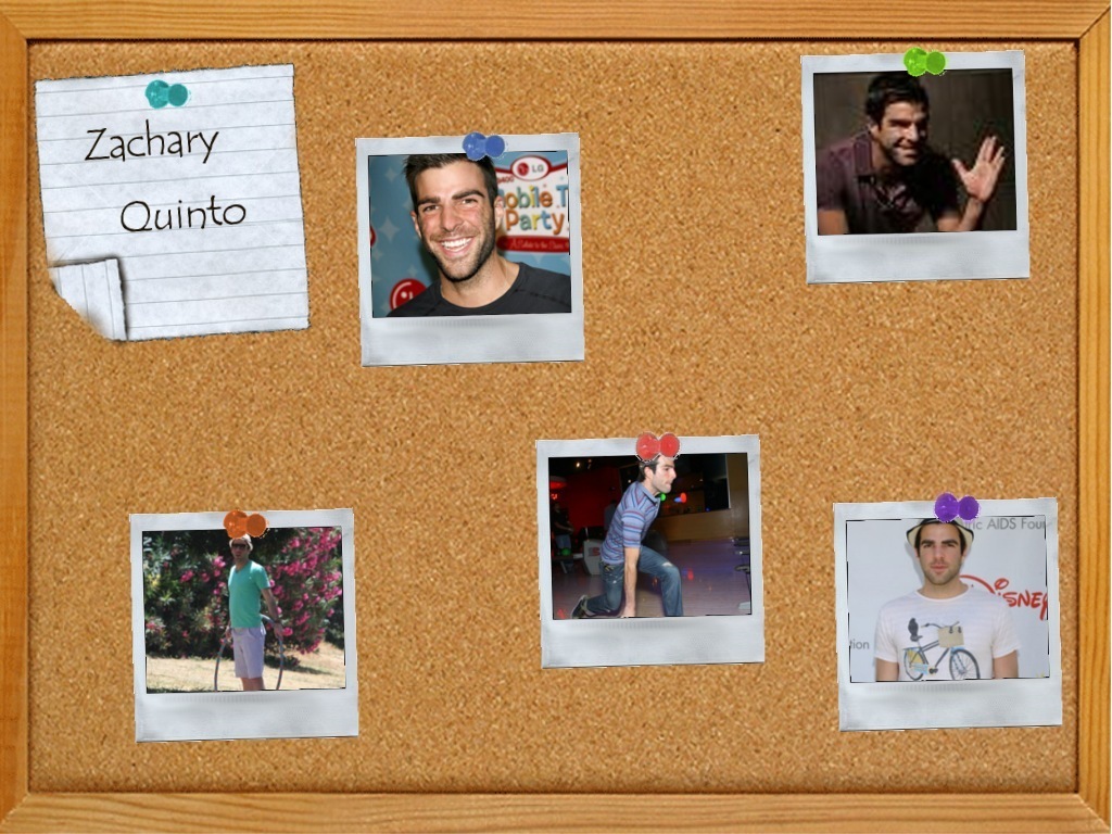
So, now that we have more time to think through a future graphic for the Facebook Cover Image, I wanted to throw this idea into the ring.

Remember Webify me - where we essentially had this board (corkboard? I forget) that looked like the board at your cubicle or something. What do you do on a corkboard? You pin things. We could pin "stickers" (like Firefox Beta), mascots (Mr. Foxy) and photos of Fans in Firefox "stuff". The design could feature designated places for each of these items, and we can change them over time with new photos/stickers/etc.

Something similar to Wal-Mart's page, but more fun and Firefox-y https://www.facebook.com/walmart

Or similar to this image
http://images2.fanpop.com/images/photos/6400000/Cork-Board-zachary-quinto-6476713-1024-768.jpg
Comment 36•12 years ago
|
||
The wallmart example is good.  what i like about it is that it almost feels like the profile image (box) is part of the other square boxes floating around.  The background can be our Firefox orange (or even the muted collage) with highlighted photos on top (possibly also tinted).  Rhonda can set up the PSD with masks and layers that we can then easily drop new photos in (perhaps).

I vote to be creative but not overcomplicate :)

Either way, lets figure out what we want before having Rhonda spend to much time.  Also, lets figure out the appropriate new due date, and go from there.
| Reporter | ||
Comment 37•12 years ago
|
||
(In reply to Tara (musingt) from comment #36)
> The wallmart example is good.  what i like about it is that it almost feels
> like the profile image (box) is part of the other square boxes floating
> around.  The background can be our Firefox orange (or even the muted
> collage) with highlighted photos on top (possibly also tinted).  Rhonda can
> set up the PSD with masks and layers that we can then easily drop new photos
> in (perhaps).
>
> I vote to be creative but not overcomplicate :)

+1. One concept is to have the muted collage with some highlighted photos that aren't tinted and so they stand out from the others. We could then swap in new photos easily. Another idea is to have our Firefox orange background with some featured photos on top.


> Either way, lets figure out what we want before having Rhonda spend to much
> time.  Also, lets figure out the appropriate new due date, and go from there.

Let's go with March 27 as the new due date, and then we can update the page to use this new cover image later that week.
Whiteboard: Due by Mar 8 → Due by Mar 27
| Reporter | ||
Comment 38•12 years ago
|
||
Moving this to April 6 for now, as Rhonda is focused on other projects.
Whiteboard: Due by Mar 27 → Due by Apr 6
Comment 39•12 years ago
|
||
Hey William--
Thanks for moving this out a few days. :)

I can get rolling on this pretty soon, I actually wasn't sure if this was ready to go as far as direction so that is why I hadn't made any move on it.

Did you want me to try some of the ideas in comment 37 or did you and Tara want to discuss a little more? If you want me to try those ideas we could always do that and go from there...

:)
--rhonda
Comment 40•12 years ago
|
||
I'm fine trying some of the ideas we talked about, though would also like to keep the scope of this bug to something reasonable b/c we have other projects for Rhonda and I want to make sure she's not spending too much time on something that is lower priority. Since we already have some options for Facebook, there's not urgency.
Comment 41•12 years ago
|
||
another idea / concept reference with a bunch of Polaroid style photos / collage that blends in with the profile pic.
Comment 42•12 years ago
|
||
OK! sounds good. We'll get rolling on this when my plate clears a little, probably next week at some point.
:)
--rhonda
Comment 43•12 years ago
|
||
Hi team,

I wanted to check in on this bug and see how (if) we were progressing. Jane has asked us to update the cover image if we can.

I found this tutorial today, on how to make your profile image (our logo) part of your cover image. http://hubze.com/2012/04/how-to-combine-your-cover-photo-and-profile-image/

I thought it would be nice if we could incorporate that technique into the Polaroid style collage, as Tara mentioned above.

There's a PSD teamplate in that tutorial, but the size of the profile image has now changed. The new profile image is 160x160 (not the 140 in the PSD template) and it  will sit at 23 px from the left & 210 px from the top.

Would we be able to set a new delivery date for this? How does May 9 sound? That's 2 weeks. Doable?
Comment 44•12 years ago
|
||
Thanks Carmen.

I'm thinking of giving our different designers a chance to do each of the cover page designs. It would be nice to mix it up a bit and let different designers take it for a spin.  So let me check a few things and get back to you.  2 weeks should be okay.

Rhonda, thanks so much for your help on this so far.  You rock!
Updated•12 years ago
|
Assignee: rspencer → tshahian
Updated•12 years ago
|
Status: ASSIGNED → NEW
Updated•12 years ago
|
Assignee: tshahian → monique
Status: NEW → ASSIGNED
| Assignee | ||
Comment 45•12 years ago
|
||
HI Tara,

Let me know when you can talk today. I'm available until 5 today.

-Thanks,
Monique

Here's another reference link of some fun ideas:
http://www.hongkiat.com/blog/creative-facebook-timeline-covers/
| Assignee | ||
Comment 46•12 years ago
|
||
Hi guys,

Just wanted to let you know that I'm still working on the comps and will send you something later this evening!

Monique
| Assignee | ||
Comment 47•12 years ago
|
||
Attached is my first stab at the Facebook cover. I downloaded most of the attachments in this string and tried to follow the coloration of the reference that Tara liked (not SOOOO firey). I did run out of approved images though and would need about 3-5 more. I ended up duplicating a few but it's hard to tell. Lastly I put a slight drop shadow on some of the image so they stand out a little more but this does veer from past renditions.Just thought it was hard to really see the images. Lastly, it made the most sense to me to put a blue behind the logo so it stands apart from the collage since that's so orange. Let me know your thoughts and have a great weekend!
| Reporter | ||
Comment 48•12 years ago
|
||
Thanks Monique - I think this is a great first stab :)

I like the layout and use of the images. You mentioned that you could use 3-5 more to avoid duplicates - Tara might be able to provide some more.

While I like the orange treatment for the photo collage, I'm not sure about having a blue background behind the Firefox logo. Since the square logo graphic gets resized and used in all our Facebook posts and comments, I'm concerned that the blue will look out of place in those contexts. I'd be curious to see what that graphic looks like using the current white background and perhaps trying an orange background too.

Tara, what do you think?
Whiteboard: Due by Apr 6
Comment 49•12 years ago
|
||
Thanks Monique, I agree with William that it's a great start.

Here are some thoughts:
* Can we adjust the tint to allow for a little more color and contrast? like our original brand book: http://www.flickr.com/photos/musingt/6750590203/in/set-72157625182329697

* I agree that the blue background doesn't fit here.  The idea is to make that profile image feel like it's part of the collage... just bleeding off a bit into the facebook profile.  The only thing is that we don't want to tint the FF logo... so, it will definitely pop a bit more than the rest of the images.  In which case, I suggest trying an orange background so it fits with the rest of the collage more.

* I'll try to pull some additional photos, sure.
| Assignee | ||
Comment 50•12 years ago
|
||
Hello,

Was just uploading two orange backgrounds behind the logo as I see Tara's comments. So check these out and I'll change the orange. What you attached is different than what I was looking at. Looks like the version you attached, the photos are in color, with an orange overlay. The other versions were translated to black and white, then applied an orange tint which is the way I did it. Will work on that next!

- Monique
| Assignee | ||
Comment 51•12 years ago
|
||
With a canvas texture behind the orange to match the videos Tara that you sent for the Android project. We can also adjust after I translate the photos back into color.

- Monique
| Assignee | ||
Comment 52•12 years ago
|
||
Here is with the photography changes per Tara's reference. Let me know what you think!

- Monique
| Reporter | ||
Comment 53•12 years ago
|
||
Thanks Monique! I'm liking CR3 a lot, especially seeing the colors come through on the photos. The orange background on the logo fits in nicely with the collage too.

Tara, what do you think?
| Assignee | ||
Comment 54•12 years ago
|
||
Hello,

I know this was an already urgent project so wanted to see if there was any other feedback and Tara do you have additional images I can plug in or good as is?

Thanks,
Monique
Comment 55•12 years ago
|
||
William is out until next week, but I'm sure he'll pop back in the bug then.

Meanwhile, I have one concern. Several of the images have text in them (Work for mankind, De Todos, etc.) (Not including the ones with stuff on their t-shirts, that's too small to worry about anyway. Those should be fine.)

Since we're a global community, I think it would be a nice gesture not to single out any language, unless we could cover them all, which is impossible. :) I love the overall design - I would just recommend different images to replace those heavy on text.

We just had a photoshoot, so I offer up any of these photos if we need them:

http://www.flickr.com/photos/78294107@N06/
| Assignee | ||
Comment 56•12 years ago
|
||
OK I'll just wait til I hear more back.

- Monique
Comment 57•12 years ago
|
||
Hey guys  sorry for the delay.  Monique, this is great! Thank you.   Also, I guess it's not so easy finding pictures :)

I agree that there are too many duplicates right now... so lets remove some of those.  I dont' think we can (or need to) completely avoid English text.  A lot of our materials (t-shirts, etc) are in English and they are pretty iconic so I rather not worry too much about those, but instead showcase group photos of other community members to capture the global nature of who we are.  With that in mind, here are a few additional photos and thoughts:

* The summit photo is great, can we zoom into the group shot so we see a pack of people vs. background scenery?
* Can we remove a few of the billboards? lets just use one:  Either the flat image of the "work for mankind" or the "de todos para todos". The ones with text can be smaller if need be so we're not emphasizing any particular locale, as Carmen said.http://www.flickr.com/photos/fligtar/5569324504/in/faves-intothefuzz/
* Please do crop any or all pictures as needed to fill the space. I rather pack in the graphics than leave a lot of padding within each photo. So, please do crop as needed.
* http://www.flickr.com/photos/gen/3677579248/in/faves-musingt/
* http://www.flickr.com/photos/musingt/5669536513/in/set-72157626486910137
* http://www.flickr.com/photos/intothefuzz/4178097600/in/set-72157622858783735
* http://www.flickr.com/photos/intothefuzz/2534487521/in/set-72157605215457894
* http://www.flickr.com/photos/fligtar/5569324504/in/faves-intothefuzz/
* http://www.flickr.com/photos/musingt/3614859675/in/faves-intothefuzz/
* I don't know who this guy is, but i like that he's wearing the shirt with a jacket :) http://www.flickr.com/photos/whartz/2111057105/
* might need an artful crop here as Sethb (the non-Indian dude) no longer works here, but I liked that this showed our passionate community in India:  http://www.flickr.com/photos/aruner/3290356456/


*
| Assignee | ||
Comment 58•12 years ago
|
||
Hello,

I replaced images with the new ones that Tara sent. Also recropped a lot of images and moved them around. Let me know of any more changes.

- Monique
Comment 59•12 years ago
|
||
Awesome, Thanks Monique!  we're almost done from my end. Just a nit/tweak:

* love the cropped in view of the big crowd shot in the center.  If possible, would you be able to crop the picture so that the characters don't show as much (or at all?) the reason is that those were unique to a particular event and aren't part of our consumer facing identity.  So I'd prefer to show the crowd of people cheering vs. those costumes.

William/Carmen -- thoughts?
| Reporter | ||
Comment 60•12 years ago
|
||
I like CR4 a lot. Agree with Tara's feedback in comment 59 - nothing else to add.

FYI Carmen is traveling today so she probably won't be able to respond until tomorrow at the earliest.
Comment 61•12 years ago
|
||
Sounds good thanks. Lets try and wrap this up asap :)
Comment 62•12 years ago
|
||
If William's happy, I'm happy. :) Good to go
| Assignee | ||
Comment 63•12 years ago
|
||
How's this?

Monique
| Reporter | ||
Comment 64•12 years ago
|
||
CR5 looks fantastic. Can we get the graphics for the cover image (collage) and profile image (Firefox logo)? Thanks Monique!
| Assignee | ||
Comment 65•12 years ago
|
||
Awesome! So just to be clear, you want both the profile pic and collage as a PNG and JPG...correct? Then also Tara wanted the layered PSD as a template so you could update the images later if you want/need to. Please confirm this is all accurate.

Thanks,
Monique
| Reporter | ||
Comment 66•12 years ago
|
||
(In reply to monique from comment #65)
> Awesome! So just to be clear, you want both the profile pic and collage as a
> PNG and JPG...correct? Then also Tara wanted the layered PSD as a template
> so you could update the images later if you want/need to. Please confirm
> this is all accurate.

That's correct - thanks!
| Assignee | ||
Comment 67•12 years ago
|
||
Here are the PNGs and JPGs but I'll have to send the PSD via email.

Thanks!
Monique
Comment 68•12 years ago
|
||
Thanks Monique. William, can we close this out now?
| Reporter | ||
Comment 69•12 years ago
|
||
Closing in 3, 2, 1...thanks Monique!
Status: ASSIGNED → RESOLVED
Closed: 12 years ago
Resolution: --- → FIXED
You need to log in
before you can comment on or make changes to this bug.
Description
•