Closed
Bug 454674
Opened 17 years ago
Closed 17 years ago
Re-theme the navigation screen
Categories
(Firefox for Android Graveyard :: General, defect, P2)
Firefox for Android Graveyard
General
Tracking
(Not tracked)
VERIFIED
FIXED
fennec1.0a1
People
(Reporter: madhava, Assigned: Gavin)
References
Details
(Whiteboard: UI polish)
Attachments
(4 files, 7 obsolete files)
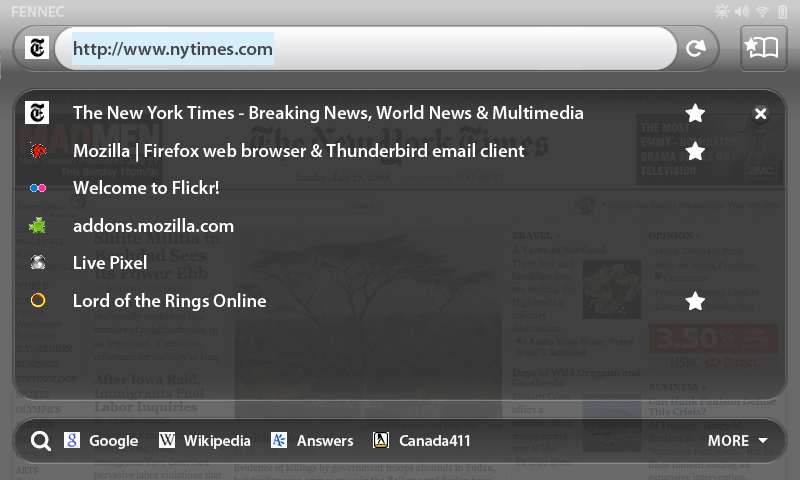
Currently, its look is based on my wireframes. We should theme it according to
the working theme. I'm working with Sean to get icons, etc. It will be along these lines:
http://blog.seanmartell.com/wp-content/uploads/2008/09/fennec_screen_8.jpg
| Reporter | ||
Comment 1•17 years ago
|
||
| Reporter | ||
Updated•17 years ago
|
Whiteboard: UI polish
Updated•17 years ago
|
Assignee: nobody → gavin.sharp
| Assignee | ||
Comment 2•17 years ago
|
||
This required editing of nav_caps, such that the top cap was on top of bottom one (for use with -moz-border-image), and had to split search_caps into two separate images (nav_search_left and nav_search_right).
I also did some other renames so that these fit in with the existing files:
background_mask -> nav_background_mask
navigation_icons -> nav_icons
search_middle -> nav_search_middle
| Assignee | ||
Comment 3•17 years ago
|
||
Attachment #338493 -
Attachment is obsolete: true
| Assignee | ||
Comment 4•17 years ago
|
||
This is super slow on the device - it takes like 1-2s just for the images to show up :(
Comment 5•17 years ago
|
||
if we make the window non-transparent how does it perform?
| Assignee | ||
Comment 6•17 years ago
|
||
Making the <panel> non-transparent doesn't really help. It appears to be the actual images loading that takes a long time. There are 7 different images used here - ideally we could reduce that but it might mean changing the appearance a little bit...
| Reporter | ||
Comment 7•17 years ago
|
||
for use in the awesomebar result-set for bookmarked pages
| Assignee | ||
Comment 8•17 years ago
|
||
Reduces the number of images/elements by using border-image. Transparency isn't working because the richlistbox breaks it, I'll need to file a layout bug on that I think.
This can be extended to also cover the navigation screen with the same style, but doing that results in strange glitches that look like they might also be bugs, need to investigate more. See XXX comments in patch.
Attachment #338494 -
Attachment is obsolete: true
| Assignee | ||
Comment 9•17 years ago
|
||
The XXX comment was at the wrong place in the other patch.
Attachment #342199 -
Attachment is obsolete: true
| Assignee | ||
Comment 10•17 years ago
|
||
Attachment #342200 -
Attachment is obsolete: true
| Assignee | ||
Updated•17 years ago
|
Attachment #342201 -
Attachment is patch: true
Attachment #342201 -
Attachment mime type: application/octet-stream → text/plain
| Assignee | ||
Updated•17 years ago
|
Attachment #342201 -
Flags: review?(mark.finkle)
Comment 11•17 years ago
|
||
Comment on attachment 342201 [details] [diff] [review]
correct patch, against tip
In the future, we should think about upscaling the favicons a little.
Attachment #342201 -
Flags: review?(mark.finkle) → review+
| Assignee | ||
Comment 13•17 years ago
|
||
Attachment #342276 -
Attachment is obsolete: true
Updated•17 years ago
|
Flags: wanted-fennec1.0+
Priority: -- → P2
| Reporter | ||
Comment 14•17 years ago
|
||
| Assignee | ||
Comment 15•17 years ago
|
||
Attachment #342278 -
Attachment is obsolete: true
| Assignee | ||
Comment 16•17 years ago
|
||
Status: NEW → RESOLVED
Closed: 17 years ago
Resolution: --- → FIXED
You need to log in
before you can comment on or make changes to this bug.
Description
•