Closed
Bug 875981
Opened 12 years ago
Closed 8 years ago
Have "activate" button on X-Ray Goggles stick to top of page on scroll
Categories
(Webmaker Graveyard :: webmaker.org, defect)
Webmaker Graveyard
webmaker.org
Tracking
(Not tracked)
RESOLVED
INCOMPLETE
People
(Reporter: humph, Assigned: katiemthom, Mentored)
References
Details
Attachments
(2 files, 1 obsolete file)
Post-June 15, we need to get X-Ray Goggles added to webmaker.org. The current iteration, https://webmaker.org/en-US/tools/x-ray-goggles/, is more aimed at kids and should be examined for low-hanging fruit in terms of UI refresh for mixing with our other tools (fonts, colours, images, ...).
Doing a more general UX treatment can happen in a follow-up bug later.
Comment 1•12 years ago
|
||
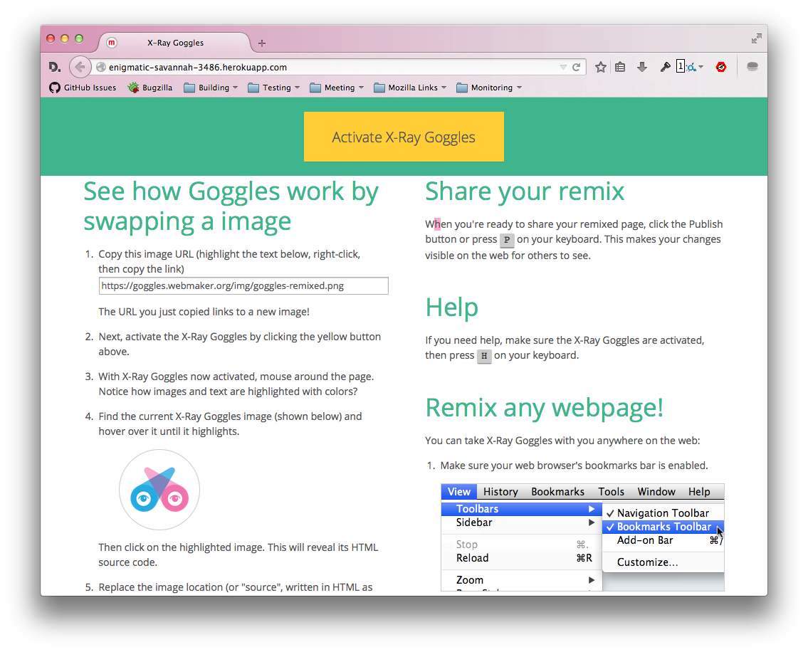
Filed under "maybe in a future iteration", here's how the landing page looks with a fixed bookmarklet button.
http://enigmatic-savannah-3486.herokuapp.com/
For beginners, it might be beneficial to have the button omnipresent and avoid scrolling back and forth with the instructions.
Comment 2•12 years ago
|
||
Um, I think this is great. Let's do it!!
Comment 3•12 years ago
|
||
Pomax gave feedback and thought this might cause more confusion than good.
This could be something to find out in a future survey...
Comment 4•12 years ago
|
||
What's the feedback? I think it's great, we are constantly referring to the yellow button in the copy below.
Comment 5•12 years ago
|
||
He's generally not a fan of "sticky" bits. The argument is that the switch from static to fixed will disrupt people's mental models of the page, and make it harder to remember what went where.
That's probably true to a degree, but it's become pretty commonplace so I wouldn't be surprised if most people were good with it.
Comment 6•12 years ago
|
||
I agree with you Thomas, I think this is becoming a familiar enough behavior. Besides, we need to push our frontend a bit more and this is a simple way to do it. I like that it keeps the action of "Activate it now" (do it do it do it) up front and first and foremost, emphasizing the behavior we want – which is for people to just try it now.
Let's implement this. cc'ing Pomax.
Comment 7•11 years ago
|
||
I still really really like this interaction. Flagging Aki to weigh in from accessibility POV. If this works for others, I would love to see this last piece implemented.
See http://enigmatic-savannah-3486.herokuapp.com/
Assignee: cassie → aki
Flags: needinfo?(aki)
Summary: Refresh of X-Ray Goggles UI for inclusion in new webmaker.org → Have "activate" button on X-Ray Goggles stick to top of page on scroll
Comment 8•11 years ago
|
||
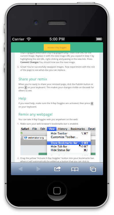
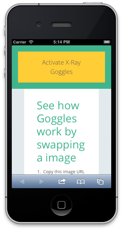
So I have some other accessibility notes I’d love to share that are out of scope of this question. But if I understand the very question at hand, which is this: http://snaps.akibraun.com/klz1m.png vs this: http://snaps.akibraun.com/fn89c.png, I see no logical reason sticky is bad. I don’t see it disrupting current users, it really doesn’t change the flow of the page very much.
The one thing to think about is how users interact with our products on mobile devices. This is a very big question, but that does not mean we should shy away from it on very small things. If we start thinking about it with every new piece we add, every change we make, it becomes much more manageable. (Why is it so important? See below for some numbers and context.)
All that said, this is currently how the sticky activation button looks on a small mobile device screen: http://snaps.akibraun.com/x114k.png which is probably fine for now, but we should probably swap out a meta tag so it looks closer to this http://snaps.akibraun.com/oq5xh.png
======
Some very, very important numbers to ponder, up-to-date as of December 2013
- 20% of all americans don’t have access to the Internet at all.
- 35% of people in the US don’t have Internet access at home.
- 59% of Americans who make less than $30,000 (low-income) have no Internet access at home.
- 88% of Americans without a high school diploma don’t have Internet access at home.
- At the same time, 88% of people have a mobile phone.
- The number of people that use their phone to access the Internet went from 31% (2009) to 55% (2012).
The source of these numbers is a talk given by Karen McGrane in December 2013 at An Event Apart San Francisco called “The Mobile Content Mandate”. I’m working on getting the slides for us all, but in the meantime something for your brains to chomp on. I know these numbers are US-centric, and I apologize for that, but they’re what I could get. You’ll be seeing a lot of this from me. <3
Flags: needinfo?(aki)
Comment 9•11 years ago
|
||
Fantastic Aki, let's do it. +1 to your suggestion for mobile, that is the desired experience exactly.
(also, big Karen McGrane fan here, keep it comin' :)
Updated•11 years ago
|
Assignee: aki → nobody
Status: ASSIGNED → NEW
| Assignee | ||
Comment 10•11 years ago
|
||
I'm interested in helping out with this. Let me know if I can help!
Updated•11 years ago
|
Flags: needinfo?(aki)
Comment 11•11 years ago
|
||
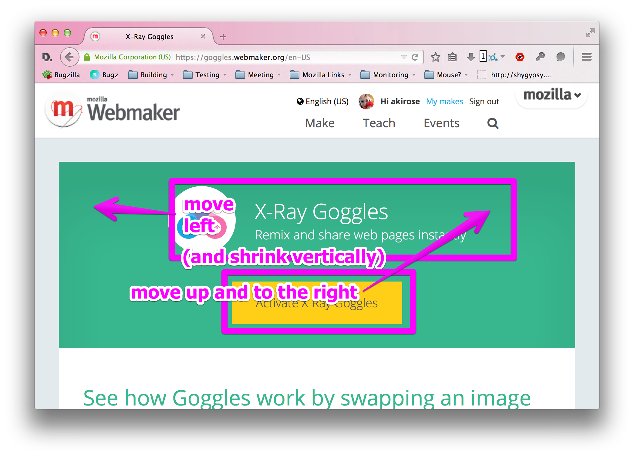
Hey Katie
I'm thinking the best way to do this is to grab the styles and javascript used for the sticky banner in Comment #1, but instead of just one big button, maybe we can do something visually more like this? http://snaps.akibraun.com/o4t7t.png
What do you think?
Assignee: nobody → katiemthom
Mentor: aki
Flags: needinfo?(aki) → needinfo?(katiemthom)
OS: Mac OS X → All
Hardware: x86 → All
| Assignee | ||
Comment 12•11 years ago
|
||
I like it! Not sure I'll get to it before next week, is that ok?
Flags: needinfo?(katiemthom)
Comment 13•11 years ago
|
||
Sounds like a plan.
Updated•11 years ago
|
Status: NEW → ASSIGNED
| Assignee | ||
Comment 14•11 years ago
|
||
Is there any documentation for Webmaker that includes how JS resources are managed?
Comment 15•11 years ago
|
||
Not really, not that I know of. The cliff's notes are this
- Any view located in /views will use require.js, the manifest located at public/main.js
- Any view located in /public/views will use uglify, the manifest found in the gruntfile (https://github.com/mozilla/webmaker.org/blob/master/Gruntfile.js#L94-121)
Does this help?
| Assignee | ||
Comment 16•11 years ago
|
||
It does, thanks!
| Assignee | ||
Comment 17•11 years ago
|
||
Hey Aki,
I'm almost done with this; I just want your feedback on the styling so I attached a screenshot. I think the yellow button should be a bit smaller, but otherwise I like it. Also, how should it behave on mobile or small viewports? I'm thinking normal behavior--no sticking.
Katie
Comment 18•11 years ago
|
||
Hey Katie
I don't see an attachment, but otherwise i think you're spot on. Looking forward to seeing it!
| Assignee | ||
Comment 19•11 years ago
|
||
Oops, I forgot to attach it--here it is.
Comment 20•11 years ago
|
||
Just one note on the screenshot, otherwise it's perfect!
Attachment #8500858 -
Attachment is obsolete: true
Flags: needinfo?(katiemthom)
| Assignee | ||
Comment 21•11 years ago
|
||
Attachment #8503658 -
Flags: review?(aki)
Flags: needinfo?(katiemthom)
Comment 22•11 years ago
|
||
Comment on attachment 8503658 [details] [review]
https://github.com/mozilla/goggles.webmaker.org/pull/143
A little more work to be done on the styles of the button, but the functionality is PERFECT. :+1:
I took some screenshots of what I'm seeing with the button at different viewports:
http://cl.ly/Y0bE/goggles.webmaker.org.zip
Attachment #8503658 -
Flags: review?(aki) → review-
Comment 23•8 years ago
|
||
The webmaker.org site is no longer developed.
https://learning.mozilla.org/blog/whats-next-for-webmaker-tools
Status: ASSIGNED → RESOLVED
Closed: 8 years ago
Resolution: --- → INCOMPLETE
You need to log in
before you can comment on or make changes to this bug.
Description
•