Closed
Bug 582410
Opened 15 years ago
Closed 15 years ago
Designs for discovery pane details view
Categories
(addons.mozilla.org Graveyard :: Discovery Pane, defect, P3)
Tracking
(Not tracked)
VERIFIED
FIXED
People
(Reporter: fligtar, Assigned: chowse)
Details
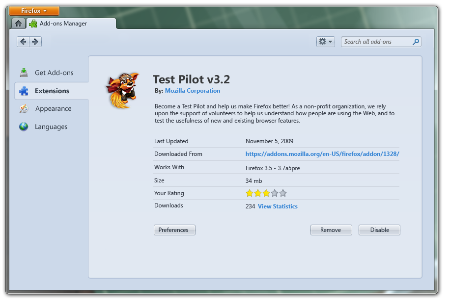
Links in the discovery pane are currently planned to open in a new tab to keep the in-frame experience consistent. I'd like to have a mini-details page made in the same style as the discovery pane so that clicking on an add-on stays in the same frame.
This is the style we're going for:
http://mozilla.seanmartell.com/pane/pane-2.jpg
And here's what the chrome details page looks like:
https://wiki.mozilla.org/images/e/e5/Detail_view.png
This can either be a full page or an overlay, but should have:
* Name
* Version
* Authors
* summary
* screenshots
* description
* rating
* downloads
* reviews (show first couple with link to see all)
* link to write a review
* install button
|
||
Comment 1•15 years ago
|
||
(In reply to comment #0)
> This can either be a full page or an overlay, but should have:
> * Name
> * Version
> * Authors
> * summary
> * screenshots
> * description
> * rating
> * downloads
> * reviews (show first couple with link to see all)
> * link to write a review
> * install button
I'm glad to see you're going for something simple.
|
Assignee | |
Comment 2•15 years ago
|
||
First mock-ups are ready. Here's the breakdown:
The initial unified design:
http://people.mozilla.com/~chowse/drop/amo/discovery/01_Addon_Detail.png
http://people.mozilla.com/~chowse/drop/amo/discovery/01_Addon_Detail_2.png
Secondary pages for EULA and Privacy Policy:
http://people.mozilla.com/~chowse/drop/amo/discovery/02_Addon_EULA.png
http://people.mozilla.com/~chowse/drop/amo/discovery/03_Addon_Privacy.png
And here's an alternate design, broken down into several smaller pages.
I'm a bit partial to this one, but the added navigational elements and
development time may not be worthwhile. Still, wanted to put it out there:
http://people.mozilla.com/~chowse/drop/amo/discovery/04_Addon_Detail_Simpler.png
http://people.mozilla.com/~chowse/drop/amo/discovery/05_Addon_Screenshots.png
http://people.mozilla.com/~chowse/drop/amo/discovery/05_Addon_Screenshots_2.png
http://people.mozilla.com/~chowse/drop/amo/discovery/06_Addon_Reviews.png
Design notes to follow...
|
|
Assignee | |
Comment 3•15 years ago
|
||
Notes on the design:
* The mock-ups were built in Omnigraffle, so they are not quite as polished
as the Discovery Pane PSDs. However, they mostly follow the same visual
language. I'll post the stencils shortly if they're needed for layout and
typography.
* For the sake of brevity:
AMO = Addons.Mozilla.Org (the current Zamboni design)
AOM = Add-ons Manager (the new Firefox 4.0 design)
* The type, colors, and sizing follow those of the AOM Detail page:
http://jboriss.files.wordpress.com/2010/08/addons_manager_pre_burningman.png
* The 'Add to Firefox' button uses the same colors and icons as the Install
buttons on AMO, but uses the geometry (flatter, less rounded corners) of
the Add-on Manager. It also should not have a 'Featured' halo. Not sure
yet if we'll need special versions for incompatibility or roadblocks.
* The rating stars are the same as those used in the AOM, though perhaps
scaled down slightly so they fit the size of the surrounding text better.
* Images and thumbnails use the same 1px border + drop shadow as Themes &
Backgrounds in the AOM.
* The scroll arrows around the screenshots can reuse the same arrows from
the Discovery Pane mocks. The fading white background won't be necessary,
but I might recommend a different hover effect (e.g blue shading and a
soft glow).
* The size of the screenshot area is determined by the width of the pane.
The height of the screenshot area should be large enough to maintain a 4:3
ratio with the width. The image itself is scaled so that it fits entirely
within the screenshot area, then centered.
Example:
Usable width of discovery pane = 400 px
Original image size = 500 x 525 px
Screenshot area = 400 x 300 px
Scaled screenshot = 286 x 300 px
* The text below the screenshot should be centered (sorry for the
inconsistency).
* The EULA and Privacy Policy boxes should be <textarea>'s to permit
easy copy-and-pasting (Ctrl+A, Ctrl+C).
On behavior:
* Clicking on 'Learn More' opens the add-on's AMO Detail page in a new tab.
* Clicking on the website, 'View Statistics', or 'More reviews' link at the
bottom opens the respective page in a separate tab.
* Clicking on the reviews link near the top takes the user to the Reviews
sections, ideally with a brief sliding transition.
* While a screenshot is loading, it should be replaced with a spinner or
progress bar. When the image is ready, it should fade in, possibly in
combination with a sliding animation (see below).
* Any space immediately to the left or right of the image should be a hover
target for the scrollers. In addition, I'd make the left and right third of
the image click targets for their respective sides.
* Clicking on the scrollers should fade out the image while sliding it slightly
to the left or the right. The next image (once loaded) should slide and fade
in from the opposite side.
|
|
Assignee | |
Comment 4•15 years ago
|
||
After showing these mocks around, I wanted to throw out one more alternative. Leans more toward the simple design, but eliminates the need for secondary pages:
http://people.mozilla.com/~chowse/drop/amo/discovery/07_Addon_Detail_Alt.png
http://people.mozilla.com/~chowse/drop/amo/discovery/07_Addon_Detail_Alt_1.5.png
http://people.mozilla.com/~chowse/drop/amo/discovery/07_Addon_Detail_Alt_2.png
Instead of a full-image view, it uses a carousel of 3 140x150px thumbnails, each which opens a lightbox. I'd love to see this done with a zooming fly-out (see http://fancybox.net/ for examples).
In addition, to make better use of the unused space in the lower right, I've added a rating distribution chart (see bug 557879). Consider this an optional, but useful, addition.
|
Reporter | |
Comment 5•15 years ago
|
||
(In reply to comment #4)
> After showing these mocks around, I wanted to throw out one more alternative.
OMG, this is exactly what I wanted to begin with but you didn't like the idea! I like this one the best. Sans rating distribution.
|
|
Assignee | |
Comment 6•15 years ago
|
||
(In reply to comment #5)
> OMG, this is exactly what I wanted to begin with but you didn't like the idea!
My fear of lightboxes lead me astray. I still think the lightbox feels awkward when it's constrained to the inner window, but I can see now the pros of having thumbnails, and we're constrained by size either way.
I'll post final mocks shortly.
|
|
Assignee | |
Comment 7•15 years ago
|
||
|
|
Reporter | |
Comment 8•15 years ago
|
||
Thanks chowse
Status: NEW → RESOLVED
Closed: 15 years ago
Resolution: --- → FIXED
|
||
Comment 9•15 years ago
|
||
Looks great. Now I'm curious to see it in action!
Status: RESOLVED → VERIFIED
|
||
Updated•10 years ago
|
Product: addons.mozilla.org → addons.mozilla.org Graveyard
You need to log in
before you can comment on or make changes to this bug.
Description
•