Closed
Bug 743629
Opened 13 years ago
Closed 13 years ago
Implement the Australis tabs on Aero
Categories
(Thunderbird :: Theme, defect)
Tracking
(Not tracked)
RESOLVED
FIXED
Thunderbird 15.0
People
(Reporter: Paenglab, Assigned: Paenglab)
References
Details
Attachments
(3 files, 5 obsolete files)
|
182.07 KB,
image/png
|
Details | |
|
21.84 KB,
patch
|
andreasn
:
review+
andreasn
:
ui-review+
|
Details | Diff | Splinter Review |
|
21.83 KB,
patch
|
Paenglab
:
review+
Paenglab
:
ui-review+
|
Details | Diff | Splinter Review |
This bug is for implementing the Australis tabs on Windows Vista/7.
| Assignee | ||
Comment 1•13 years ago
|
||
This patch implements the Australis tabs for Vista and Win7. If everything is okay with this patch I'll implement it for all other platforms.
The only issue I saw was the tab overflow begins earlier than with the actual tabs. This comes because of the left/right margins of -14px to make the tabs superimpose. Without this negative margins the overflow works as before. I propose to file a new bug to solve this issue.
Assignee: nobody → richard.marti
Status: NEW → ASSIGNED
Attachment #613257 -
Flags: ui-review?(nisses.mail)
Attachment #613257 -
Flags: review?(nisses.mail)
| Assignee | ||
Comment 2•13 years ago
|
||
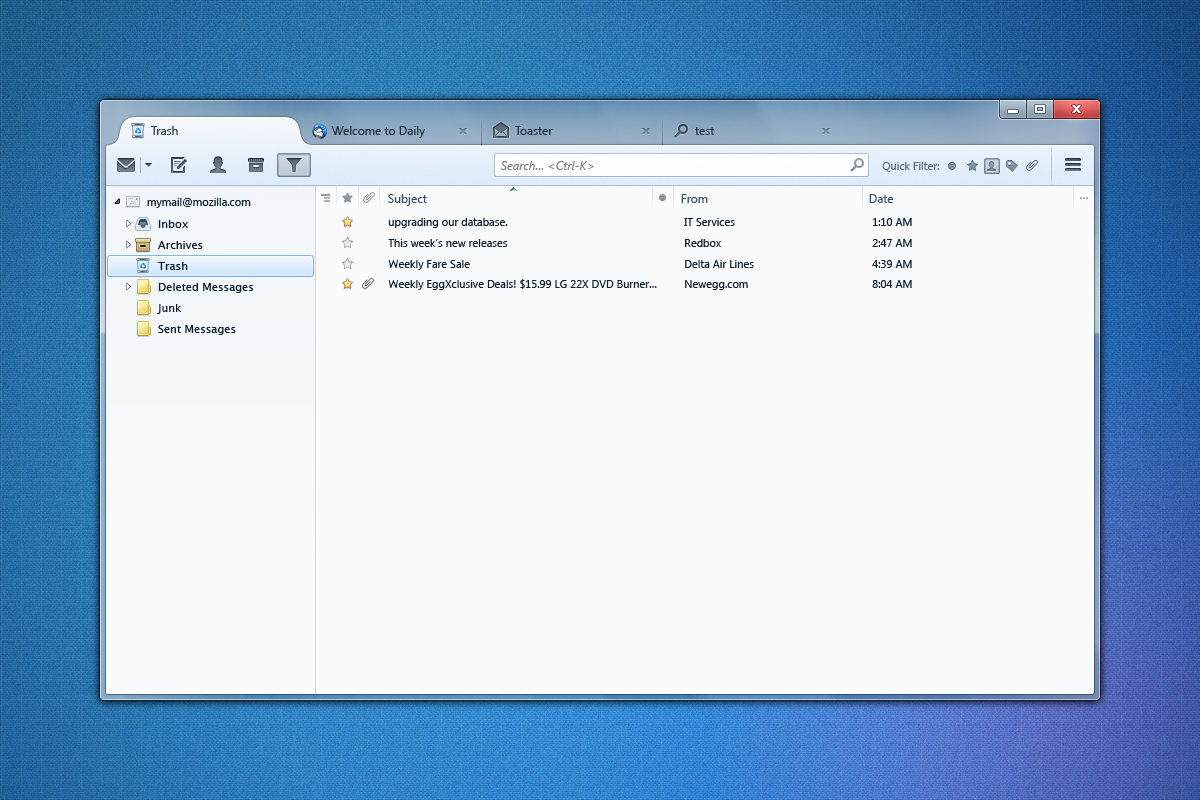
On top my default theme, then Win7 default, Basic, Classic and on bottom High Contrast Nr. 1.
The first tab is selected, the second hovered and the third is inactive.
Comment 3•13 years ago
|
||
The background image in the tabs toolbar looks to hang over a pixel on the right and left. You either need to add a 1px margin to both sides, or a 1px solid transparent border. Of course, this becomes a moot point if they ever fix the bug to building the frame completely in XUL (bug 590945) because then you can more easily blend the frame to the tab toolbar.
| Assignee | ||
Comment 4•13 years ago
|
||
Patch addressing comment 3 and small changes for easier implementation on other platforms.
Attachment #613257 -
Attachment is obsolete: true
Attachment #613257 -
Flags: ui-review?(nisses.mail)
Attachment #613257 -
Flags: review?(nisses.mail)
Attachment #613655 -
Flags: ui-review?(nisses.mail)
Attachment #613655 -
Flags: review?(nisses.mail)
Comment 5•13 years ago
|
||
Comment on attachment 613655 [details] [diff] [review]
Patch v2
The shapes of the tabs looks slightly off, and I think this is because of the graphics used. The graphics used in the design spec have a smoother curve. Will attach new graphics to this bug.
1. https://people.mozilla.com/~shorlander/files/australis-designSpecs/images-win7/tabActiveStart.png
Attachment #613655 -
Flags: ui-review?(nisses.mail) → ui-review-
Comment 6•13 years ago
|
||
to be applied on top of Patch v2
Comment 7•13 years ago
|
||
Comment on attachment 613655 [details] [diff] [review]
Patch v2
setting r- here, as the tabs are not good enough yet, so I think the svg mask needs it's numbers tweaked a bit.
Attachment #613655 -
Flags: review?(nisses.mail) → review-
| Assignee | ||
Comment 8•13 years ago
|
||
This patch is based on WIP patch for Firefox from Frank Yan (Bug 732583). I changed the images for active tabs to work also for Personas and Classic theme.
Attachment #613655 -
Attachment is obsolete: true
Attachment #615667 -
Attachment is obsolete: true
Attachment #619301 -
Flags: ui-review?(nisses.mail)
Attachment #619301 -
Flags: review?(nisses.mail)
Comment 9•13 years ago
|
||
Comment on attachment 619301 [details] [diff] [review]
Patch v3
Woah, really nice tab rounding now!
Some nitpicks:
* Both the tab favicon and the close buttons are too far away from the edges of the tab. Looks like it's 14px instead of 10px
* The first tab is too far away from the left edge, 3px too much.
* The edges also needs some rounding, but that's outside the scope of this bug, so I filed bug #751527 about that.
* The color of the close button too weak.
* The hover of the close tab icon needs to be fixed to become red. The active state looks good.
Code looks good at quick glance, but giving r- there due to ui-review minus.
Attachment #619301 -
Flags: ui-review?(nisses.mail)
Attachment #619301 -
Flags: ui-review-
Attachment #619301 -
Flags: review?(nisses.mail)
Attachment #619301 -
Flags: review-
| Assignee | ||
Comment 10•13 years ago
|
||
(In reply to Andreas Nilsson (:andreasn) from comment #9)
> * The first tab is too far away from the left edge, 3px too much.
> * The edges also needs some rounding, but that's outside the scope of this
> bug, so I filed bug #751527 about that.
This two are opposite needs for your desire :) When I remove the gap of 3px then the rounding will go into the tab.
I can change the .tabmail-tabs padding of now 3px to the value of the radius needed for the rounding. What do you think which radius would be good, 1.5px or 2px?
| Assignee | ||
Comment 11•13 years ago
|
||
(In reply to Andreas Nilsson (:andreasn) from comment #9)
> Comment on attachment 619301 [details] [diff] [review]
> Patch v3
>
> Some nitpicks:
> * Both the tab favicon and the close buttons are too far away from the edges
> of the tab. Looks like it's 14px instead of 10px
Fixed
> * The first tab is too far away from the left edge, 3px too much.
Removed the 3px padding. Needs to be re-added depending of the radius in bug 751527
> * The color of the close button too weak.
> * The hover of the close tab icon needs to be fixed to become red. The
> active state looks good.
I took now the close button from the design specs page. If the color is still to weak, the it's by design ;)
Attachment #619301 -
Attachment is obsolete: true
Attachment #621270 -
Flags: ui-review?(nisses.mail)
Attachment #621270 -
Flags: review?(nisses.mail)
| Assignee | ||
Comment 12•13 years ago
|
||
Improved inactive tab "splitter"
Attachment #621270 -
Attachment is obsolete: true
Attachment #621270 -
Flags: ui-review?(nisses.mail)
Attachment #621270 -
Flags: review?(nisses.mail)
Attachment #621295 -
Flags: ui-review?(nisses.mail)
Attachment #621295 -
Flags: review?(nisses.mail)
Comment 13•13 years ago
|
||
(In reply to Richard Marti [:paenglab] from comment #10)
> (In reply to Andreas Nilsson (:andreasn) from comment #9)
> > * The first tab is too far away from the left edge, 3px too much.
> > * The edges also needs some rounding, but that's outside the scope of this
> > bug, so I filed bug #751527 about that.
>
> This two are opposite needs for your desire :) When I remove the gap of 3px
> then the rounding will go into the tab.
Indeed, I realized this when playing around a bit in DOMi. The spec page shows a rounding on the toolbar, so I think we should go for that too. I was looking at these two images [1] [2] that seems to have little spacing before the first page as well as rounded toolbar, but if that is too complex to implement in a sane way, then I think the rounded toolbar is more important.
1. https://people.mozilla.com/~shorlander/files/australis-designSpecs/images-win7/style-appTab-notifications.png
2. http://28.media.tumblr.com/tumblr_m0iwtyy6nh1qkoea4o1_1280.png
Comment 14•13 years ago
|
||
(In reply to Richard Marti [:paenglab] from comment #11)
> > * The color of the close button too weak.
> > * The hover of the close tab icon needs to be fixed to become red. The
> > active state looks good.
>
> I took now the close button from the design specs page. If the color is
> still to weak, the it's by design ;)
Looking at it a second time, you're right. I was looking at it using a dark background, and the mockups are probably supposed to use a light background.
Comment 15•13 years ago
|
||
Comment on attachment 621295 [details] [diff] [review]
Patch v4.1
Setting ui-review+ as all my nitpicks have been addressed or explained.
Attachment #621295 -
Flags: review?(nisses.mail) → review+
Comment 16•13 years ago
|
||
So one thing that crossed my mind, but that I forgot to mention in the review is that the spec specifies that the tabs should be 180px wide, but I think that it would be good to keep our slightly wider tabs, as it will be good to still be able to fit the title "Inbox - name@domain.com" all right. Plus the fact that I assume Thunderbird don't tend to have as many tabs as Firefox open at the same time. Therefore we can afford the extra ~20px(?).
Comment 17•13 years ago
|
||
Comment on attachment 621295 [details] [diff] [review]
Patch v4.1
...and in this comment I set the ui-review flag instead of the code-review flag I accidentally set previously. I also hear there is coffee in the kitchen now. :)
Attachment #621295 -
Flags: ui-review?(nisses.mail)
Attachment #621295 -
Flags: ui-review+
Attachment #621295 -
Flags: review?
Attachment #621295 -
Flags: review+
Comment 18•13 years ago
|
||
Comment on attachment 621295 [details] [diff] [review]
Patch v4.1
> a/mail/themes/qute/mail/tabmail-aero.css line 74
> .tabmail-tab[selected] {
> position: relative;
> z-index: 100;
> text-shadow: none;
> }
and
> a/mail/themes/qute/mail/tabmail-aero.css line 287
> .tab-close-button {
> ...
> z-index: 150;
> }
Why the high z-index number here?
Everything else looks good, so code-review+ with that explained!
Attachment #621295 -
Flags: review? → review+
| Assignee | ||
Comment 19•13 years ago
|
||
I checked m-c and c-c what other values are used and found from 1 to 1000050. I decided to use secure values with 100 and 150. I can try values like 10 and 15 if you prefer them. Or which values do you think would fit better?
| Assignee | ||
Comment 20•13 years ago
|
||
I've set now a z-index of 1 and 2 and it still works.
Attachment #622400 -
Flags: ui-review+
Attachment #622400 -
Flags: review+
| Assignee | ||
Updated•13 years ago
|
Keywords: checkin-needed
Comment 21•13 years ago
|
||
Status: ASSIGNED → RESOLVED
Closed: 13 years ago
Flags: in-testsuite-
Keywords: checkin-needed
Resolution: --- → FIXED
Target Milestone: --- → Thunderbird 15.0
You need to log in
before you can comment on or make changes to this bug.
Description
•