Closed
Bug 774118
Opened 13 years ago
Closed 9 years ago
Gray Highlight in Awesomebar search is too subtle
Categories
(Firefox :: Address Bar, defect)
Tracking
()
RESOLVED
INVALID
People
(Reporter: jmjjeffery, Assigned: ahurle)
References
Details
(Keywords: access, regression)
Attachments
(3 files, 1 obsolete file)
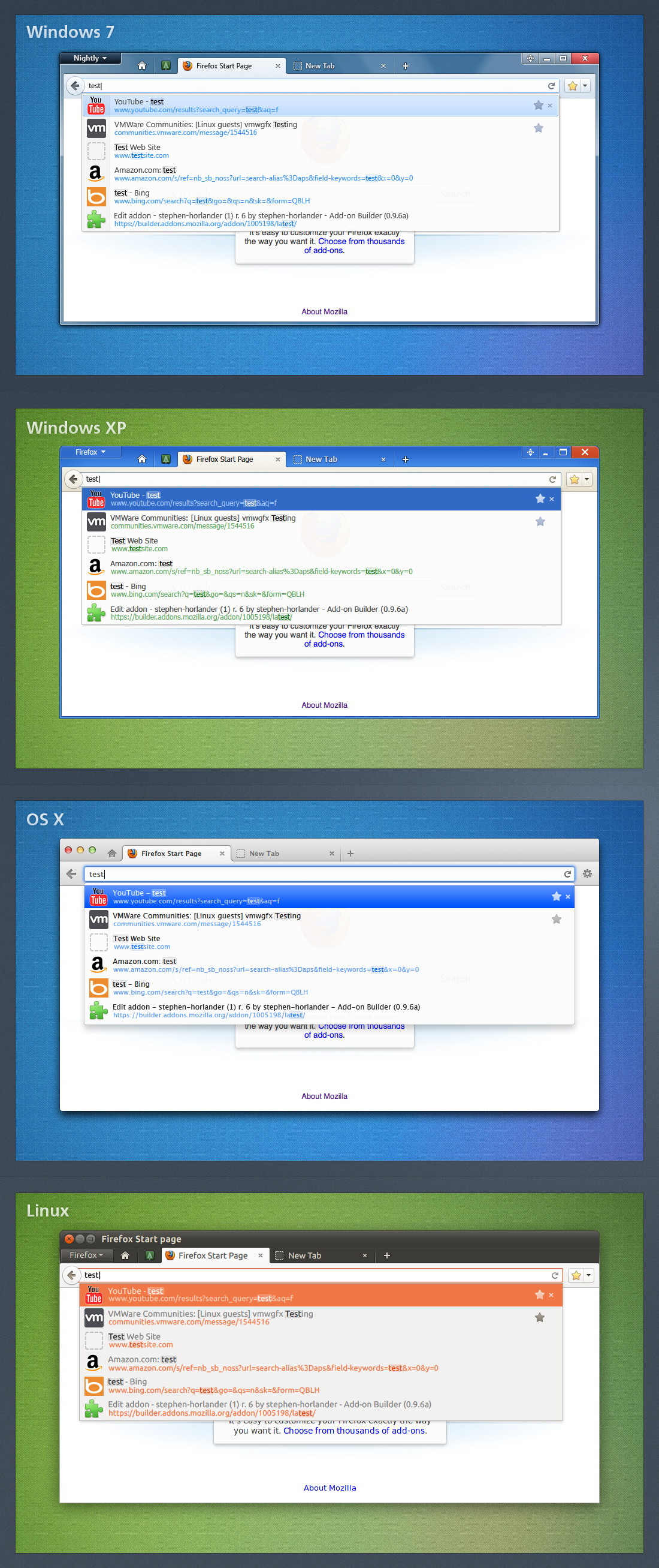
With the landing of bug 587909 searching in the Awesomebar changed from Bolding of the search item to a very light-gray block on the found letter.
Its much too subtle and looks like 'artifacts' on the screen.
Either change back to 'Bold Letters', or better yet make the search/found letters 'Yellow' to match the search function in Win7. Not sure what Vista uses for Highlight.
Comment 1•13 years ago
|
||
I don't think Vista ever had term highlighting in its search function. It should most likely use the Win7 look.
| Reporter | ||
Comment 2•13 years ago
|
||
Yellow highlighting may not be best. Win7 uses that in Explorer when searching.
IE9 changes the searched text to a light-blue.
Chrome just bold-ens the searched text.
Making the searched text bold seems to be the most pleasing and leans toward 'more professional looking' than just the 'block-highlighting'.
And windows explorer handles it by using Yellow Highlight http://i.imgur.com/Iw8mD.jpg
| Assignee | ||
Comment 4•13 years ago
|
||
(In reply to Jim Jeffery not reading bug-mail 1/2/11 from comment #2)
> Making the searched text bold seems to be the most pleasing and leans toward
> 'more professional looking' than just the 'block-highlighting'.
One of the reasons we got rid of bold text is that it shifts the surrounding content as you refine your search. If a result title has the word "Firefox" in it, then as you type each letter of "firefox" into the awesomebar, the matched substring becomes wider from the bold and pushes everything after it to the right. I don't see us going back to bold because of that unattractive shifting problem.
| Reporter | ||
Comment 5•13 years ago
|
||
The 'shift' is not that noticeable. Almost every program on windows that uses bold letters during search shifts the text.
Interesting however is the fact that if you search for a url-string in the awesomebar, say entering: 'bug' to search for a link in bugzilla the letters in the link as they change to a richer color, not sure its bold letters, do NOT shift the results/display. The 1px shift during searching in the 'title' is what should be investigated and fixed to display properly and not cause a shift like when searching the URL's.
IE9 changes the color of the searched text to a 'blue' without any shift. Why not do the same here ?
The blocky highlight of searched text just looks bad, at least with the chosen light-gray color.
| Reporter | ||
Comment 6•13 years ago
|
||
It was pointed out here in the forums that a 1 px shift during a quick search in the Awesomebar is not good practice, but...
The entire Navigation bar shifting back & forth with the removal/add of the 'Forward' button is acceptable.
Your logic for removing the bolding due to shifting text is dubious at best.
This is more change for the sake of change and should be reconsidered.
The bolding during search has been around since 4.0, maybe earlier and to my knowledge there has been not been an out-cry for a change or removal/change of the display of searched text.
| Assignee | ||
Comment 7•13 years ago
|
||
It's worth mentioning that another benefit of a lack of bolding is that we can use a consistent highlight effect for languages containing ligatures (bug 774495).
(In reply to Jim Jeffery not reading bug-mail 1/2/11 from comment #5)
> Interesting however is the fact that if you search for a url-string in the
> awesomebar, say entering: 'bug' to search for a link in bugzilla the letters
> in the link as they change to a richer color, not sure its bold letters, do
> NOT shift the results/display. The 1px shift during searching in the
> 'title' is what should be investigated and fixed to display properly and not
> cause a shift like when searching the URL's.
Yes, the exact width changes depend on font family and size, and even which particular letter is bolded. This is expected. If you continue typing the entire bugzilla URL, it looks like 'z' and 'r' will still cause a shift on the URL line.
There isn't anything to investigate regarding this behavior - this particular font behaves this way when bolded. It seems the only way to fix this would be to use some font that doesn't change the width of its characters when bolded, which I don't think is a good solution to this problem.
> IE9 changes the color of the searched text to a 'blue' without any shift.
> Why not do the same here ?
It's generally not a good idea to convey information through color differences alone, since it may be difficult for color blind or high-contrast theme users to see. There's also the issue of figuring out a proper system color to use while being aesthetically pleasing.
> The blocky highlight of searched text just looks bad, at least with the
> chosen light-gray color.
Don't know what to say here besides "I disagree" - I like the highlight. And while I understand a desire to be consistent with Windows 7's search feature, I think yellow would probably look out of place in the Firefox UI. If we happen to have a proper system color for it we have no way to make it transparent (bug 538727, another reason for a neutral gray to be used). We'd also have to decide on a color for other platforms to solve the subtleness elsewhere...
(In reply to Jim Jeffery not reading bug-mail 1/2/11 from comment #6)
> It was pointed out here in the forums that a 1 px shift during a quick
> search in the Awesomebar is not good practice, but...
>
> The entire Navigation bar shifting back & forth with the removal/add of the
> 'Forward' button is acceptable.
>
> Your logic for removing the bolding due to shifting text is dubious at best.
These little shifts add up as your matched substring gets longer. Another fun problem is that these accumulated shifts will go away all at once when the substring no longer matches. For example, if you go to bugzilla.mozilla.org so it's in your history, then type in "bugzilla", the results will bold that match in the URL and title. Once you add a period, it will match that part in the URL and no longer match anything in the title. This causes the end of the title to shift 5-10px to the left when "Bugzilla" is unbolded. It's worse when longer/multiple matches no longer apply.
I wasn't personally involved in the forward button change you mentioned, but it doesn't make sense to compare it to this problem. The forward button changes state when the user is most likely focusing their attention on that area of the screen (i.e. clicking the back button, or clicking forward until there is no future history). The change isn't suddenly distracting. If the user is using keyboard shortcuts to effect that change in forward button state... well, the entire location bar/identity block/browser content is probably changing anyway since they're navigating to a different page, so it's not much more jarring than normal in that case. I'm sure there were other factors in this decision, but again, I wasn't involved there.
In the case of the awesomebar results shifting, the user is likely focusing on the text box or results. If all of the text in the results is shifting as the user types, this adds useless visual noise in their periphery and distracts from the highlighted matches. This is bad. We'd like the user to be able to see where their query is found in the results as they type without being distracted by irrelevant changes in surrounding text.
> The bolding during search has been around since 4.0, maybe earlier and to my
> knowledge there has been not been an out-cry for a change or removal/change
> of the display of searched text.
Actually, this shifting problem was recognized as an issue with bolding years ago in bug 406254. I'm not sure if this is an outcry-worthy issue regardless (I imagine everyone has resigned themselves to the fact that text will shift when you bold it - it is widespread, like you mentioned). Still good to fix.
All of this being said, I can sympathize with the original problem stated by this bug: concern over lack of emphasis. Jared mentioned in bug 587909 comment 59 that we can just lighten non-matched text with an opacity change instead of the faux bold thing I'm doing, and I wanted to leave that for a follow-up, so I will do it in this bug :) . It's what shorlander's mockup originally had (more or less) and faaborg also proposed it as a solution in bug 406254. Cc'ing shorlander, as he might have comments on this. Perhaps the highlight effect should be made a tad more dark/opaque as well?
Assignee: nobody → fracture91
Status: NEW → ASSIGNED
Summary: Gray Highlight in Awesomebar search is too subtle - Should be 'Yellow' to match Win7 or reverted to 'Bold Letters' → Gray Highlight in Awesomebar search is too subtle
Comment 8•13 years ago
|
||
One design principle of the "awesome bar" is to give you the wanted result with minimal user input. Thus it happens quite often that the search term consists just of one or two letters. The point of the highlight should be to draw attention to the words containing these letters, rather than the letters in isolation. So I don't think we want to significantly de-emphasize the surrounding text.
| Assignee | ||
Comment 9•13 years ago
|
||
(In reply to Dão Gottwald [:dao] from comment #8)
> One design principle of the "awesome bar" is to give you the wanted result
> with minimal user input. Thus it happens quite often that the search term
> consists just of one or two letters. The point of the highlight should be to
> draw attention to the words containing these letters, rather than the
> letters in isolation. So I don't think we want to significantly de-emphasize
> the surrounding text.
We're already de-emphasizing surrounding text to some degree by not drawing a gray box around it, IMO. I don't think that reducing the opacity of surrounding text will detract from this principle as long as it's not reduced so far as to significantly hurt readability. Faaborg's mockup [1] is too light. Shorlander's mockup [2] is more reasonable.
Perhaps if we want to draw attention to the containing words, the highlighting should be smarter and use some midrange emphasis effect for text that belongs to a containing word but wasn't part of the user's input. For example, if a result title is "Get Mozilla Firefox" and the user has typed "fire", then "Fire" in the title is highlighted with the gray box and 100% opacity, "fox" is at 100% opacity with no gray box, and "Get Mozilla" is at <100% opacity. I think that's something for a different bug, though.
[1] https://bug406254.bugzilla.mozilla.org/attachment.cgi?id=343431
[2] https://wiki.mozilla.org/images/a/a8/LocationBar-Results-i01.jpg
| Assignee | ||
Comment 10•13 years ago
|
||
This patch also:
- Increases opacity of highlight in non-selected title on OSX to same level as Windows 7 - seemed especially hard to see otherwise
- Adds the box shadow back to URL highlight on Linux so it has a darker border, like all other highlights
The lowered opacity level is used on all text when you click the dropmarker. I left the "text-shadow: 0 0 currentColor" hack in there, because it seemed like removing it brought us back to the same subtlety that we originally had, thus not addressing the problem in this bug.
| Assignee | ||
Comment 11•13 years ago
|
||
Shorlander: It looked like your mockup used a different font weight on Windows, so I've included an extra screenshot of XP and 7 with font-weight: 600 on the results. Without the additional font weight, the reduced opacity is perhaps too light. Do you think we should go with the increased weight?
Attachment #644095 -
Flags: ui-review?(shorlander)
Comment 12•13 years ago
|
||
Comment on attachment 644087 [details] [diff] [review]
v1 Reduce opacity of non-matched text
>--- a/toolkit/themes/winstripe/global/autocomplete.css
>+++ b/toolkit/themes/winstripe/global/autocomplete.css
>+.ac-subdue-text,
>+html|span.ac-subdue-text {
>+ opacity: 0.7;
>+}
>+
>+.ac-comment > html|span.ac-subdue-text,
>+.ac-comment.ac-subdue-text {
>+ opacity: 0.8;
>+}
This causes gray-scale anti-aliasing.
Attachment #644087 -
Flags: review-
Comment 13•13 years ago
|
||
I don't understand why you have to make everything so drab and implement features in your own way, ignoring native design.
Increasing weight is just too heavy and distracting, why can't it be changed to yellow, is there a specific reason?
The work going on here is a fantastic example of why everybody complains about how Firefox isn't native on any platform.
No offense but stop trying to push your own design agenda and ignoring what others say -- after all isn't Firefox the free and open browser, that puts us first?
There's a reason why it's yellow and it shouldn't hard to realise why.
| Assignee | ||
Comment 14•13 years ago
|
||
(In reply to Dão Gottwald [:dao] from comment #12)
> Comment on attachment 644087 [details] [diff] [review]
> v1 Reduce opacity of non-matched text
>
> >--- a/toolkit/themes/winstripe/global/autocomplete.css
> >+++ b/toolkit/themes/winstripe/global/autocomplete.css
>
> >+.ac-subdue-text,
> >+html|span.ac-subdue-text {
> >+ opacity: 0.7;
> >+}
> >+
> >+.ac-comment > html|span.ac-subdue-text,
> >+.ac-comment.ac-subdue-text {
> >+ opacity: 0.8;
> >+}
>
> This causes gray-scale anti-aliasing.
This looks like a bug in itself - it only happens to me on Windows 7 with HWA enabled. Filed bug 776793. I can't reproduce it with the STR there on Firefox 14.
If it turns out that this is caused by something strange about my setup (only happens on specific driver versions, etc.), we probably shouldn't block on it.
Comment 15•13 years ago
|
||
Comment on attachment 644087 [details] [diff] [review]
v1 Reduce opacity of non-matched text
(In reply to Dão Gottwald [:dao] from comment #12)
> Comment on attachment 644087 [details] [diff] [review]
> v1 Reduce opacity of non-matched text
> This causes gray-scale anti-aliasing.
Bug 776793 will address this so this patch probably won't need any code changes for that. Were there other concerns with the patch?
Attachment #644087 -
Flags: review- → review?(dao)
Comment 16•13 years ago
|
||
(In reply to Matthew N. [:MattN] from comment #15)
> Comment on attachment 644087 [details] [diff] [review]
> v1 Reduce opacity of non-matched text
>
> (In reply to Dão Gottwald [:dao] from comment #12)
> > Comment on attachment 644087 [details] [diff] [review]
> > v1 Reduce opacity of non-matched text
> > This causes gray-scale anti-aliasing.
>
> Bug 776793 will address this so this patch probably won't need any code
> changes for that. Were there other concerns with the patch?
The track record of text rendering shortcomings makes me skeptical that we can count on bug 776793 in the immediate future. That aside, the sub-pixel anti-aliased text in attachment 644095 [details] looks too faint to me (to the extent that I don't think it meets our accessibility standards). I explained earlier in this bug why I don't think we should overstate the highlight at the expense of the surrounding text. Making all text bold doesn't look like an attractive solution either.
| Assignee | ||
Comment 17•13 years ago
|
||
(In reply to Dão Gottwald [:dao] from comment #16)
> The track record of text rendering shortcomings makes me skeptical that we
> can count on bug 776793 in the immediate future.
It looks like they're just turning off Azure by default for now to avoid the bug (and others).
> (to the extent that I don't think it meets our accessibility standards).
You're right, this patch regresses the WCAG2 compliance level with regards to color contrast in some places. I've updated it to not regress the levels (i.e. if the text was at level AAA with 100% opacity, it should stay at that level after the patch). Note that this means the effect is not used in certain cases on certain platforms. If you're looking for AA level as a minimum for "our accessibility standards", that would give some more leeway.
Stephen wanted to see a try build with this patch, so he can find that here whenever they finish building:
https://tbpl.mozilla.org/?tree=Try&rev=9777a4e8788d
https://ftp.mozilla.org/pub/mozilla.org/firefox/try-builds/fracture91@gmail.com-9777a4e8788d/
Attachment #644087 -
Attachment is obsolete: true
Attachment #644087 -
Flags: review?(dao)
Attachment #648242 -
Flags: ui-review?(shorlander)
Attachment #648242 -
Flags: review?(dao)
Comment 18•13 years ago
|
||
Comment on attachment 648242 [details] [diff] [review]
v2 - Don't regress WCAG2 contrast compliance levels
Dao's on holiday for a week, so to avoid holding this up I can handle the code review. Would like to hear Stephen's comments first though.
Attachment #648242 -
Flags: review?(dao) → review?(bmcbride)
Comment 19•13 years ago
|
||
(In reply to Andrew Hurle [:ahurle] from comment #17)
> Created attachment 648242 [details] [diff] [review]
> v2 - Don't regress WCAG2 contrast compliance levels
>
> (In reply to Dão Gottwald [:dao] from comment #16)
> > The track record of text rendering shortcomings makes me skeptical that we
> > can count on bug 776793 in the immediate future.
>
> It looks like they're just turning off Azure by default for now to avoid the
> bug (and others).
>
> > (to the extent that I don't think it meets our accessibility standards).
>
> You're right, this patch regresses the WCAG2 compliance level with regards
> to color contrast in some places. I've updated it to not regress the levels
> (i.e. if the text was at level AAA with 100% opacity, it should stay at that
> level after the patch). Note that this means the effect is not used in
> certain cases on certain platforms. If you're looking for AA level as a
> minimum for "our accessibility standards", that would give some more leeway.
>
> Stephen wanted to see a try build with this patch, so he can find that here
> whenever they finish building:
> https://tbpl.mozilla.org/?tree=Try&rev=9777a4e8788d
> https://ftp.mozilla.org/pub/mozilla.org/firefox/try-builds/fracture91@gmail.
> com-9777a4e8788d/
Hi Dao, I would suggest that AA conformance i.e. contrast ratio of 4.5:1 is sufficient in the default case as long as users can increase the contrast using browser and/or OS level settings if required.
Comment 20•13 years ago
|
||
Comment on attachment 648242 [details] [diff] [review]
v2 - Don't regress WCAG2 contrast compliance levels
># HG changeset patch
># Parent ada7183da42dac857feff683ef8d5bc6c3b10b1c
># User Andrew Hurle <fracture91@gmail.com>
>Bug 774118 - Make awesomebar matches less subtle by reducing opacity of non-matched text
>
>diff --git a/toolkit/content/widgets/autocomplete.xml b/toolkit/content/widgets/autocomplete.xml
>--- a/toolkit/content/widgets/autocomplete.xml
>+++ b/toolkit/content/widgets/autocomplete.xml
>@@ -1200,37 +1200,37 @@
> <xul:hbox align="center" class="ac-title-box">
> <xul:image xbl:inherits="src=image" class="ac-site-icon"/>
> <xul:hbox anonid="title-box" class="ac-title" flex="1"
> onunderflow="_doUnderflow('_title');"
> onoverflow="_doOverflow('_title');">
> <xul:description anonid="title" class="ac-normal-text ac-comment" xbl:inherits="selected"/>
> </xul:hbox>
> <xul:label anonid="title-overflow-ellipsis" xbl:inherits="selected"
>- class="ac-ellipsis-after ac-comment"/>
>+ class="ac-ellipsis-after ac-comment ac-subdue-text"/>
> <xul:hbox anonid="extra-box" class="ac-extra" align="center" hidden="true">
> <xul:image class="ac-result-type-tag"/>
>- <xul:label class="ac-normal-text ac-comment" xbl:inherits="selected" value=":"/>
>+ <xul:label class="ac-normal-text ac-comment ac-subdue-text" xbl:inherits="selected" value=":"/>
> <xul:description anonid="extra" class="ac-normal-text ac-comment" xbl:inherits="selected"/>
> </xul:hbox>
> <xul:image anonid="type-image" class="ac-type-icon"/>
> </xul:hbox>
> <xul:hbox align="center" class="ac-url-box">
> <xul:spacer class="ac-site-icon"/>
> <xul:image class="ac-action-icon"/>
> <xul:hbox anonid="url-box" class="ac-url" flex="1"
> onunderflow="_doUnderflow('_url');"
> onoverflow="_doOverflow('_url');">
> <xul:description anonid="url" class="ac-normal-text ac-url-text"
> xbl:inherits="selected type"/>
>- <xul:description anonid="action" class="ac-normal-text ac-action-text"
>+ <xul:description anonid="action" class="ac-normal-text ac-action-text ac-subdue-text"
> xbl:inherits="selected type"/>
> </xul:hbox>
> <xul:label anonid="url-overflow-ellipsis" xbl:inherits="selected"
>- class="ac-ellipsis-after ac-url-text"/>
>+ class="ac-ellipsis-after ac-url-text ac-subdue-text"/>
> <xul:spacer class="ac-type-icon"/>
> </xul:hbox>
> </content>
> <implementation implements="nsIDOMXULSelectControlItemElement">
> <constructor>
> <![CDATA[
> let ellipsis = "\u2026";
> try {
>@@ -1399,26 +1399,28 @@
> let start = 0;
> let len = indices.length;
> // Even indexed boundaries are matches, so skip the 0th if it's empty
> for (let i = indices[0] == 0 ? 1 : 0; i < len; i++) {
> next = indices[i];
> let text = aText.substr(start, next - start);
> start = next;
>
>+ let span = document.createElementNS("http://www.w3.org/1999/xhtml", "span");
>+ span.textContent = text;
>+
> if (i % 2 == 0) {
> // Emphasize the text for even indices
>- let span = aDescriptionElement.appendChild(
>- document.createElementNS("http://www.w3.org/1999/xhtml", "span"));
> span.className = "ac-emphasize-text";
>- span.textContent = text;
> } else {
>- // Otherwise, it's plain text
>- aDescriptionElement.appendChild(document.createTextNode(text));
>+ // Otherwise, subdue the text
>+ span.className = "ac-subdue-text";
> }
>+
>+ aDescriptionElement.appendChild(span);
> }
> ]]>
> </body>
> </method>
>
> <method name="_adjustAcItem">
> <body>
> <![CDATA[
>diff --git a/toolkit/themes/gnomestripe/global/autocomplete.css b/toolkit/themes/gnomestripe/global/autocomplete.css
>--- a/toolkit/themes/gnomestripe/global/autocomplete.css
>+++ b/toolkit/themes/gnomestripe/global/autocomplete.css
>@@ -155,28 +155,34 @@ treechildren.autocomplete-treebody::-moz
> padding: 0;
> }
>
> .ac-normal-text > html|span {
> margin: 0 !important;
> padding: 0;
> }
>
>+.ac-subdue-text,
>+html|span.ac-subdue-text {
>+ opacity: 0.9;
>+}
>+
>+.ac-url-text.ac-subdue-text,
>+.ac-action-text.ac-subdue-text,
>+.ac-url-text > html|span.ac-subdue-text {
>+ opacity: 0.8;
>+}
>+
> html|span.ac-emphasize-text {
> box-shadow: inset 0 0 1px 1px rgba(0,0,0,0.1);
> background-color: rgba(0,0,0,0.05);
> border-radius: 2px;
> text-shadow: 0 0 currentColor; /*faux bold effect*/
> }
>
>-.ac-url-text > html|span.ac-emphasize-text,
>-.ac-action-text > html|span.ac-emphasize-text {
>- box-shadow: none;
>-}
>-
> .ac-normal-text[selected="true"] > html|span.ac-emphasize-text {
> box-shadow: inset 0 0 1px 1px rgba(255,255,255,0.3);
> background-color: rgba(255,255,255,0.2);
> }
>
> .ac-title, .ac-url {
> overflow: hidden;
> }
>diff --git a/toolkit/themes/pinstripe/global/autocomplete.css b/toolkit/themes/pinstripe/global/autocomplete.css
>--- a/toolkit/themes/pinstripe/global/autocomplete.css
>+++ b/toolkit/themes/pinstripe/global/autocomplete.css
>@@ -146,29 +146,39 @@ treechildren.autocomplete-treebody::-moz
> padding: 0;
> }
>
> .ac-normal-text > html|span {
> margin: 0 !important;
> padding: 0;
> }
>
>+.ac-comment:not([selected="true"]) > html|span.ac-subdue-text,
>+.ac-comment.ac-subdue-text:not([selected="true"]) {
>+ opacity: 0.85;
>+}
>+
> html|span.ac-emphasize-text {
>- box-shadow: inset 0 0 1px 1px rgba(208,208,208,0.4);
>- background-color: rgba(208,208,208,0.2);
>+ box-shadow: inset 0 0 1px 1px rgba(208,208,208,0.5);
>+ background-color: rgba(208,208,208,0.3);
> border-radius: 2px;
> text-shadow: 0 0 currentColor;
> }
>
> .ac-url-text > html|span.ac-emphasize-text,
> .ac-action-text > html|span.ac-emphasize-text {
> box-shadow: inset 0 0 1px 1px rgba(183,210,226,0.4);
> background-color: rgba(183,210,226,0.3);
> }
>
>+.ac-comment[selected="true"] > html|span.ac-emphasize-text {
>+ box-shadow: inset 0 0 1px 1px rgba(208,208,208,0.4);
>+ background-color: rgba(208,208,208,0.2);
>+}
>+
> .ac-title, .ac-url {
> overflow: hidden;
> }
>
> /* ::::: textboxes inside toolbarpaletteitems ::::: */
>
> toolbarpaletteitem > toolbaritem > textbox > hbox > hbox > html|*.textbox-input {
> visibility: hidden;
>diff --git a/toolkit/themes/winstripe/global/autocomplete.css b/toolkit/themes/winstripe/global/autocomplete.css
>--- a/toolkit/themes/winstripe/global/autocomplete.css
>+++ b/toolkit/themes/winstripe/global/autocomplete.css
>@@ -177,35 +177,69 @@ treechildren.autocomplete-treebody::-moz
> padding: 0;
> }
>
> .ac-normal-text > html|span {
> margin: 0 !important;
> padding: 0;
> }
>
>+.ac-subdue-text,
>+html|span.ac-subdue-text {
>+ opacity: 0.8;
>+}
>+
>+.ac-url-text.ac-subdue-text,
>+.ac-action-text.ac-subdue-text,
>+.ac-url-text > html|span.ac-subdue-text {
>+ opacity: 0.7;
>+}
>+
> html|span.ac-emphasize-text {
> box-shadow: inset 0 0 1px 1px rgba(208,208,208,0.5);
> background-color: rgba(208,208,208,0.3);
> border-radius: 2px;
> text-shadow: 0 0 currentColor;
> }
>
> @media (-moz-windows-default-theme) {
> %ifdef WINSTRIPE_AERO
> html|span.ac-emphasize-text {
> box-shadow: inset 0 0 1px 1px rgba(0,0,0,0.1);
> background-color: rgba(0,0,0,0.05);
> }
>+ .ac-url-text.ac-subdue-text,
>+ .ac-action-text.ac-subdue-text,
>+ .ac-url-text > html|span.ac-subdue-text {
>+ opacity: 0.9;
>+ }
>+ .ac-url-text.ac-subdue-text[selected="true"],
>+ .ac-action-text.ac-subdue-text[selected="true"],
>+ .ac-url-text[selected="true"] > html|span.ac-subdue-text {
>+ opacity: 1;
>+ }
> %else
>- .ac-url-text > html|span.ac-emphasize-text,
>- .ac-action-text > html|span.ac-emphasize-text {
>+ .ac-url-text > html|span.ac-emphasize-text {
> box-shadow: inset 0 0 1px 1px rgba(202,214,201,0.3);
> background-color: rgba(202,214,201,0.2);
> }
>+ .ac-url-text.ac-subdue-text,
>+ .ac-action-text.ac-subdue-text,
>+ .ac-url-text > html|span.ac-subdue-text {
>+ opacity: 1;
>+ }
>+ .ac-subdue-text[selected="true"],
>+ .ac-normal-text[selected="true"] > html|span.ac-subdue-text {
>+ opacity: 0.95;
>+ }
>+ .ac-url-text.ac-subdue-text[selected="true"],
>+ .ac-action-text.ac-subdue-text[selected="true"],
>+ .ac-url-text[selected="true"] > html|span.ac-subdue-text {
>+ opacity: 0.9;
>+ }
> %endif
> }
>
> .ac-title, .ac-url {
> overflow: hidden;
> }
>
> /* ::::: textboxes inside toolbarpaletteitems ::::: */
Attachment #648242 -
Flags: review-
Comment 21•13 years ago
|
||
My comment didn't get through... Here it is again:
I'd like to see some evidence or reasonable explanation why making the text lighter at all would be a usability win. The string that user just entered actually isn't informative at all, the context is. As far as I can tell, we simply don't know what part of the text will help the user identify the wanted entry. It may even be some word that the search string isn't part of. Highlighting the search string is merely a hint.
So I'm putting my r- back in here until the above question is cleared up. In the meantime, I'd suggest just landing the part that makes the highlight background and box-shadow more opaque.
Updated•13 years ago
|
Attachment #648242 -
Flags: review?(bmcbride)
Comment 22•13 years ago
|
||
Clearly no-one bothered to test this change on a variety of monitors. Whilst the grey background behind the text is visible on my fairly new HP 25" monitor, it barely shows up at all on my older Dell 20". I suspect many of your users will be experiencing similar problems due to this short-sighted and unnecessary change.
Updated•10 years ago
|
Attachment #648242 -
Flags: ui-review?(shorlander)
Updated•10 years ago
|
Attachment #644095 -
Flags: ui-review?(shorlander)
Comment 25•9 years ago
|
||
doesn't apply to the new style (but we also have a new bug 1262606)
Status: ASSIGNED → RESOLVED
Closed: 9 years ago
Resolution: --- → INVALID
You need to log in
before you can comment on or make changes to this bug.
Description
•