Closed
Bug 818673
Opened 12 years ago
Closed 4 years ago
Encourage people to add revision comments
Categories
(developer.mozilla.org Graveyard :: Collaboration, enhancement)
developer.mozilla.org Graveyard
Collaboration
Tracking
(Not tracked)
RESOLVED
WONTFIX
People
(Reporter: openjck, Unassigned)
References
Details
(Whiteboard: [triaged][type:feature][patchwelcome][difficulty=intermediate])
Attachments
(2 files, 2 obsolete files)
Sheppy: Assigning this to you as we discussed in the meeting today.

Please let us know whether writers would like this feature and, in as much detail as possible, what you would like this feature to look like.
Comment 1•12 years ago
|
||
Attached a PNG of a mockup for this request that would appear when saving a change if there's no revision comment already specified.
Comment 2•12 years ago
|
||
Maybe the popup should be first, and get default focus, since most people will probably use that for quick saves?
Comment 3•12 years ago
|
||
Switched to using a list instead of a popup for the predefined comments; swapped the list and the edit box -- most people will likely use predefined comments, so it should get first focus.
Attachment #689311 -
Attachment is obsolete: true
Comment 4•12 years ago
|
||
So for, only one person I've talked to (:davidwalsh) has said they'd be overly annoyed by this dialog popping up if they forgot to enter an edit comment.

Maybe we could make it so you could bypass it with a modifier key when clicking the save button?
Comment 5•12 years ago
|
||
I've also mocked this up using a combo box that combines the text field and list of predefined options into a single combo box control; this has the benefit of doing autocomplete and reducing the need to tab or click around to choose your comment.
Comment 7•12 years ago
|
||
How about this idea: if the user doesn't begin to type a comment, or start to click around in the predefined comments list, within, say 15-20 seconds (time to be determined), the box automatically dismisses and the article is saved without a comment?

This would let people have time to remember to add a comment, but would not necessarily slow people down too much in their workflow if they don't want to.

We can also at some point look into adding a user preference to disable the box entirely.

Thoughts?
Attachment #689321 -
Attachment is obsolete: true
Comment 8•12 years ago
|
||
Is this in addition to moving the revision comment field up directly under the Save buttons? Currently, you have to scroll to the bottom of the page to see it, completely disconnected from the other save-related UI elements.
Comment 9•12 years ago
|
||
(In reply to Janet Swisher from comment #8)
> Is this in addition to moving the revision comment field up directly under
> the Save buttons? Currently, you have to scroll to the bottom of the page to
> see it, completely disconnected from the other save-related UI elements.

Good question. I'm not sure I like the idea of taking up so much more space up at the top of the screen that you can't use for editing.
Comment 10•12 years ago
|
||
I think some judicious tweaking could squeeze the revision field into space that is currently unused at the top of the screen.

I don't think users will like being prompted because they failed to fill in a field they couldn't even see.

Perhaps we can get some interaction design advice?
Comment 11•12 years ago
|
||
I'm with Janet. Most of the time, I don't add a comment because the comment box is far from the save button. I think we should try first by putting both of them next one to the other.

Also I think we should duplicate them (at the top and the bottom of the page), or to have them always visible, at any position we are in the page.

If the collocation of Save and the comment box is not enough, it would still be possible to look for more complex solutions.
Comment 12•12 years ago
|
||
If we can move the comment box to the top without taking up more space, then let's try that. I personally would still rather have the dialog but that's just me, I think. :)
| Reporter | ||
Comment 13•12 years ago
|
||
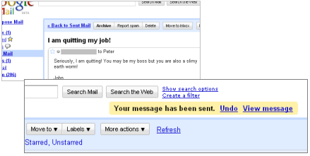
Some really great ideas here. I especially love the pre-defined comment options.

With regard to positioning, have we ever considered putting the save button (and other buttons) at the bottom of the page, near the revision comment field?

When it comes to the popup, I have to agree with David. I would be annoyed by it, and I expect that most users would feel the same way. In fact, popup boxes present an even bigger challenge: habituation. Users get used to clicking a certain option (in this case, possibly "Cancel") and instinctively click it even when they don't want to. Have you ever clicked "OK" on a dialog only to wonder what you agreed to? The same thing could happen here.

So while I do think we should encourage users to provide useful comments, I wonder if a popup box would really help.

What else could we do to prompt the user? I really like an interface Meetup presents to new users. Signing up for your first event is very straightforward. After all, most users want to get this done as quickly as possible. It is only /after/ you sign up that you are presented with the chance to choose some interests for event recommendations. Believe it or not, I found myself using that form recently despite usually ignoring similar questions. Why? By that point I had already done what I needed to do. I was no longer rushing through the form as quickly as possible and avoiding distractions. If they moved that "interests" form earlier in the workflow, I never would have used it.

Maybe we could do something similar in the MDN. After a user submits some edits, he could be presented with the option to share more details. The notice could look like the GMail undo feature (http://blogoscoped.com/files/gmail-undo-feature.png) or the "Draft saved" feature of the MDN -- there if he needs it, but not a distraction from his ultimate goal of updating the page. The notice could remind him that if he shares more details he could reduce the likelihood of his edit being trashed. Not being in a rush to save his hard work, he might take the suggestion to heart.

Just one idea. I would like to get some user experience volunteers into the discussion here too.
| Reporter | ||
Updated•11 years ago
|
Whiteboard: p=
| Reporter | ||
Updated•11 years ago
|
Summary: Research: Encourage people to add revision comments → Encourage people to add revision comments
| Reporter | ||
Updated•10 years ago
|
Severity: normal → enhancement
Whiteboard: [triaged][type:feature]
Comment 14•9 years ago
|
||
Added productwanted so that it is added to the Product Manager radar.
Keywords: productwanted
Comment 15•9 years ago
|
||
Personally I disagree with John and David. Adding a revision comment is an important step in version control and people should be actively asked to add one. This is how virtually all VCS clients work, like e.g. the ones in Eclipse or Netbeans or TortoiseSVN/GIT.

I.e. the user should be prompted to summarize his changes. In case he really doesn't want to add a comment, he can dismiss it by clicking 'Save changes'/'OK' a second time or hitting Ctrl+Enter.

In Sheppy's mockup the message above the dialog should be reduced to 'Please summarize your changes. You may also choose from the list below.' You may add a link to a description why revision comments are important.

Sebastian
Keywords: productwanted
Updated•9 years ago
|
Keywords: productwanted
Comment 16•9 years ago
|
||
Obviously, I agree with Sebastian here. :)
Comment 17•9 years ago
|
||
Comments from the product council meeting:
* This bug will support editors and content maintainers
* A requirement to submit a comment will likely have a noticeable effect on the number of revisions (which might be good)
* A requirement to submit a comment will impact our most frequent contributors the most
* If we require a comment, it should be easier to submit a comment than it is now
Keywords: productwanted
Whiteboard: [triaged][type:feature] → [triaged][type:feature][patchwelcome][difficulty=intermediate]
Comment 18•9 years ago
|
||
I've created this Firefox add-on:

https://addons.mozilla.org/en-US/firefox/addon/mdn-save-with-comment-hotkey/

This focuses the revision comment edit box and scrolls it into view.

It's not a perfect solution, but it's a handy start.

I'm working on an update that will instead of scrolling present a dialog box prompting for the comment.
Comment 19•4 years ago
|
||
MDN Web Docs' bug reporting has now moved to GitHub. From now on, please file content bugs at https://github.com/mdn/sprints/issues/ and platform bugs at https://github.com/mdn/kuma/issues/.
Status: NEW → RESOLVED
Closed: 4 years ago
Resolution: --- → WONTFIX
Updated•4 years ago
|
Product: developer.mozilla.org → developer.mozilla.org Graveyard
You need to log in
before you can comment on or make changes to this bug.
Description
•