Closed
Bug 763863
Opened 13 years ago
Closed 13 years ago
Design mobile search page
Categories
(Marketplace Graveyard :: Consumer Pages, defect, P1)
Tracking
(Not tracked)
RESOLVED
FIXED
2012-06-21
People
(Reporter: cvan, Assigned: sawyer)
References
()
Details
(Keywords: uiwanted)
Attachments
(8 files)
Requirements:
- Filters (collapsible)
* Category (currently you can select only one at a time, but we can easily make these checkboxes à la http://i.imgur.com/cd1kq.png)
* Price
+ Free
+ Paid
+ Free w/ In-App (currently we do not expose "... w/ In-App" as separate options; this is an open-ended UX question)
+ Paid w/ In-App
* Optimized for
+ Desktop
+ Mobile
+ Tablet
- Sort options (could be collapsible)
* Relevance
* Weekly Downloads
* Top Rated
* Price
* Newest
- Counts/Pages
* We currently surface the total, previous/next buttons, and page numbers/offsets. We do not necessarily have to show all this information in the same format. However, we should somehow let the user know which results they have looked at and be able to track where the user left off upon leaving the page.
- Items
* While there are quite a few results being shown on desktop — and we can show more than this — this would be the bare minimum:
+ Name
+ Price
+ Icon
+ Rating
* It would be supremely cool if we could somehow expose screenshots or thumbnails of the screenshots so users could browse those without having to directly visit a detail page. (This is totally Maria's idea, and she has some good thinking on how we could make this work.)
* It would probably make good sense for us to display the items very similar to how they are presented on the homepage (http://i.imgur.com/ADSsy.png).
Bug 758341 covers the front-end+backend implementation of the design set forth in this bug.
| Reporter | ||
Updated•13 years ago
|
Whiteboard: [ui]
Target Milestone: --- → 2012-06-14
| Assignee | ||
Comment 1•13 years ago
|
||
| Reporter | ||
Comment 2•13 years ago
|
||
Pretty!
A few questions/remarks:
- I'd change "Premium" to read "Free" since that might be translate better in other languages.
- Did we intentionally want to omit weekly downloads?
- In the last panel there is an "X" next to the search field. Will it be clear to users that the "X" means cancel the search?
* Perhaps we could use the iPhone pattern of including the "X" inside the search <input> and maybe add a "Search" button (à la http://cl.ly/3d1u3e1A2Q3Z3u0b0t11)? I do, however, have concerns that — unless you're a regular user of a smart phone/browser — users may not be familiar of the pattern of pressing ENTER to trigger a search.
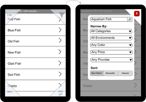
- Search facets/filters
* Category (required): http://cl.ly/141o220y1Q0C0u2Q0v1x
* Sort order (required): http://cl.ly/03262l2j000U0f1y1R30
* Examples (albeit ugly ones): http://www.uxmatters.com/mt/archives/2010/04/images/figure_4_four_corners.jpg or http://blogs.library.ucsf.edu/mobilized/files/2011/12/yelp_filters.png
- How do I view all the apps from a particular category here? On desktop/tablet we have http://cl.ly/3x473T0T2w1i2W403C0U
- How do we distinguish a "featured" (aka "sponsored") listing? On desktop/tablet we have http://cl.ly/0A440a2Z3M0E3m1O2B2H
Comment 3•13 years ago
|
||
We are still working on what this page will look like.
I would like us to try and start out as minimal as possible regarding the filter and sorting options. From my experience users care a lot about paid/free and relevance/rating and not so much about other filters. I can definitely see us expanding to more sophisticated filter/sorting options in the future, but for v1 I say let's start with free/paid and relevancy/rating only.
I'm hoping we can fit those on the search results page itself, that bypasses a bunch of difficult usability issues with communicating whether filters are sticky etc. When we add more, we'll have to move them to a separate window, as shown in Chris's example.
| Reporter | ||
Comment 4•13 years ago
|
||
(In reply to msandberg from comment #3)
> I would like us to try and start out as minimal as possible regarding the
> filter and sorting options. From my experience users care a lot about
> paid/free and relevance/rating and not so much about other filters. I can
> definitely see us expanding to more sophisticated filter/sorting options in
> the future, but for v1 I say let's start with free/paid and relevancy/rating
> only.
This seems reasonable. How and where can I filter by a category? If we forgo this on search results, how would I be able to browse apps by a particular category (without having to go to the homepage)?
| Reporter | ||
Updated•13 years ago
|
Target Milestone: 2012-06-14 → 2012-06-21
Comment 5•13 years ago
|
||
(In reply to Chris Van Wiemeersch [:cvan] from comment #4)
> This seems reasonable. How and where can I filter by a category? If we forgo
> this on search results, how would I be able to browse apps by a particular
> category (without having to go to the homepage)?
I added a minimal version of the category filter in the new filters screen that only has all/games/music. Happy to discuss extending this, and choosing which category filters are the most interesting, but this might be a good place to start? Adding designs shortly.
Comment 6•13 years ago
|
||
The browse page is reached by clicking a category or performing a search.
1. Filters will be available by clicking the filter button. Filter page design (https://www.dropbox.com/s/swc6zzay4mmic6p/filters.jpg)
2. Clicking the free/price button will start the installation flow. (TBA, go with current for now)
3. Clicking anywhere on an app but the price button opens up the app details page.
Specs in https://bugzilla.mozilla.org/show_bug.cgi?id=761906.
4. Switching between the list and detailed list is done by an overlay toggle.
Shown on top is apps featured within the category (or search if applicable). If no featured apps, just show list. The detailed view is overwhelming with featured apps, will have to iterate on this.
List view: https://www.dropbox.com/s/qq6ww6mneo1z27h/search-list-0801.jpg
Expanded view: https://www.dropbox.com/s/g7nf7bwvspv4ap6/search-detail-08.jpg
The expanded view scrolls vertically just like the list view.
- The expanded view shows one screenshot and allows for horizontal scrolling to the right for more screenshots.
- The user can scroll to the left to see "cards" with a few reviews and the app summary.
Comment 7•13 years ago
|
||
Comment 8•13 years ago
|
||
Comment 9•13 years ago
|
||
| Reporter | ||
Comment 10•13 years ago
|
||
These look great.
Filter screen:
- Are the grayed-out buttons the selected ones (http://cl.ly/343I2X300S0Y351m0q0M)? I'm used to white to denote the active/selected state. That confused me initially.
- If I do a new search we reset the filters, yes?
- Filter by Category is probably going to have to be a <select> drop-down. That okay?
List view:
- Similar to the point above, the greyed out list view icon next to the bright graphical view icon confused me. (http://cl.ly/1L1N3S2e1o1D040Q1U2L)
- Rocket button goes home or back? (http://cl.ly/3D3c3m303M0P2k0K2b1J) We won't be able to modify settings from here, correct?
- Can we get a 1px border in between the featured apps? (The gradient throws me off http://cl.ly/3z1S3v1i2E0V1k1M2d2M and it probably won't look great on mobile unfortunately.)
Graphical view:
- Absolutely adore this. <3
- If I scroll down, am I guaranteed to see only one app all the time? (http://cl.ly/2n0o2b180v1Z1q334640) Or is it just whatever fits fits? (We might need to make it shorter so that people understand there's more than one app being listed - but I guess we'll have to wait until we see it on the devices.)
| Reporter | ||
Comment 11•13 years ago
|
||
Since we are allowing "sort by rating" are we going to be showing number of reviews alongside star rating for each app? In the mock we are not - http://cl.ly/0p261f2B2l181O2M0w3A - which could make it difficult to compare multiple similarly rated apps.
| Reporter | ||
Comment 12•13 years ago
|
||
Can we get the .PSD source files for these designs (and the homepage, etc.)? Thanks!
Comment 13•13 years ago
|
||
(In reply to Chris Van Wiemeersch [:cvan] from comment #11)
> Since we are allowing "sort by rating" are we going to be showing number of
> reviews alongside star rating for each app? In the mock we are not -
> http://cl.ly/0p261f2B2l181O2M0w3A - which could make it difficult to compare
> multiple similarly rated apps.
Hm, that fell through the cracks. The number of reviews should be shown. The mocks will have to be touched up to reflect that, can you move ahead without that? I'll upload the .psd files later today.
Comment 14•13 years ago
|
||
This .psd contains both the standard and expanded list views. If you have any problems seeing both or maneuvering photoshop let me know.
Updated•13 years ago
|
Attachment #636880 -
Attachment description: Search results / browse screen → .psd - search results / browse screen
Comment 15•13 years ago
|
||
Comment 16•13 years ago
|
||
Comment 17•13 years ago
|
||
(In reply to Chris Van Wiemeersch [:cvan] from comment #10)
> These look great.
yay!
> Filter screen:
> - Are the grayed-out buttons the selected ones
> (http://cl.ly/343I2X300S0Y351m0q0M)? I'm used to white to denote the
> active/selected state. That confused me initially.
Yes, the gray is the selected state right now. Agreed that it's not optimal, we will update the visuals when we do the full visual review.
> - If I do a new search we reset the filters, yes?
Yes. We may need to revisit the option of having filters be sticky later.
> - Filter by Category is probably going to have to be a <select> drop-down.
> That okay?
Mmhrm, why do we need it to be a drop-down? Is this to accommodate for all the categories? I think we should be conservative to begin with and see what filters will actually be needed to not overwhelm the user.
> List view:
> - Similar to the point above, the greyed out list view icon next to the
> bright graphical view icon confused me. (http://cl.ly/1L1N3S2e1o1D040Q1U2L)
Noted, will look at the toggle.
> - Rocket button goes home or back? (http://cl.ly/3D3c3m303M0P2k0K2b1J) We
> won't be able to modify settings from here, correct?
Rocket button goes home. Settings are only reachable from home screen.
> - Can we get a 1px border in between the featured apps? (The gradient throws
> me off http://cl.ly/3z1S3v1i2E0V1k1M2d2M and it probably won't look great on
> mobile unfortunately.)
Yeah, we need to figure something out for the featured apps, it's a little overwhelming to have them there - especially in the expanded list view.
>
> Graphical view:
> - Absolutely adore this. <3
:)
> - If I scroll down, am I guaranteed to see only one app all the time?
> (http://cl.ly/2n0o2b180v1Z1q334640) Or is it just whatever fits fits? (We
> might need to make it shorter so that people understand there's more than
> one app being listed - but I guess we'll have to wait until we see it on the
> devices.)
Yeah, we need to make sure that we can show enough of the next app to indicate that the user can scroll down. Let's start with a continuous scroll (user can stop at any point and we just show wherever they stopped). Later we might try out a scroll that "snaps" the view, so when a user stops scrolling we make sure that the view starts with the top of a new app.
Comment 18•13 years ago
|
||
thanks. implementation bug is bug 769029
Status: NEW → RESOLVED
Closed: 13 years ago
Resolution: --- → FIXED
You need to log in
before you can comment on or make changes to this bug.
Description
•