Closed
Bug 244025
Opened 21 years ago
Closed 21 years ago
More obvious secure site indication - url bar and status icon
Categories
(Firefox :: Address Bar, defect, P2)
Tracking
()
VERIFIED
FIXED
Firefox1.0beta
People
(Reporter: bugs, Assigned: kevin)
References
Details
(Keywords: fixed-aviary1.0)
Attachments
(3 files, 1 obsolete file)
|
9.41 KB,
patch
|
Details | Diff | Splinter Review | |
|
97.60 KB,
image/png
|
Details | |
|
12.32 KB,
image/png
|
Details |
This is for discussion about making the fact that you're at a secure page more
noticable.
Here's one idea.
http://www.bengoodger.com/software/mb/urlbar.png
| Reporter | ||
Updated•21 years ago
|
Status: NEW → ASSIGNED
Flags: blocking1.0+
Target Milestone: --- → Firefox1.0beta
Comment 1•21 years ago
|
||
What's the rationale for putting this in the url bar?
It just seems to me that the "status bar" is the correct place to put icons
that pertain to the status of a page. Maybe we just need to change the current
status bar icon a bit? Fwiw, Konqueror displays an icon in the status bar on a
secure site and the security icon on the toolbar changes from unlocked to
locked (this latter action isn't too obvious). But we could easily add a
toolbar icon that changed from greyed out to active on a secure site and place
it on the toolbar by default to the right of the Go button.
I'm also not keen on seeing the url bar filled with the cautionary colour
yellow - secured sites should not be construed as a source of worry or
concern, which is what yellow does. A friendly shade of green is far more
appropriate. I would also use it as a border rather than colouring the entire
field.
My preference would be to simply improve the existing status bar icon
behaviour, and, if necessary, throw a green/yellow/red border around the url
bar as appropriate (but I wouldn't put anything in the bar itself).
Comment 2•21 years ago
|
||
I like the URL bar idea, could go either way on the yellow, really.
Options off the top of my head:
Replace the throbber/site icon (not sure if that works on Mac)
Make the statusbar panel have a green background and actual text to raise the
visibility. Something like "This site is secure" next to the icon. If it was
all background of green, it'd be quite obvious, but possibly ugly as well.
| Reporter | ||
Updated•21 years ago
|
Priority: -- → P3
| Reporter | ||
Comment 3•21 years ago
|
||
this doesn't remove the status icon. perhaps the status icon should be removed.
Mike, do you want to test this patch and tell me what you think?
| Reporter | ||
Comment 4•21 years ago
|
||
I should try green too as david suggests... I used yellow since that's
traditionally been the "secure site" color in Netscape browsers.
The problem I have with any status notifications is that they're hard to see.
Often I go to a site and get to the last stage of a potential transaction before
remembering to look for SSL indication.
Using a background is easy as it allows us to maintain the native-theme-rendered
appearance of the location bar in all states.
Priority: P3 → P2
| Reporter | ||
Comment 5•21 years ago
|
||
(my patch implements a slightly softer shade of yellow:
http://www.bengoodger.com/software/mb/secure.png
)
| Reporter | ||
Comment 6•21 years ago
|
||
Attachment #150631 -
Attachment is obsolete: true
| Reporter | ||
Comment 7•21 years ago
|
||
Fixed. We'll test this for a while to see how it goes.
Status: ASSIGNED → RESOLVED
Closed: 21 years ago
Resolution: --- → FIXED
| Reporter | ||
Comment 8•21 years ago
|
||
actually, this needs to be hooked up for pinstripe too.
Status: RESOLVED → REOPENED
Resolution: FIXED → ---
| Reporter | ||
Updated•21 years ago
|
Status: REOPENED → ASSIGNED
OS: All → MacOS X
Hardware: All → Macintosh
Comment 9•21 years ago
|
||
I could have sworn I was cced on this bug until I saw the checkin.
hmm, looks like the change for winstripe didn't make trunk?
Comment 10•21 years ago
|
||
Great change. Maybe move the icon to the left, so that it's close to the domain
and also more visible? Maybe you then won't need the color change.
Comment 11•21 years ago
|
||
The icon of a key is not displayed when the site of SSL is displayed.
Mac OS X 10.3.4
Mozilla/5.0 (Macintosh; U; PPC Mac OS X Mach-O; ja-JP; rv:1.7) Gecko/20040620
Firefox/0.9.0+
Comment 12•21 years ago
|
||
see comment 8, this isn't hooked up for pinstripe yet
Comment 13•21 years ago
|
||
Colouring the url bar is a nice idea, but removing the status bar icon will lead
to problem for those that don't use the url bar. The url bar is after all an
optional component.
Comment 14•21 years ago
|
||
the status bar has always been optional too. However, more importantly, the
URL bar isn't present on most popup (i.e. login popups), but the status bar
often is (There is also a possibility of making the status bar always shown for
security reasons. IE is moving towards that). We might need to examine when to
still show the statusbar icon.
Some of the theme authors are curious as to whether or not this requires a
skinVersion change - since page security is now shown in the URL bar, if the
theme doesn't implement the necessary theme-fu to make it look right, people
won't know that the page is secure.
Could this be a problem?
Comment 16•21 years ago
|
||
> There is also a possibility of making the status bar always shown
[because of the lock icon]
I thought Mozilla and/or FF already did that or it was planned?
Comment 17•21 years ago
|
||
that discussion is in bug 245406. seems to me that we have two bugs for the same
issue, with work going in different directions...
Comment 18•21 years ago
|
||
I have to agree with comment #14 and comment #15 as well.
1. With any theme other than the defualt there is now no security ICON.
2. If a website opens a secure pop-up and does not display the status bar so
that the secure ICON is not displayed, that is the webistes fault. If it does
not display the location-bar and the browser has decided to buck a convention
used by all browsers up to now and NOT display a security indication in the
statusbar, that is the browsers fault.
That said I like the idea of making it more obvious. It is just not having the
icon in the statusbar that I have issues with.
Comment 19•21 years ago
|
||
How about having the icon in BOTH places? The alternative would be the need to
detect whether the statusbar and/or URL-bar are dis- or en-abled.
Comment 20•21 years ago
|
||
I like the idea of the icon in both places because the current state is that we
now have a browser security issue with all themes except winstripe, since the
borwser no gives no indication of site security aith any other theme.
Comment 21•21 years ago
|
||
that's a poor solution. If the URL bar is hidden, we should show in the status
bar. Themes really shouldn't be saying they're compatible with future versions
(since we bumped the version, I had three extensions and one theme disabled at
startup), so if we bump the version number before making these changes, that
shouldn't be an issue.
I think that an interim solution of status bar and URL bar together would be
best - this way, no one can be subverted if the URL bar is hidden, and theme
authors have time to update before it disappears altogether.
Or perhaps a new preference? getIntPref("security.ui.showLock") = 0 for URL bar,
1 for status bar, 2 for both?
Comment 23•21 years ago
|
||
Ben: as I mentioned by email a while back, I've been doing some work in this
area over in bug 245406. I think there are some very good arguments (outlined
there) for doing something in the status bar rather than the URL bar.
Could you have a look at that bug and tell me what you think?
Gerv
Comment 24•21 years ago
|
||
gerv, the problem with that is that it still is subtle and not clearly obvious.
Using the current nightly its quite obvious when you're on a secure site,
without having to look/notice a small icon well away from the primary visual
scan area (the top of the page). The status bar solution is of dubious value
except for cautious users.
Putting it in both places at the same time is silly. We've done a fairly good
job of eliminating duplicate/redundant UI. If the urlbar is hidden, we can
easily show the statusbar icon as a fallback.
Comment 25•21 years ago
|
||
Another idea that wouldn't necessitate a skinVersion bump (ref: Comment #15)
would be to add a default stylesheet for the new URLbar method. That way, it
would show up even if a theme hadn't been updated but still allow the theme
designer to override it later.
There are still other issues regarding the pro/con of having on the statusbar
that the above doesn't address (personally, I'm leaning on leaving status icons
on the status bar but I also like the URLbar implementation) so I guess I'd
favor a redundant icon implementation.
Comment 26•21 years ago
|
||
> Using the current nightly its quite obvious when you're on a secure site,
> without having to look/notice a small icon well away from the primary visual
> scan area (the top of the page).
If the person isn't looking for the lock, then we've lost anyway. That's what
they've been taught to do for years to check that they are "secure".
> Putting it in both places at the same time is silly. We've done a fairly good
> job of eliminating duplicate/redundant UI. If the urlbar is hidden, we can
> easily show the statusbar icon as a fallback.
It makes no sense to have the information in two different places depending on
the configuration of the page UI. That's a recipe for confusion.
The aim here is to have the simplest possible set of instructions that e.g. a
bank can put on their website for people to follow to make sure they are not
being scammed. The simpler they are, and the easier to carry out, the more
people will follow them and the fewer people will get scammed.
With my change, they are: "Look at the ever-present status bar. Check for a
yellow lock and the name 'mybank.com'".
The status bar will always look exactly the same, wherever on the site you are -
there's no possibility of confusion, or phishy-style URLs. Any window with that
is OK, anything else is bad. Dead simple.
With a change like the one proposed here, the instructions would be "Look at the
URL bar, assuming it's present and the page is not a popup, and make sure it's
yellow. Manually decode the URL and figure out the domain name. Check it's
'mybank.com'. If there's no URL bar, then instead... etc."
Gerv
Comment 27•21 years ago
|
||
> If the person isn't looking for the lock, then we've lost anyway.
Not necessarily. If we make it so obvious and in their face (toolbar,
background), they may wonder what purpose it has, figure it out by the clues we
give (icon, labels) and observation and then pay attention to it.
> That's what they've been taught to do for years to check that they
> are "secure".
That's exactly the fallacy. It doesn't mean "secure", it means
'you're really talking to the domain owner and to him only (says VeriSign)'.
<https://www.crackers.invalid/improve-your-browser.exe> is not secure by any
measure, despite lock icon. Neither is
<https://www.citibank-secure-onlinebanking.com>. The lock icon is only
meaningful in connection with a certain domain, and if you trust the domain for
the task at hand, so putting it next to the domain makes inherently sense (be it
urlbar or status bar).
> The aim here is to have the simplest possible set of instructions
Good goal. I can subscribe to both argumentations (urlbar and statusbar).
Comment 28•21 years ago
|
||
> That's exactly the fallacy. It doesn't mean "secure", it means
> 'you're really talking to the domain owner and to him only (says VeriSign)'.
Indeed. So what's missing? Confirmation that you are on the domain you think you
are on. So we need to put that confirmation right next to the lock, so people
get both bits of info in the same glance.
Further to the "simple instructions" discussion, imagine also a screenshot of
the statusbar with a closed lock with the words "mybank.com" next to it, on a
banking site. The bank can simply say "Your copy of Firefox must look exactly
like _this_ if you are anywhere on our site." I think that's really powerful.
Gerv
Comment 29•21 years ago
|
||
"Putting it in both places at the same time is silly. We've done a fairly good
job of eliminating duplicate/redundant UI."
But what you seem to be suggesting is putting it in both places, but at
different times. That seems no less silly (in fact, it's probably more silly). A
kind of redundant backup UI, in case the primary UI isn't there...
I think the URL bar idea is fine, but don't make the status bar thing an
alternative - either have both all the time, or pick one. And it should be
something that the site can't turn off.
Comment 30•21 years ago
|
||
Besides the icon location debate, I have another suggestion for the color.
Could we possibly have 2 different colors for SSL sites, one for 128 bit or
better encryption and a different color for low grade encryption?
Comment 31•21 years ago
|
||
Suggestion: Color the URL bar (but no icon), and put the icon in the status bar.
That way, the user has a noticeable clue (colored URL bar) that "something" is
different (motivation/reminder to look for "why"), and the lock icon is in a
more standard location (status bar). To help the user discover _why_ his URL bar
is suddenly a different color, it might be useful to provide a tooltip (This
site is secure. Double-click the lock icon in the statusbar for details.) or
context menu entry ("Why is my URL bar background colored?" Although that may be
too long).
If we go the lock icon in the statusbar route, it may make sense to disallow any
hiding/disabling of the statusbar while at a secure site.
Comment 32•21 years ago
|
||
Well, if we want it the icon to be in only one place, and at the same place
under all conditions, and prevent the server from hiding it, then it cannot be
diplayed in the URL because if we display the URL after the server has
specifically told us not to, how long do you think it will take before a
security bug gets filed on that? Many sites purposely do not display the URL
for what they conisider (although probably misguidedly) to be security reaosns
becuase they don't want the user to see the information they have encoded in the
URL.
Comment 33•21 years ago
|
||
I like the Comment #31 suggestion. It removes the duplicate icon condition (having two icons, favicon and security, on the URLbar looks odd, imo.) It alerts the user that something has occurred different from their normal surfing experience causing them to pause and take notice. The only other thing that might more likely cause them to glance at the statusbar lock icon would be to then make its background the same as that of the URLbar.
Comment 34•21 years ago
|
||
Comment #31 looks to me like a desperate attempt to justify poor UI ;-) If you
have to add a tooltip with a mini-manual in it to explain what's going on,
that's a clue that your UI design is bad.
I think we are all agreed that whatever UI we use has to be made so that the
site can't turn it off. (This in itself is a big change; currently, you can turn
off all chrome with window.open()).
So we have two choices, the URL bar and the status bar. Arguments for the status
bar:
- IE has opted for making the status bar compulsory in Windows XP Service Pack
2. Compatibility with what they are doing is certainly a tie-breaker, if
nothing else.
- The status bar is thinner, so less space is taken.
- The status bar already contains the other security UI, the lock. Leaving aside
phishing, having that always visible is valuable.
- The status bar has room to add an unambigous site declaration, whereas the URL
bar will always be hard to parse for complex URLs.
These arguments are why I filed and did a patch for bug 245406.
Now, we could also do something in the URL bar, but in my view that muddies the
"simple story" which (as I've said in earlier comments) is key to the whole
thing. I also can't really see what you can do to make it obvious what you are
saying (as comment 31 proves.)
Gerv
Comment 35•21 years ago
|
||
I'll add the "enterprise" 2 cents:
Whatever is done, the statusbar lock icon should remain, and be always visible
(even if on a non-secure site). The reason for this is that many web
applications and bank sites keep the status bar shown and hide the urlbar. They
instruct the user to asertain that the lock is "secure" when using online
banking for example, and usually mention the statusbar.
Having 2 places show a site as being secure is indeed usefull and shouldn't
cause any trouble. I also think that the statusbar should show the domain next
to the lock, but that is another bug.
Also, Microsoft is going to make the statusbar unhiddable soon, and Mozilla
might do the same. Yes, the status bar might not be the best place, but if (and
I assume it will happen) the statusbar security icon gets more media attention,
we should support it.
Nuff said, I like the idea. The problem I see is someone opening a page with a
false urlbar that looks secure and fools the user - is there anything we can do
to make that impossible (I doubt it though)?
Comment 36•21 years ago
|
||
My vote would be for moving the padlock back to the status-bar, and in its place
putting the word "(secure)" or something similar in the URL bar (like in the
first screenshot Ben linked to), along with the yellow background.
With this method there is:
1) still a visible change in the URL bar
2) explicit explanation in the URL bar of what the change was
3) no rearrangning of the UI by moving the padlock icon from the location it's
been in for the past 9+ years.
It should be noted that this is also where it's at in IE, which is subsequently
where people will be looking for it.
| Reporter | ||
Comment 37•21 years ago
|
||
I may have been a little over-zealous in removing the status bar icon. I did not
think of the sub window case. I think that's worthy enough to bring back the
status icon for now anyway.
| Reporter | ||
Comment 38•21 years ago
|
||
Resummarizing, resetting to "all"
OS: MacOS X → All
Summary: More obvious secure site indication → More obvious secure site indication - url bar and status icon
Comment 39•21 years ago
|
||
A better solution would probably be to turn the Status Bar yellow on secure
connections and force it to be shown on secure connections. That way even popup
windows with no toolbars should still know a secure transaction is taking place.
Comment 40•21 years ago
|
||
IMO we don't want to "only force the status bar on secure connections", because
it's not only secure connections where one can get phishing problems.
Gerv
Comment 41•21 years ago
|
||
Re: theming concerns
If the URL bar is going to change color, that should probably be a
theme-independent action. Currently (20040623) the lock icon doesn't show on
non-default themes (as is expected for themes that don't include the lock icon
yet) but the URL bar doesn't turn yellow either. Seems like a good idea to force
the color change regardless of the theme since the point of this change is to
make secure sites blatently obvious.
Comment 42•21 years ago
|
||
Re comment #41. I believe the default background color for the URL bar is theme
dependent, therefore the color for a secure site would kind of need to be theme
dependent if we want to ensure it is different for the secure case than for the
normal case.
Comment 43•21 years ago
|
||
Well, if they call it "status bar" I guess it's meant to display the status of
the browser, correct? :)
Personally I think the status bar icon should remain because:
1) It's already used for displaying the status of popup blocking and available
updates. Spreading status icons over the whole browser screen would be a lack
of consistency in the UI IMHO.
2) All sites instruct their customers to look at the status bar for that padlock
icon. Unless Firefox manages to get all major banks of the world to amend their
help pages, we will lose some novice users by doing things too radically
differently - they will not see the mentionned padlock and assume their
connection is not encrypted.
3) I second what everyone said about the URL bar being often missing from popup
windows and the competition considering enforcing the display of the status bar.
I would suggest still using a different URL bar color (to attract the user's
attention) and the status bar icon (to be consistent with every other existing
notifications).
As for the theme issue... This is a development release - I think we should
focus on development even if it means disturbing early technology adopters (also
known as "guinea pigs" or "beta testers").
Comment 44•21 years ago
|
||
A trickster could also make a page's icon look like a lock.
(The icon shown in the left of the URL bar, as well as the
left of the tab &/or bookmark.)
(In reply to comment #35)
> The problem I see is someone opening a page with a
> false urlbar that looks secure and fools the user -
> is there anything we can do
> to make that impossible (I doubt it though)?
My initial thought: Keep the "standard" status bar icon. Also,
allow themes to recolor the url bar background & border. (Only
for 128+ bit SSL?)
I also like the idea of the status bar icon having a matching
pane background & border color (around the yellow lock).
I like comment #25: apply the color changes by default unless the
skin explicitly overrides them.
| Reporter | ||
Updated•21 years ago
|
Flags: blocking-aviary1.0RC1+
Comment 45•21 years ago
|
||
Congratulations - a bug was created a bug because a colour was hardcoded. Each
and every time a colour is hardcoded problems are created, especially if the
area concerned deals with text. There's a good reason I suggested in comment
#1 to only colour the border and not the field.
See bug 249680
Comment 46•21 years ago
|
||
Late to the conversation, but I'd like to add my opinions.
I think this could be a great idea. Allow me to take it further, if you will.
Right now, the common mantra is for users to "look for the 'https', a little
padlock at the bottom, and 'mybank.com'." This information is scattered across
the browser window. Yes, with enough repetition, people grow accustomed to
doing so. But they don't know why they are doing it, or what it means. Why
then, instead of making the user look for disjoint information, don't we better
exploit the natural associations of the pieces of information.
The URL bar has already moved more toward an meta field. The favicon is used,
in conjunction with the URL and page title, to identify a certain site. These
bits and pieces can be saved together as a bookmark to allow the user to more
easily select the site they wish to revist. If we ask users to look for a lock,
doesn't that imply that security is part of the site identity? Just as a
generic page is displayed when no favicon is present, some kind of neutral icon
could be displayed when the page is not secure. Colors could be useful too.
I think we could clarify the differences between the status bar and the URL bar.
The status bar seeems, to me, to be useful for relating actions associated with
a certain site. The page is "done" loading, there were "blocked popups," you
can "change the stylesheet," there are "javascript errors." None of these
really contribute anything to the overall identify of the site. The padlock, on
the other hand, doesn't fit with the examples above. It serves to bolster the
identity of the site you are visiting, and therefore, I believe, is better
suited for the URL bar.
That's the coneptual jist of my argument. If one buys it, there are
implications that probably make its implementation rather impractical: the URL
bar should never be hidable, as it conveys page identity. Which brings us back
to the concerns of the theme designers, web designers, and Microsoft devotees.
But then, just because Microsoft does something, or it is the way we have done
things in the past, does not mean it is the best way.
Anyway, hope you find it worth consideration!
Comment 47•21 years ago
|
||
Why something as important as the lock would be placed at the least visible part
of the browser like the bottom, as Mozilla and Konqueror does, is odd. If it's
important, put it where the reader is likely to encounter it FIRST. Safari at
least puts it in the upper right although the poor visual contrast of a small,
dark gray lock on a light gray background takes away from the advantage of the
position over at the very bottom.
The larger the screen, the worse the effect becomes. The eye naturally goes
towards the upper left, but larger resolutions make scanning for the lock icon
at the other 3 corners more work on the ye.
Because the URL bar is sometimes hidden, I agree that it is unwise to rely
solely on just the url bar. But if you are going to include the SSL lock icon in
the URL bar, I suggest moving it to the left for higher visibility instead of on
the far right.
When a reader is confronted with a very long URL, as is common with commercial
secure sites, the URL provides a lot of visual clutter. Once users see a long
url string of some 60 character form identifier, they will probably tune out the
right side of the url bar to some extent. Not every site's secure URL is as
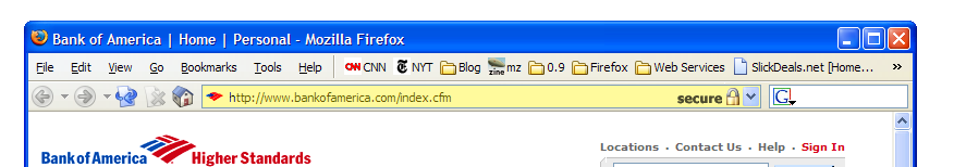
short as Bank of America's.
Relying on a one letter difference in the URL, even if it is early in the string
and in a consistent place (https), isn't user friendly. Asking the user to look
at the URL and then look at another totally different location (right side top
or bottom or bottom left) as additional verification seems clunky as well. A
lock at the left of the url bar is always noticeable (if there's a url bar).
Most users do use their url bars, and the url area is a logical place to look
for connection security. A url bar lock is a good enhancement for the majority
of users, and the far left of the url bar makes more sense.
If you want to change the url color, I suggest something different than yellow.
At least in the U.S, it is associated with warning. Perhaps not the feeling you
want for a secure connection. Without the lock symbol being in a quickly seen
area, the user will see a color change far earlier than having any context about
what the change was about (again, could be bad if the color is a not a
re-assuring one) unless you want to compensate with a pop-up like Mozilla does
for secure connections to explain things the first few times.
Comment 48•21 years ago
|
||
"If one buys it, there are implications that probably make its implementation
rather impractical: the URL bar should never be hidable, as it conveys page
identity."
One doesn't buy it. Almost everything in the URL bar (URL, favicon) is under the
pretty close control of the page author. Therefore, it doesn't establish site
identity at all - it tells you what the author wants you to _think_ the site
identity is.
Gerv
| Reporter | ||
Comment 49•21 years ago
|
||
the remaining work is basically theme work mac only - reassigning to kevin.
Assignee: bugs → webmail
Status: ASSIGNED → NEW
| Reporter | ||
Comment 50•21 years ago
|
||
Kevin - do you think you can whip something attractive up quickly? We have about
3 weeks until RC1.
| Assignee | ||
Comment 51•21 years ago
|
||
Ben, I'm going to check this in soon with some other changes. Here's a screen
shot.
| Reporter | ||
Comment 52•21 years ago
|
||
Cool!
Comment 53•21 years ago
|
||
any eta on landing this? thx chofmann
Comment 54•21 years ago
|
||
Kevin: can you make sure the Mac version hardcodes a color: in addition to the
background-color:?
I just posted a patch in bug 249680 for winstripe, but since the Pinstripe
changes haven't landed I can't edit them.
| Assignee | ||
Comment 55•21 years ago
|
||
Sorry for the delay. Mac theme changes checked in on branch and trunk. I did
hardcode the color.
Comment 56•21 years ago
|
||
fixed on branch, deps are separate bugs, getting this off radar.
Keywords: fixed-aviary1.0
Comment 57•21 years ago
|
||
> Almost everything in the URL bar (URL, favicon) is under the
> pretty close control of the page author. Therefore, it
> doesn't establish site identity at all
The URL, by definition, is a URI, which, by definition, is an identifier for a
resource. So in that respect, the URL bar does reflect the page's "identity".
I do agree, though, that this alone is not sufficient to *authenticate* the site
or page. Even a padlock or some other indication that SSL is in use is
insufficient to do that. What would be needed is a better way of expressing the
content of the SSL certificate, but that's out of the scope of this bug (see bug
184881).
Comment 58•21 years ago
|
||
(In reply to comment #44)
> A trickster could also make a page's icon look like a lock.
> (The icon shown in the left of the URL bar, as well as the
> left of the tab &/or bookmark.)
Yup! That would be me:
http://iang.org/ssl/
http://www.financialcryptography.com/mt/archives/000179.html
And I got the idea from http://pgp.com/ ...
I think the lock being on the URL bar is a great experiment, and
we need many more of those, I think in this case, it's not going
to help. If it is to be put anywhere near the URL - which is a
good idea - it should be put on the chrome somehow.
iang
> My initial thought: Keep the "standard" status bar icon. Also,
> allow themes to recolor the url bar background & border. (Only
> for 128+ bit SSL?)
Yes, good idea. And even nicer would be for the user to select
the colour, as a local private petname tied to that cert.
> I also like the idea of the status bar icon having a matching
> pane background & border color (around the yellow lock).
The more colour and presentation that can be applied to just
that cert, the better. Tying it to SSL helps only until
the phishers decide it's worth their effort to start using
SSL for phishing.
iang
Comment 59•21 years ago
|
||
I just thought I'd post a small extra request for an "anti-phishing" feature: a
whitelist of secure sites. The procedure:
1) Whenever a secure site is visited, clicking/right-clicking the
"www.securesite.com (padlock)" text in the status bar provides a UI means to
"Add 'www.securesite.com' to Secure Site List".
2) When a secure site is subsequently visited, the browser checks the site
domain against its whitelist of known and trusted sites. If it matches, the
Location bar colour changes from yellow to green (or other appropriate colour
choice).
3) The secure list would be accessible within the standard browser options much
like the popup blocker list, so sites can be added/removed there.
The idea is that you add your favourite sites (online banking etc.) to the
whitelist, and visually alerted when you visit "https://www.secures1te.com" or
some other near-but-not-quite phishing site by the fact that the URI is the
normal HTTPS yellow, not the trusted green.
Comment 60•21 years ago
|
||
(In reply to comment #59)
...
> 2) When a secure site is subsequently visited, the browser checks the site
> domain against its whitelist of known and trusted sites. If it matches, the
> Location bar colour changes from yellow to green (or other appropriate colour
> choice).
Right, it needs to do this based on indexing the cert.
...
> The idea is that you add your favourite sites (online banking etc.) to the
> whitelist, and visually alerted when you visit "https://www.secures1te.com" or
> some other near-but-not-quite phishing site by the fact that the URI is the
> normal HTTPS yellow, not the trusted green.
Yes, this would be a big improvement. We need to trial ideas
like this.
Accordinto to Tyler Close's petname variant, you might go one
step further, and as well as clicking-to-whiten the site, also
give the user a chance to add a bookmark-like 'petname'. When
they return to their favourite bank site, the petname could be
displayed in the URL bar, or chrome somewhere (obvious, blatent)
and tell them they are at "My Bank" rather than pay.bankoramerican.com
The Herzberg & Gbara ideas go even further by letting the user
'sign off' on a site, and displaying the site's logo on the top,
which is a big visual clue as to where they are. Very powerful
branding notions! A bit like my suggestion that the CA's branded
logo should also be showed, as this means the CA has to start
protecting its brand (and closes off the CA-MITM). See screen
shots in below URL of how they built it into a Mozilla plugin.
iang
Herzberg & Gbara (includes screenshots):
http://www.cs.biu.ac.il/~herzbea/Papers/ecommerce/spoofing.htm
also their plugin: http://TrustBar.Mozdev.Org
| Assignee | ||
Updated•21 years ago
|
Status: NEW → RESOLVED
Closed: 21 years ago → 21 years ago
Resolution: --- → FIXED
Comment 61•21 years ago
|
||
This was marked fixed on 3/14. What changed?
Comment 62•21 years ago
|
||
nothing had changed, it just hadn't been marked fixed when it should have been.
Status: RESOLVED → VERIFIED
You need to log in
before you can comment on or make changes to this bug.
Description
•